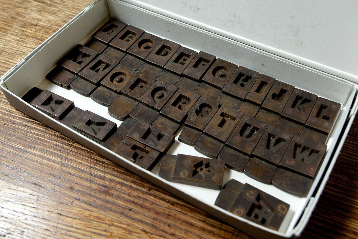
Original Sans
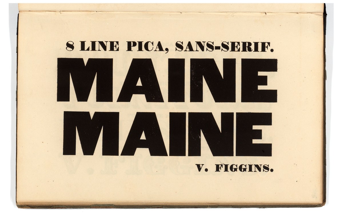
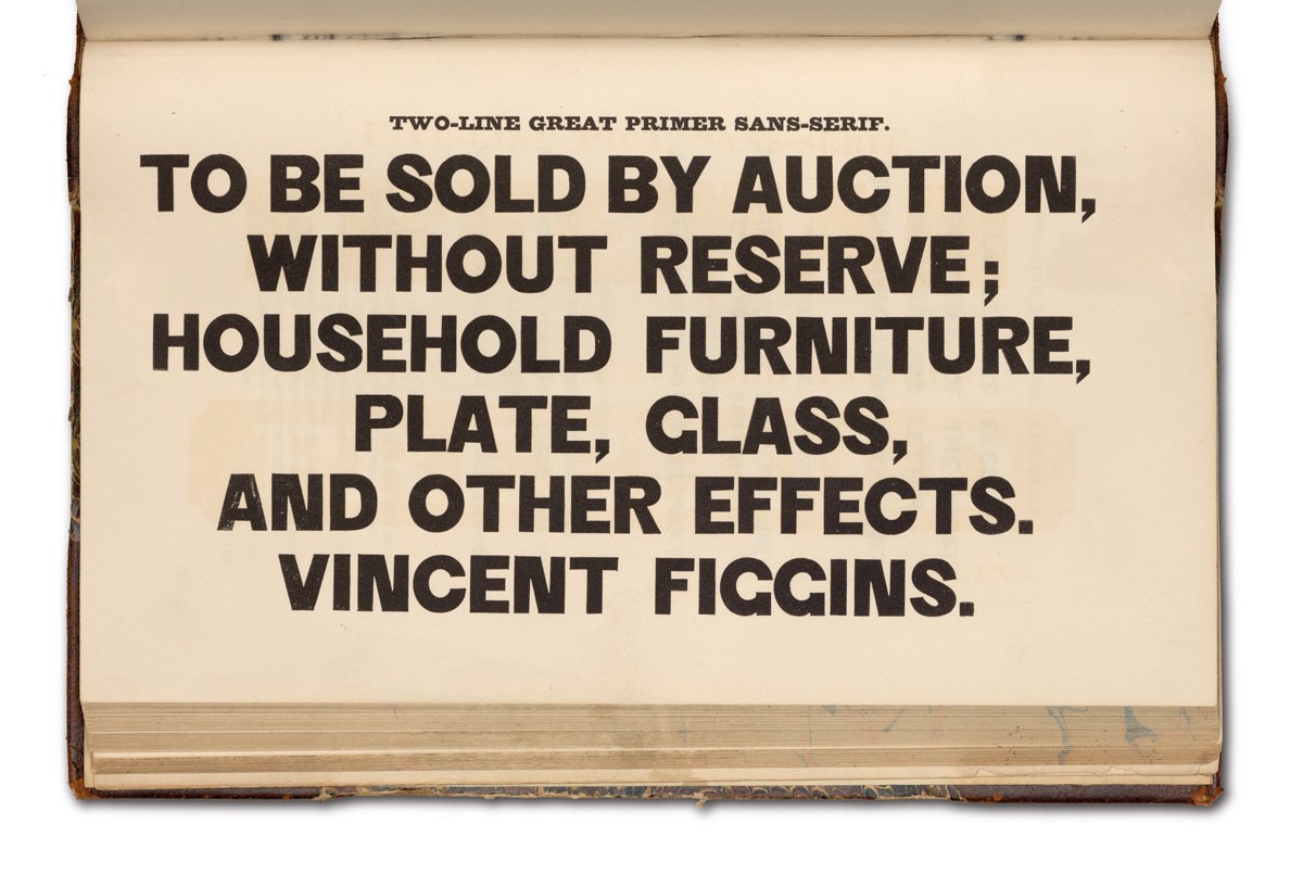
Vincent Figgins’ 8 Line Pica, Sans-Serif, shown in his Specimen of Printing Types, 1828. Tetterode Collection, University of Amsterdam.
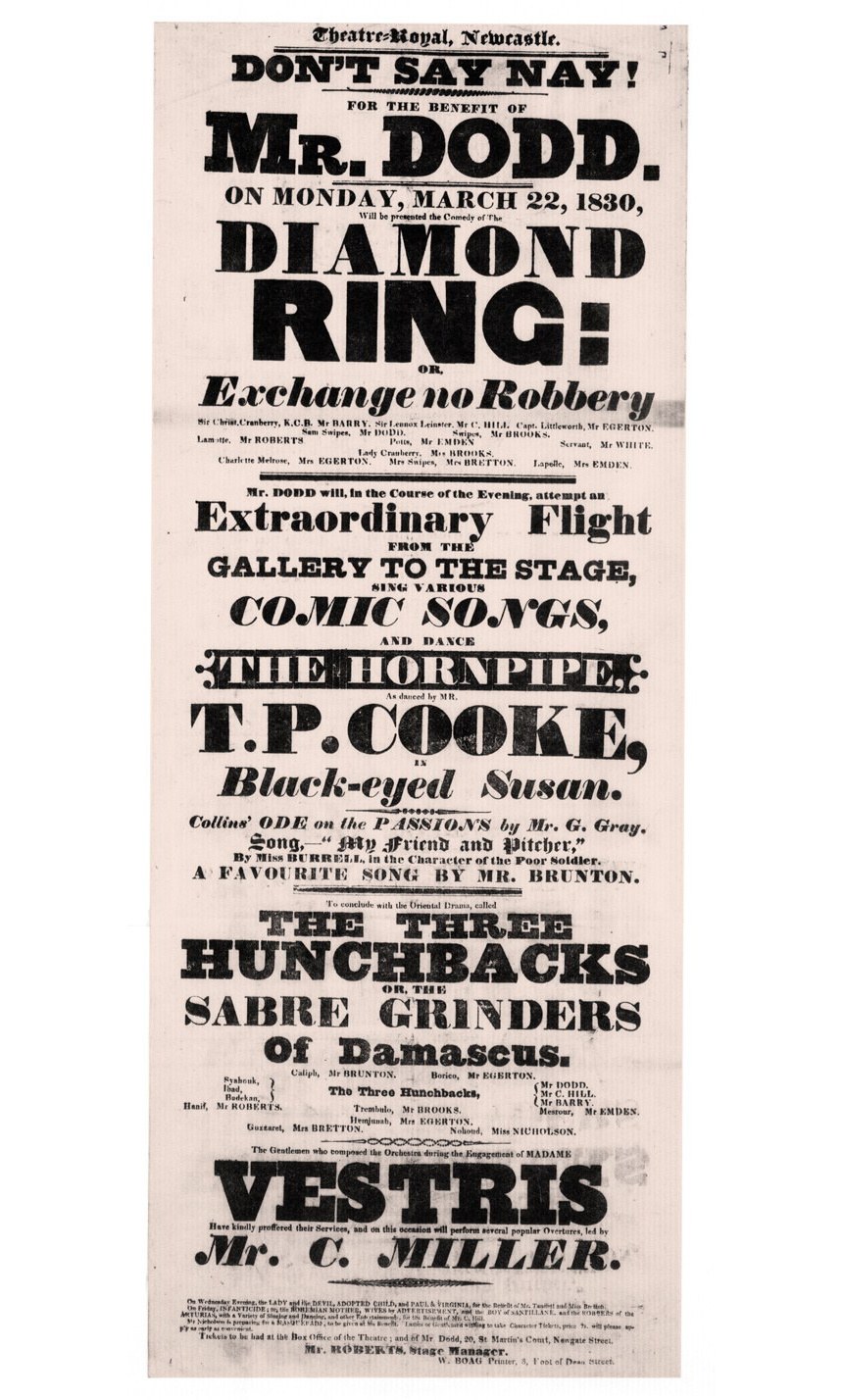
An early appearance of 8 Line Pica, Sans-Serif in Newcastle in March 1830. British Library, Creative Commons.

Vincent Figgins’ Six-Line Pica, Antique, No. 2, shown in his Specimen of Printing Types, 1833. St Bride Library.
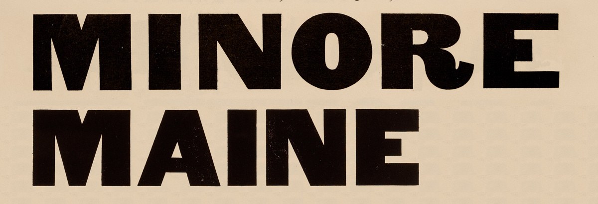
Figgins’ Six-Line Pica, Antique, No. 2 with its slabs removed and 8 Line Pica, Sans-Serif, below. In weight they are almost identical, and many of the letters share similar characteristics.
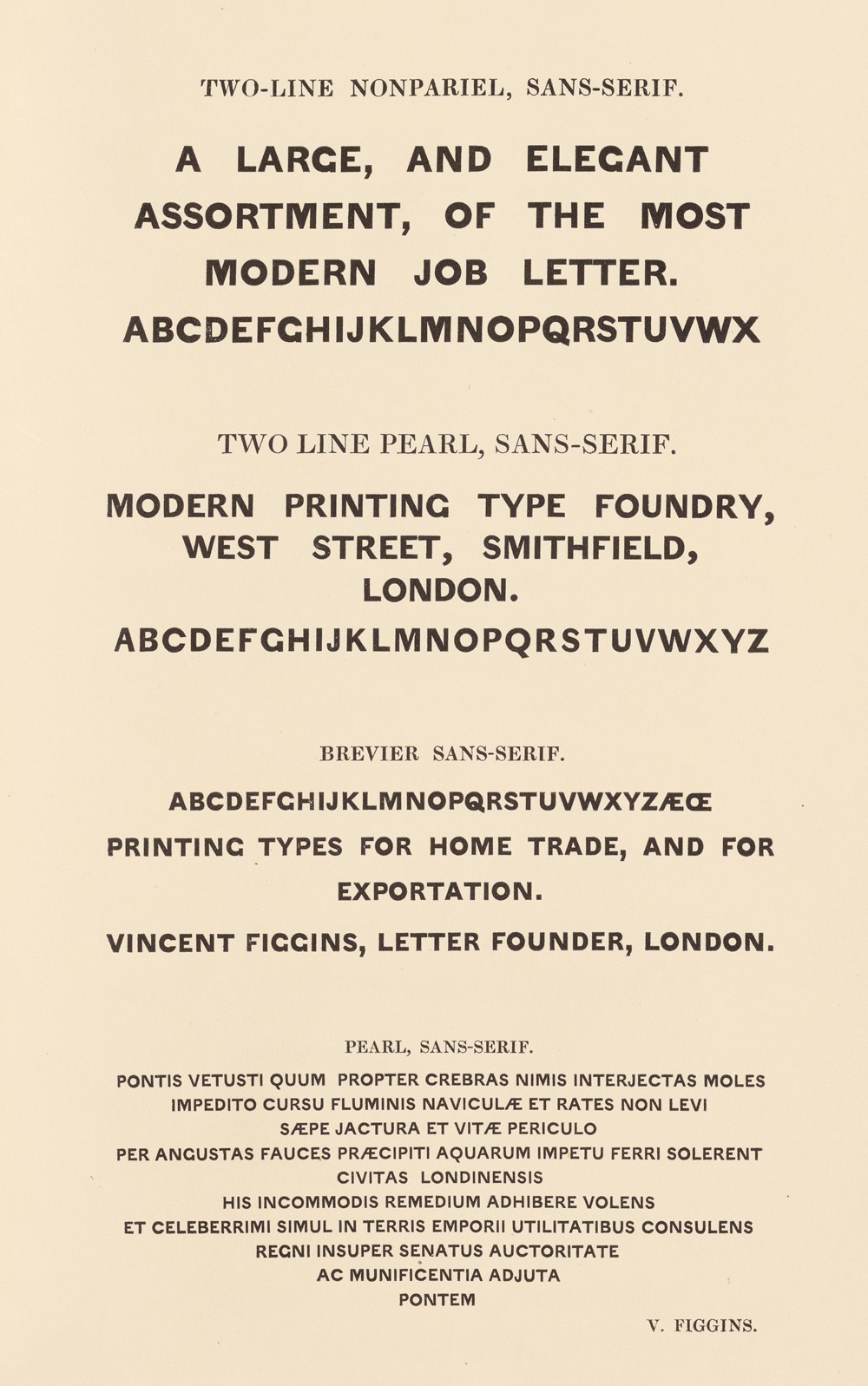
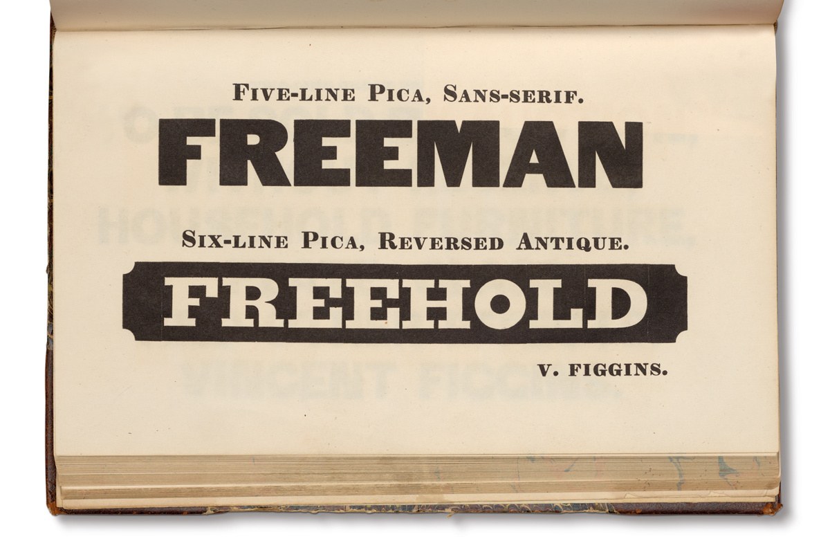
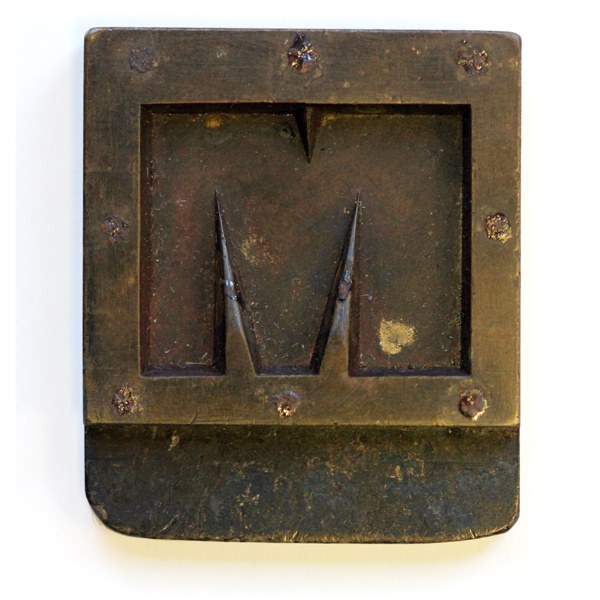
When looking for a model for a lowercase, we saw that Figgins’s Egyptian types would offer a suitable example; simply removing the slabs shows a convincing sans form. Though no punches or matrices exist of Figgins’s Egyptian, countless examples can be found in the specimens. By 1833, Figgins alone showed 23 separate sizes of Egyptian. The Egyptians offer an example of how tall the x-height should be, the difference in weight between capitals and lowercase, and the variation in weight in the lowercase. The Five-line follows a more geometric form with a heavy lowercase and its relatively large x-height. In contrast, The Two-line Great Primer is lighter in weight, has a smaller x-height, higher contrast, and is less geometric in form.
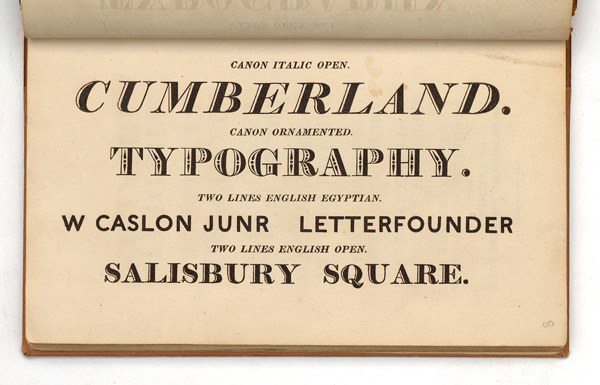
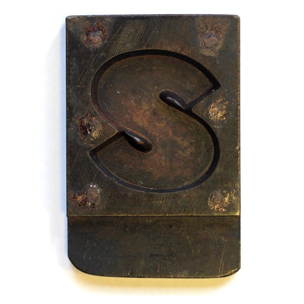
Compared to Caslon’s pioneering form, Figgins’s are more emphatic and less delicate. At times crude and less resolved, they have a more obvious industrial-like charm to them. The lightness of Caslon’s sans made characters like the S easier to make, and though the O looks perfectly circular and mononlinear in weight, it is less obviously so than that of Figgins. Caslon’s letters are closer to the architectural lettering style of the period, as shown by the drawings of Sir John Soane,5 whereas Figgins’s follows a bolder, more aggressive style, keeping with the typographical models of the Egyptian and display typography of the time. Despite the success of the form in print, the British foundries did not adopt the form in large sizes, preferring and directing much of their energy towards developing the bold condensed form, such as Thorowgood Grotesque. Today, these pioneering, no-nonsense, bold forms demand reevaluation: what may have once been considered crudity will now be seen as real character against the smoothness often found in contemporary sans form. For the designer today, these are attractive qualities, making Original Sans as appealing today as it was then.
Much of the story of the earliest sans serif typefaces (and the letterform itself) can be found in James Mosley, ‘The Nymph and the Grot’, Typographica new series 12, 1965 and a second edition for the Friends of St Bride Printing Library, 1999.
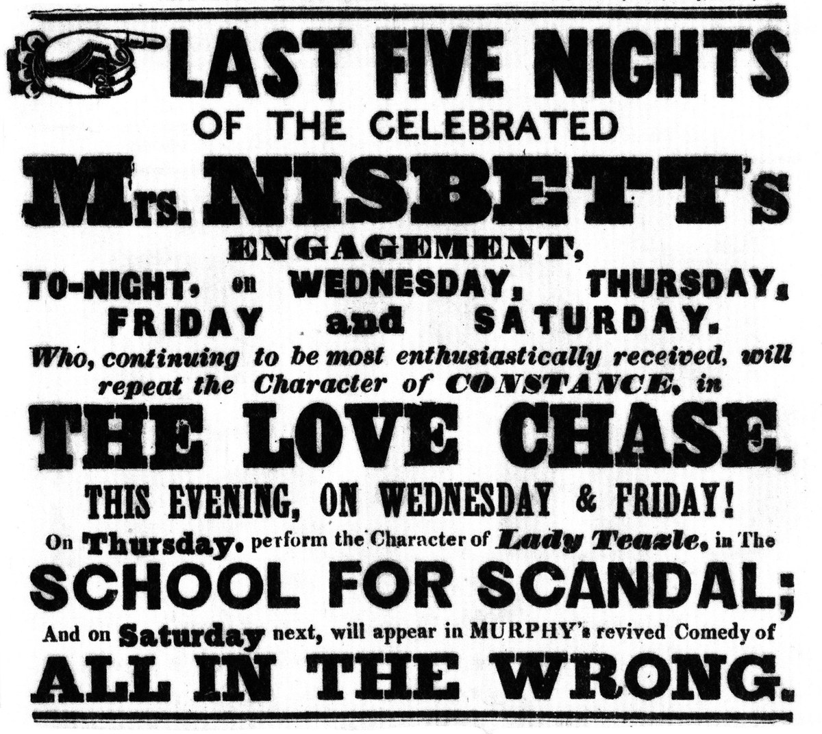
Its appearance in specimens of Blake & Garnett—and its successors Blake and Stephenson, then Stephenson Blake—do not seem to have boosted its popularity. Few examples seems to appear outside of these specimens, though some can be found in London theatre posters from the 1840s and 1850s. For a typeface of such limited use, it is surprising that it appears across the Atlantic in the specimens of the Mackellar, Smiths & Jordan, from Philadelphia.
The British foundries were slow to adopt the lowercase, which only appeared later in the century.
Nicolete Gray
See Mosley
