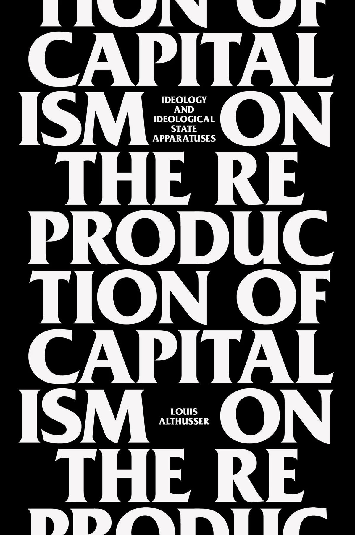
Moulin’s syncopated cadence
Sans serifs with contrast are fertile ground for type designers. Perhaps it’s their ambiguity that encourages invention, because the genre is defined less by what a typeface is and more by what it isn’t: not a structurally uniform geometric, not a low-contrast grotesk, not a classical serif, and so on, leaving ample room for experimentation.
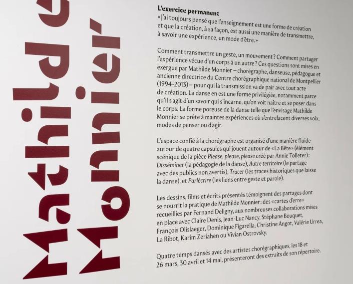
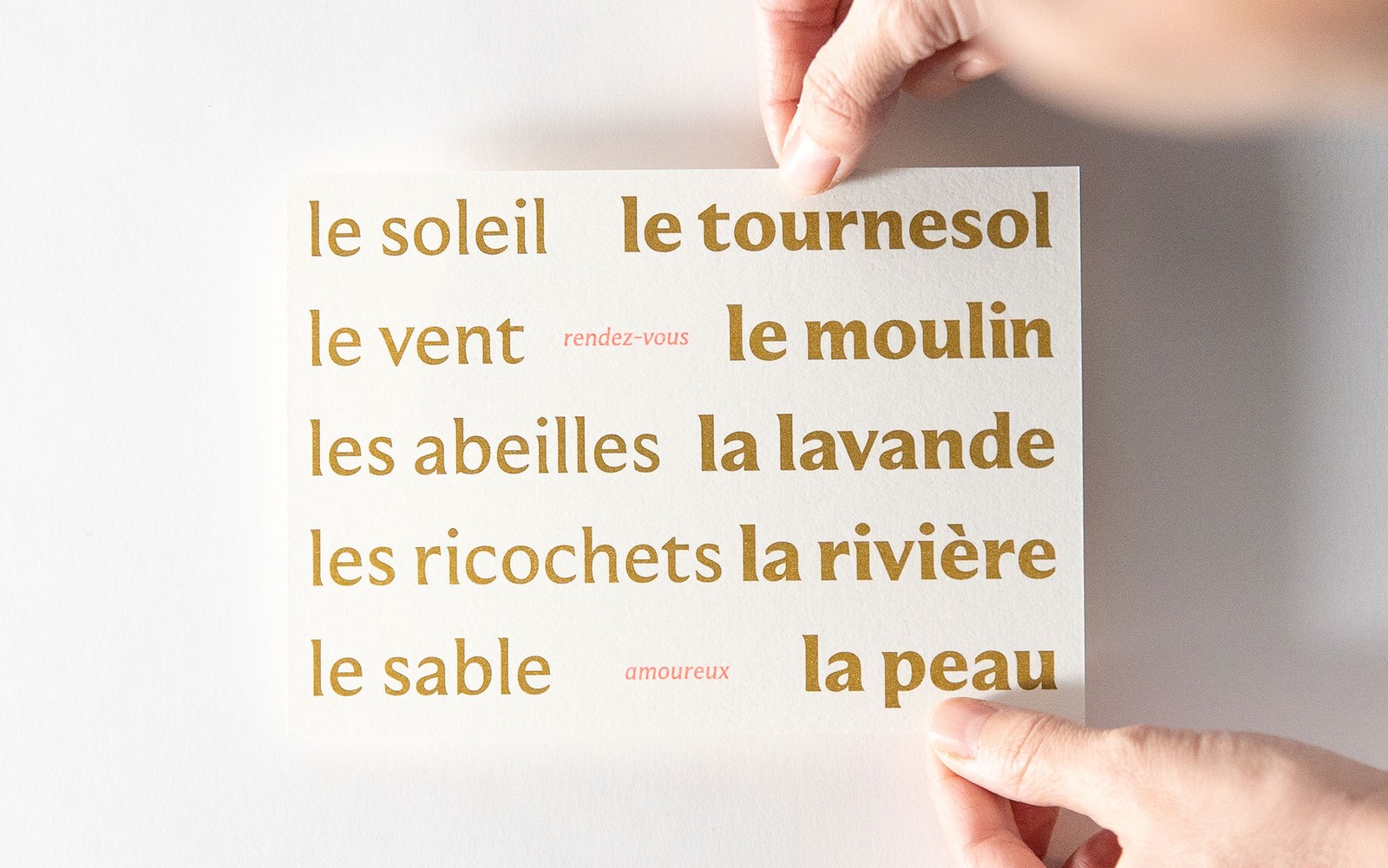
Superficially, Sandrine Nugue’s Moulin appears similar to other contrasting sans serifs in our library. It shares an elegance with Darby Sans and an incised quality with Orleans and Ergon; and, like Canela, it occupies an ambivalent zone between serif and sans. But where Darby Sans and Canela explicitly engage with historical serif typefaces, Moulin plays a different game: “I don’t just want to interpret historical shapes,” Nugue wrote in an early email about the project. Instead, Moulin follows a deceptively simple logic of stressing the incoming and outgoing gesture of each letterform, letting the weight endlessly tumble back on itself, knitting words together in text and creating a surprising series of countershapes in headlines.
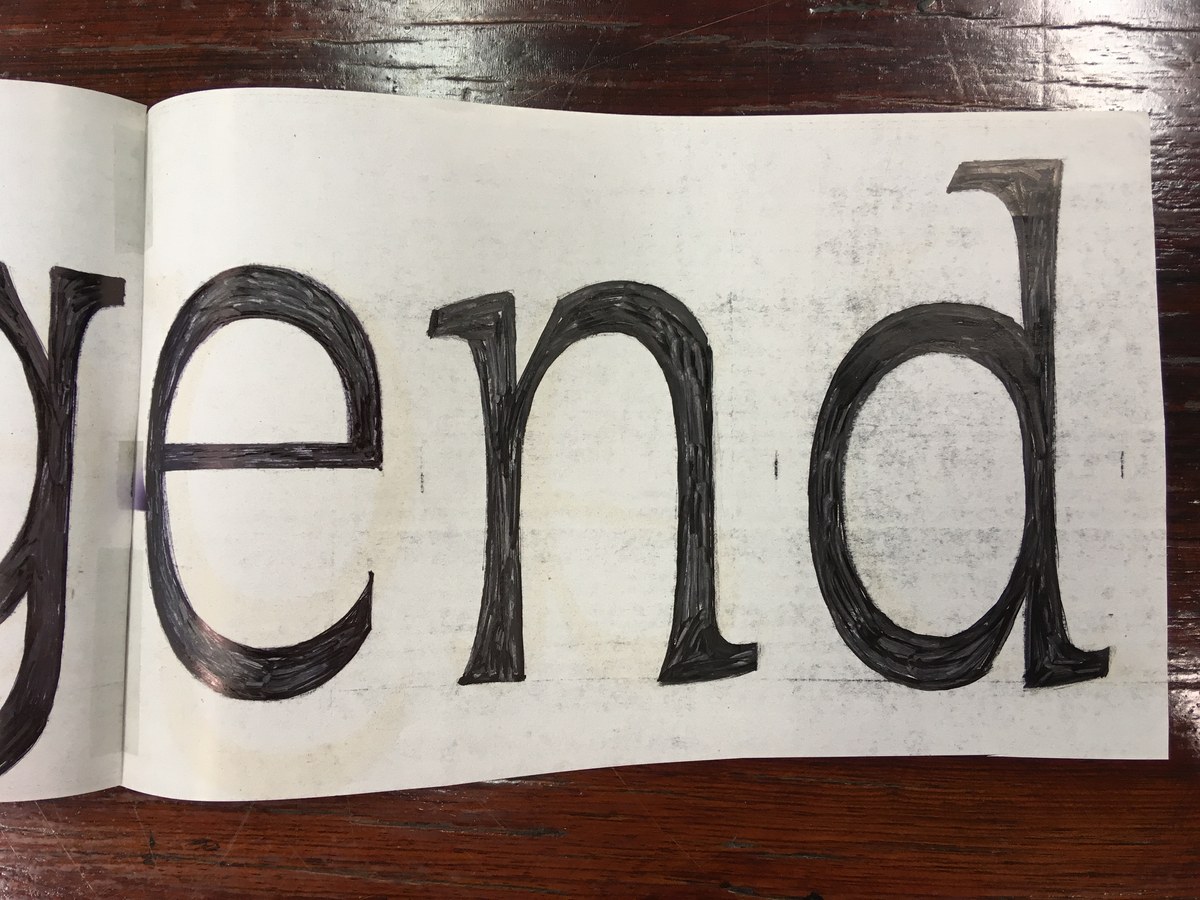
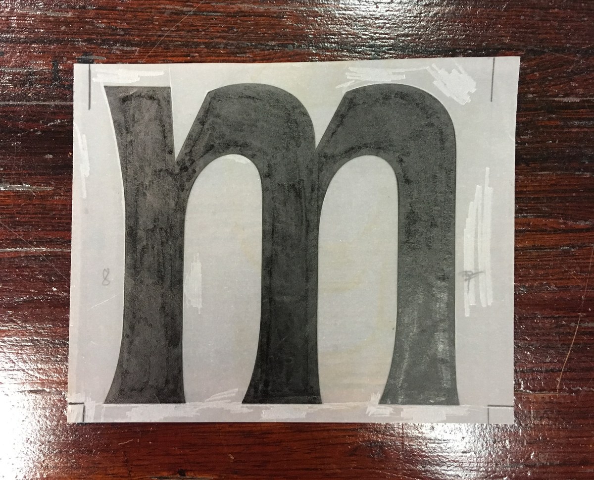
I asked Nugue to explain her approach to text typefaces. “A text face needs to be comfortable to let the reader focus on the subject,” she told me. “What I try from the beginning, first with my student project Ganeau and then concretized with Infini, is to find the balance between legibility and singularity, so the text typeface can be singular enough to also be used in display like Infini, but that these particular features are quieter at text sizes and more like a texture.” Moulin’s particular character comes from the balance of the radically asymmetrical flares and the rounded counterforms, applied to classical proportions.
Rhythm
In use
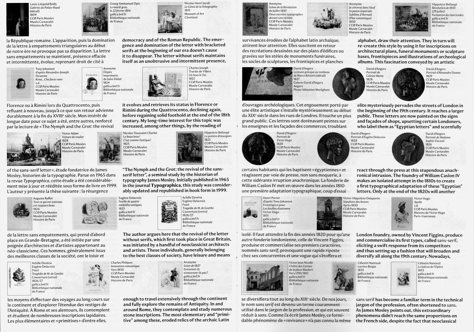
Spread from SANS (FR) 1628-1924, written and designed by Sébastien Morlighem, published in 2022 by Éditions Non Standard.
