Isambard
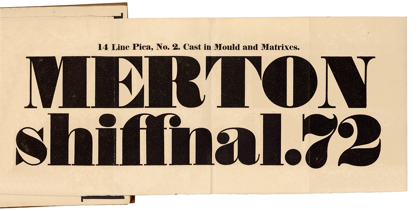
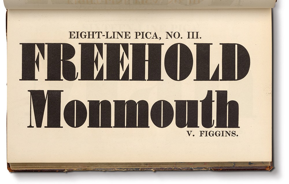
The typical fat face made in the first three decades of the nineteenth century was heavy in weight and large in size. 14 Line Pica, No. 2 as shown in Thorowgood’s New Specimen of Printing Types, late R. Thorne, 1821. Thorne is often considered the pioneer of the form. St Bride Library.
Take a serif typeface and make it bold. Then, make it bolder. And then, bolder again. Carry on until it seems that it can’t be any bolder, for where would all the weight go? Then, make it even bolder—bold to the point of becoming overblown and vulgar—so that next to a normal weight of roman, it could only seem monstrous. So bold that it would take enough ink for the inner counterforms to almost disappear and for the terminals to be exaggerated beyond anything seen before. This is the fat face and, by the second decade of the nineteenth century, they were the boldest typefaces people had ever seen. Originally designed for making words as eye-catching and bold as possible, even today they retain their impact.
The fat face is the joyful expression of an idea—to make something as bold as can be—executed with real vigour and the utmost conviction. And so, from the skeleton of the elegant modern came this bombastic form. But while the modern gently moved away from the traditions of the past, the fat face completely broke free of them. Once the fat face arrived, all the other bold designs of the nineteenth century followed: the Egyptian being a fat face with low contrast and the Italian with reverse contrast.
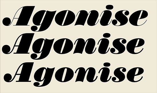
Isambard is the cousin of Brunel; it takes the heaviest weight, the black, and pushes it as far as it can be pushed. In sheer weight it is heavier then anything the British foundries ever produced in a normal width, yet not beyond the realms of what a founder might have produced. Isambard does not have to fit neatly into the immediate family design of Brunel. Forms become distorted in keeping with the idea of extreme weight, so the balls are bloated to near-bursting. Shapes become simplified: the E, F, L, T, and Z all lose the curvature in their terminals and are simple triangular forms. The inner shapes are no longer completely rounded, but become flat-sided. The transformation between thick and thin is exaggerated.
By the first decade of the nineteenth century, the idea of a bold weight was an established idiom in typeface design and as soon as one foundry produced a bold, another would produce something even bolder. When the first fat face appeared is not clear. It has often been claimed that Thorne introduced the form in 1803, but the specimen of that year does not even show a bold face. Fry shows bold faces in a specimen around 1808, but they are not recognisably fat. Thorne’s last known specimen of 1810 (before the purchase by Thorowgood) shows faces that are so, but this does not conclusively prove Thorne was the innovator of the form. For example, no known Figgins specimen exists between 1801 and 1815, when he clearly shows fat faces. An examination of the types from the Caslon and Catherwood foundry and its successor, Caslon and Livermore, gives some idea of the increase in weight in fat faces from the 1810s to the 1830s. The Four-line Pica that appears in the earliest specimen must have been surpassed, for it is not shown in the specimen from the 1830s. Instead, a bolder design appears, No. 1, which one might consider to be a fat face. No. 3 does not greatly increase weight in the capitals but does so in the lowercase, which has narrower counters, though both No. 1 and No. 3 are clearly developments of the earlier design. In weight, the lowercase of Isambard is around 25% heavier, the capitals around 13% heavier. Isambard also has a greater contrast than found in these examples.
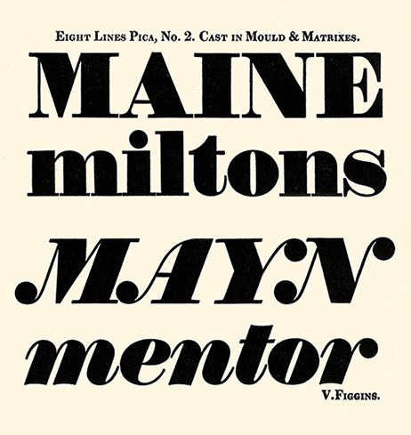
The heaviest weight shown in Specimen of Printing Types by Vincent Figgins, 1815. Facsimile edition, Printing Historical Society, 1967. Matthew Carter’s Elephant from 1992, later renamed Big Figgins, is based on some of the bold typefaces from this specimen that approach what we know today as fat face.

Caslon and Catherwood, Four-Line Pica Roman from Caslon and Catherwood, cut in the first decade of the nineteenth century. Specimen of Printing Types by Caslon & Catherwood, undated, but before 1821. This weight no longer appears in specimens issued in the 1830s. St Bride Library.
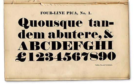
Caslon and Livermore, Four-Line Pica Roman, No. 1, first appears in Caslon & Livermore’s specimen of 1825. Specimen of Printing Types by Henry Caslon, 1842.
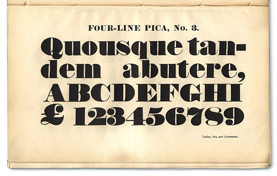
Caslon and Livermore, Four-Line Pica Roman, No. 3. First appears in Caslon & Livermore’s specimen of 1825. Specimen of Printing Types by Henry Caslon, 1842.
A similar pattern of development can be identified in all of the other foundries: multiple versions of the same size of display face with increasing scale in their numeric identifiers, almost always denoting an increase in weight. Maximum weight and contrast was probably achieved sometime in the 1830s, at which point the fat face could develop no further (though they continued in production, even being cast from original matrices), until the end of commercial foundries in the latter part of the twentieth century.1
The fat face can be described as the exaggeration of the modern letterform, extreme variation between thick and thin strokes with the reduction of modulation in bracketing. This often leads to very dramatic typefaces: sharp changes between weights, extreme ball terminals, and minimum counters as the space inside letters is reduced to the smallest amount it can be. The extremity of weight can often lead to distortion as the x-height is increased to accommodate weight without resorting to an expansion of width, the dot of the i and j become distorted ovals, and the ball of the f widens rather than deepens.
Italics follow the same principles, often with rounded notches on the base of the h, k, m, n, and r, and the tops of the a, g, u, w, and y. Certain forms are simplified, such as a single-storey form of the g or a tailless f. The A, M, N, V, W, and Y are usually rendered in the swash style with extreme bulbous balls; specimens often show the word VANWAYMAN. Fat faces would often be very closely fitted with virtually no sidebearings between the letters and the boundries of the type.

The fat face italic at the maximum weight of the nineteenth century; little modulation between thick and thin strokes, with the swash capitals and their exaggerated ball endings. First appears in Caslon & Livermore’s specimen of 1825. Specimen of Printing Types by Henry Caslon, 1842.

The rounded notches found on the bases of the h, k, m, n, r; the tops of the a, g, u, w, y; and the swash letters are typical of the forms found in Isambard.
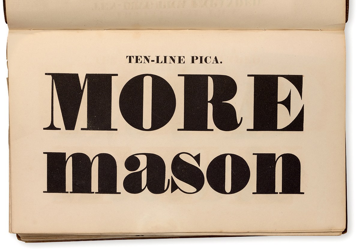
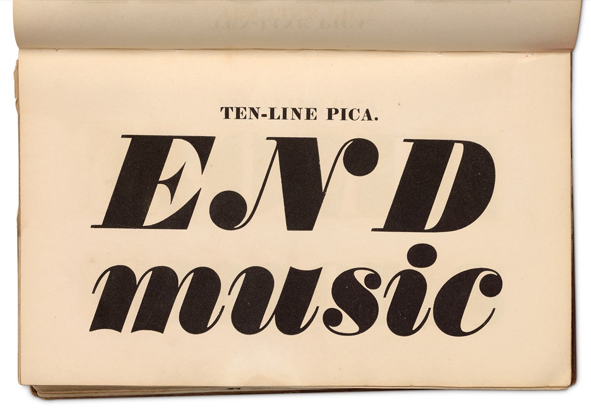
The second style of fat face has lower contrast, with even less modulation between thick and thin strokes. The Ten-Line Pica appears first in Caslon & Livermore’s specimen of 1825, as shown in Specimen of Printing Types by Henry Caslon, 1842.
Ten-Line Pica italic. Specimen of Printing Types by Henry Caslon, 1842.
Isambard comes in two variants, a regular and No. 2. In the regular, the contrast between thick and thin is greater, with the thins being the weight of Brunel Poster and there being some modulation between thick and thin strokes. In No. 2 there is less contrast, with the thins being much heavier. The spacing remains tight for large sizes but there is almost no modulation with the transition from thick to thin strokes being abrupt. It might be speculated that the shift towards lower contrast and less modulation happened for two reasons. For one, the version with heavier serifs was easier to read in larger sizes and brought greater impact, though perhaps they were just easier to make. Secondly, one might consider that these more robust serifs and hairlines are more durable for printers—any study of playbills (where these faces were used) will show damaged types frequently. In 1808, William Caslon IV had pioneered a method of matrix manufacture which necessitated that the design was cut into a sheet of brass and then mounted on a back; to make thin hairlines would presumably have been more complicated. These matrices were called Sanspareil.

Brunel Poster Black and Isambard share the same weight of hairline, whereas Isambard No. 2 has a lower contrast and heavier thins, but the spacing remains tight.

The italic of Isambard No. 2 is more upright than either Brunel or Isambard.
Smaller
Long Primer No. 8 (10 point), a fat face at text size, cut in the fourth decade of the nineteenth century. Specimen of Printing Types by Henry Caslon, 1842.
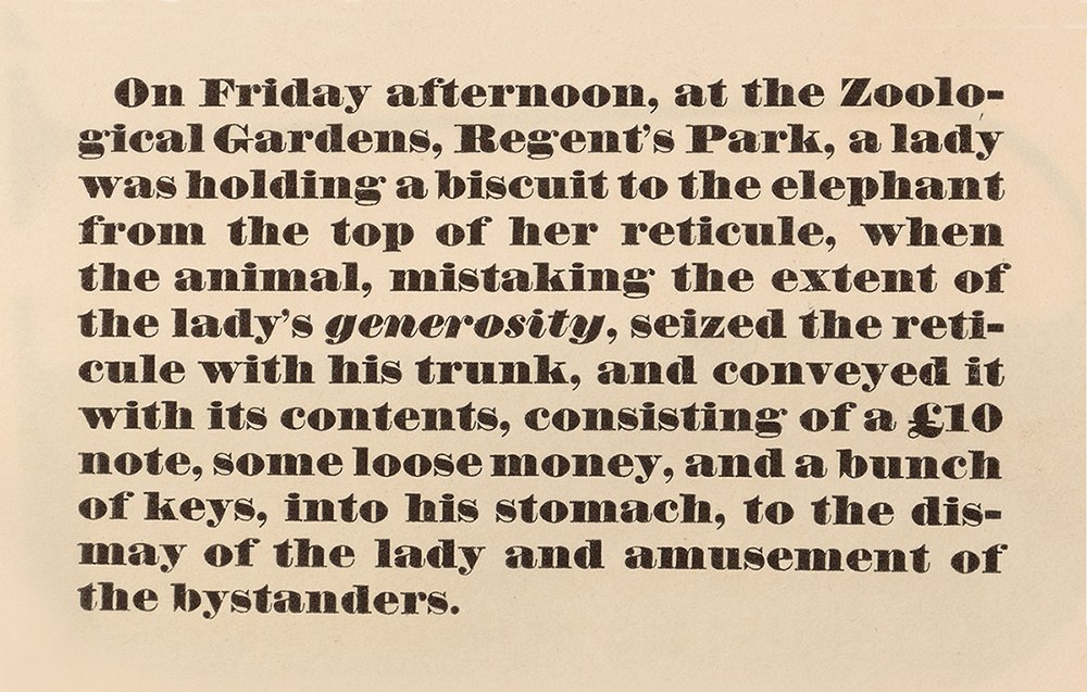
The fat face was created for display typography in sizes from 14 point to the largest that could be cast in metal. Yet, in the spirit of innovation and inventiveness that characterizes nineteenth-century typefounding, from the late 1820s on it became customary to make fat faces in smaller and smaller sizes, even down to Nonpareil (around 6 point). At such sizes, the fat face could be used for emphasis—a bold name on a title page, for example—but also for short passages of text or poetry, as the specimens show. The skill that was needed to fit all that weight into the limited space of a display face would be just as complex in a text size, if not harder. Though the text weights appear to be as heavy as the display weights, they simply can’t be. Counters are larger, x-heights increased, balls and dots are often stretched and widened. And though the form waned in popularity in step with the display sizes, some foundries continued to cast them into the next century.

Smoke proof of Caslon & Livermore Pica No. 7, roman cut by Rochaix and italic cut by Boileau, 1832. St Bride Library.

Isambard, Isambard No. 2, and Isambard Text. The weight in Isambard Text is lighter, the spacing looser, and the counters more open.
Isambard, Isambard No. 2 and Isambard Text Italic. The angle of the italic is less in the Text.
Narrower
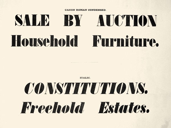
The first condensed serif typeface appear in Specimen of Printing Types by Vincent Figgins, 1833. St Bride Library.
If the first three decades of the nineteenth century were about making bolder and bolder typefaces at ever-increasing sizes, whether it be fat faces or Egyptians, the fourth saw an explosion in the production of narrower and narrower typefaces. It is not too difficult to imagine how, by the 1830s, foundries had started to run out of steam with the fat face, having cut the style in virtually all sizes. Their energies were instead being diverted to new forms, most notably the sans and a condensed variant. Figgins appears to be the first to show the condensed form in 1832, first as all capitals and then a year later with lowercase. The other foundries all followed this lead in the years that came after.
In condensing the style, the counters remain narrow but weight is lost from the vertical strokes. This makes the form lighter, though it maintains the appearance of having a similar density on the page to the regular width. Serifs are almost always flat and the variation between thick and thin strokes is usually extreme. The round characters, such as the O, are no longer rounded ovals but increasingly pinched in their curves as the letters get narrower. The numerals are unlike those of the regular width of the fat face. For example, the bottom of the 2 and top of the 7 are no longer flat, but a wave-like form.
While the roman form became widely accepted, the condensed italic style is obscure in type.2 One example can be found, made by Alexander Wilson & Son before 1843. If almost every fat face has a matching italic, the opposite is true of the condensed form. It is also a style that seems to have been rare in contemporary lettering. Was it an unpopular form, or was it simply an undiscovered one? Condensed sans italics remain similarly unusual. Or were foundries simply deterred by the difficulty and expense of casting such a design? Whatever the reason, Isambard’s condensed italics have no direct model. Instead, they have been derived from the design precedents established within the regular widths of Isambard.
Following the introduction of the bold weight, the fat face was the second of the great innovations of the nineteenth century. The creation of balanced and convincing seriffed letters, which maximized extremes of weight and contrast was one of the great challenges facing nineteenth-century punchcutters. That they managed to achieve such success in both roman and italic styles, in multiple sizes from the largest down to the smallest text sizes, and in condensed widths bears testimony to the skill of the punchcutters and foundries producing these new and progressive designs.
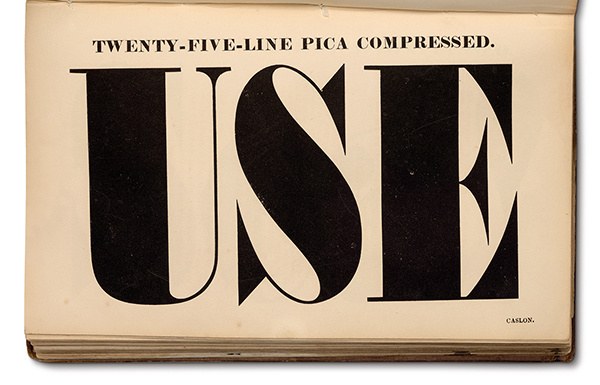
The largest condensed metal typeface that Caslon produced, Twenty-Five-Line Pica Compressed (300 point). Specimen of Printing Types by Henry Caslon, 1842.
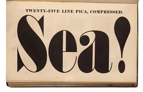
The largest condensed metal typeface Caslon produced, Twenty-Five-Line Pica Compressed (300 point). Specimen of Printing Types by Henry Caslon, 1842.
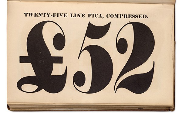
The largest condensed metal typeface that Caslon produced, Twenty-Five-Line Pica Compressed (300 point). Specimen of Printing Types by Henry Caslon, 1842.
A rare example of a condensed italic fat face in Britain, as produced by Alexander Wilson and Sons before 1843. In style, it fits what we would expect in a condensed fat face. Shown in the last specimen issued by the foundry, Specimen of Two-Line Letter, Book and Newspaper Founts and Metal Rules and Border by Alexander Wilson and Sons, 1843. In the copy at St Bride Library, Alexander Wilson and Sons is struck out and replaced by Marr, Gallie & Company who had taken over the firm. St Bride Library.