Ionic Modern: A latter modern
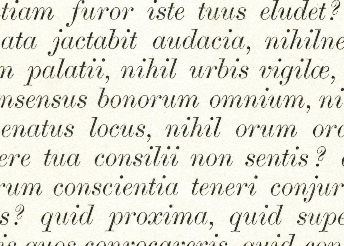
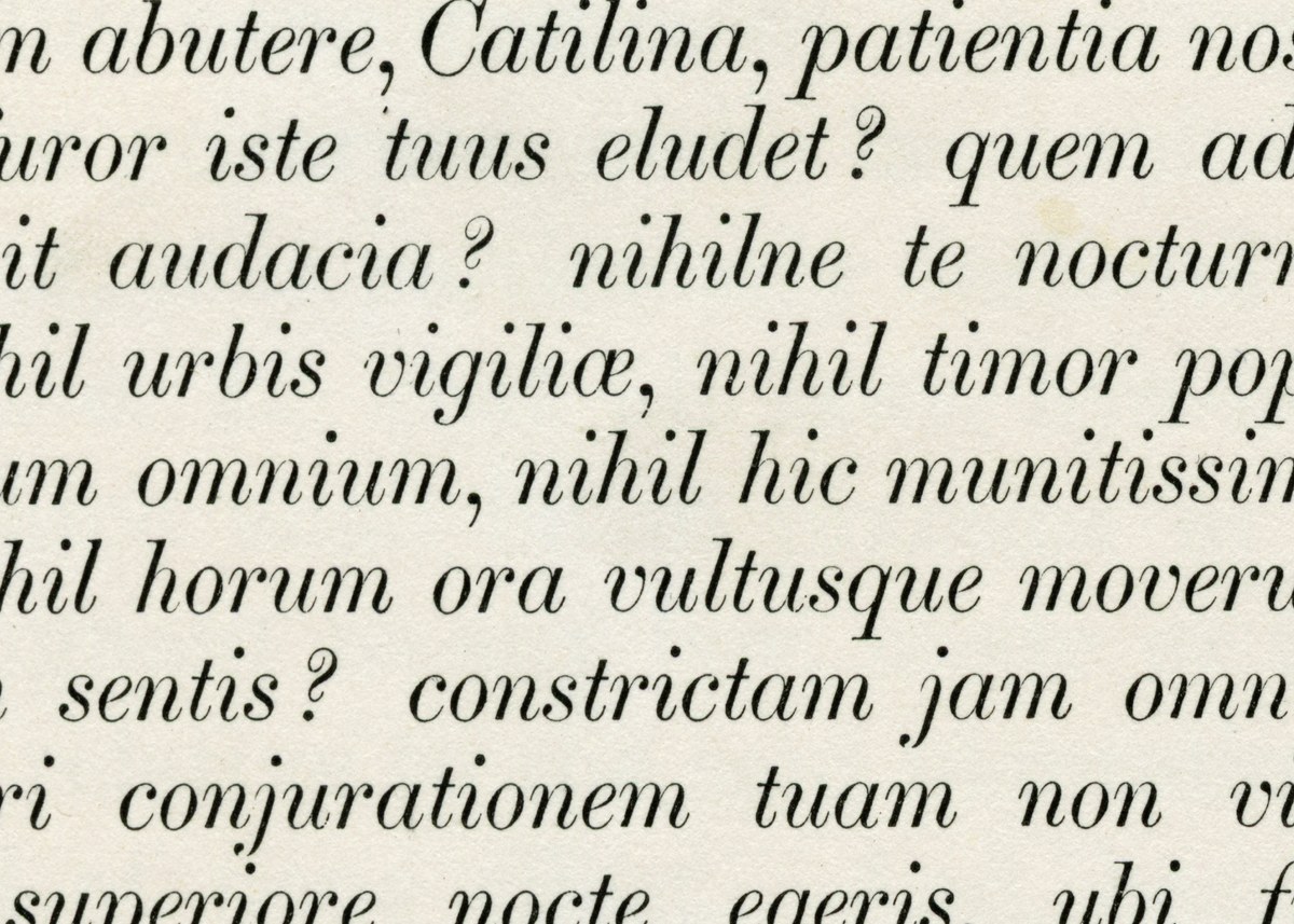
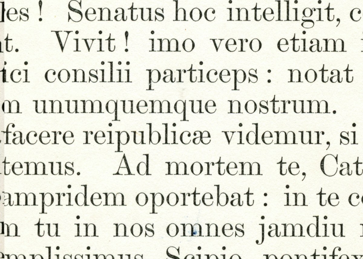
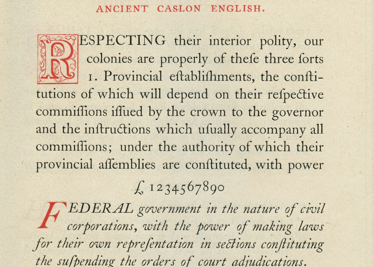
Ionic Modern is a variable font that draws on two sources: the highly contrasted Modern style of the second half of the nineteenth century; and its contemporary, the robust and utilitarian Ionic face pioneered by the Caslon Foundry. Designed by Paul Barnes and Greg Gazdowicz, Ionic Modern blends these sources along two axes – contrast and weight – to create new possibilities in the space between them.
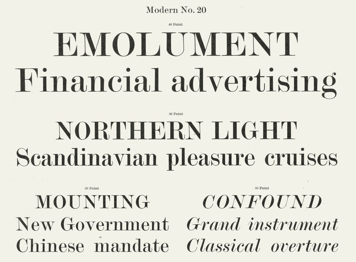
As the contrast increases, the Ionic becomes a sturdy Modern perfect for text before turning into a high-contrast headline style. Thus Ionic Modern solves the issue often associated with the Modern style of that period: being too contrasted and emaciated for anything other than headlines. This mutability lets today’s designers tailor type to their specific needs.
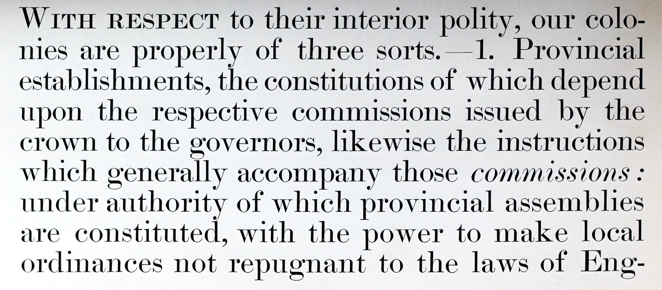
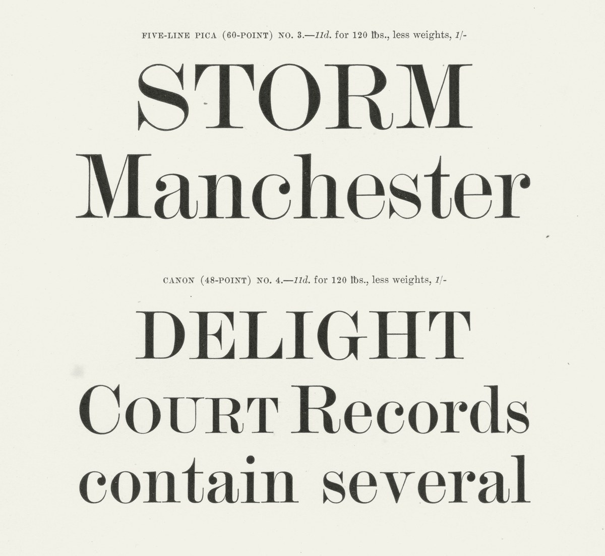
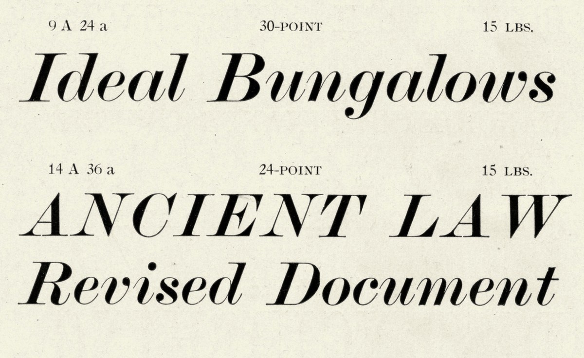
Caslon Modern in the 1850s, in display, as shown in Specimen of Printing Types of the Caslon and Glasgow Letter Foundry 22, Chiswell Street. H.W. Caslon & Co. London, 1851.
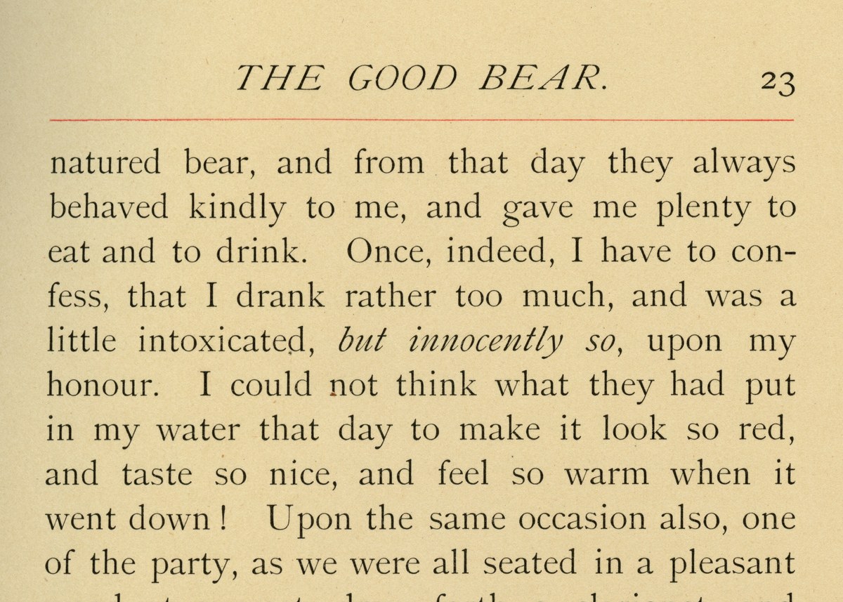
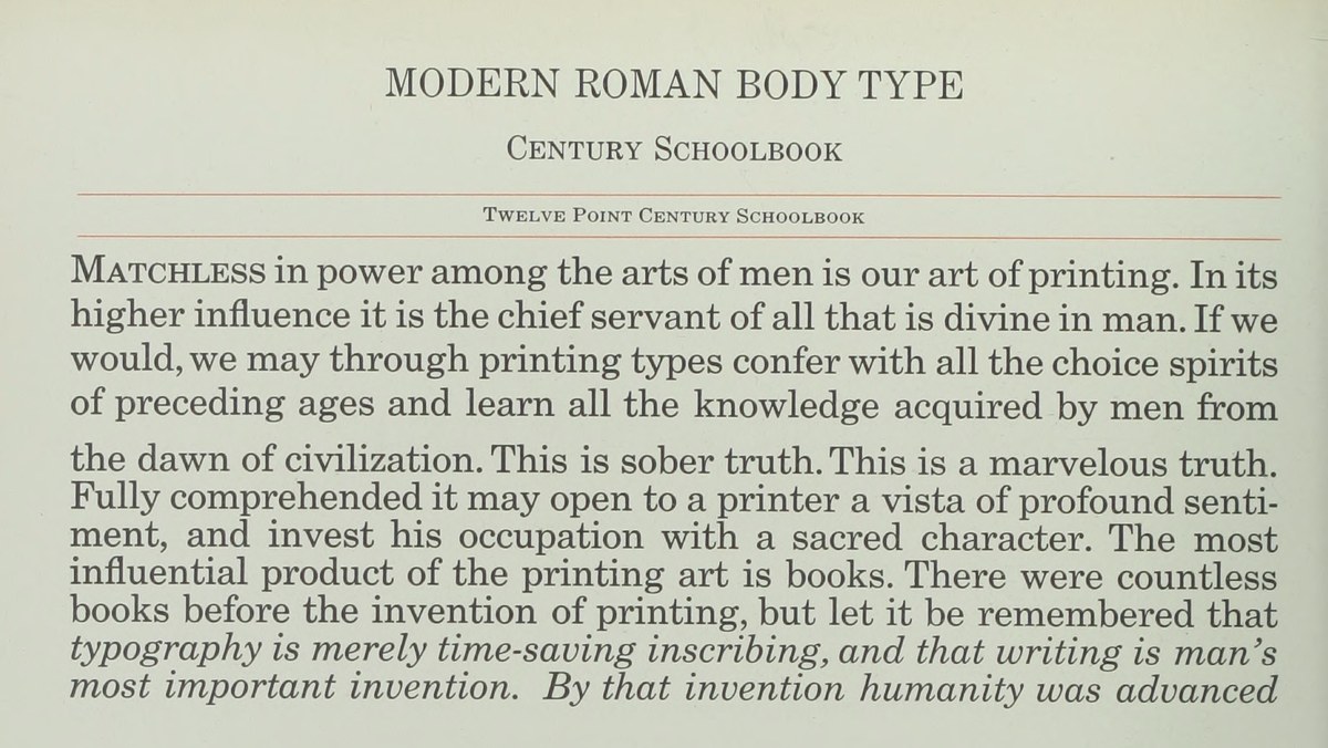
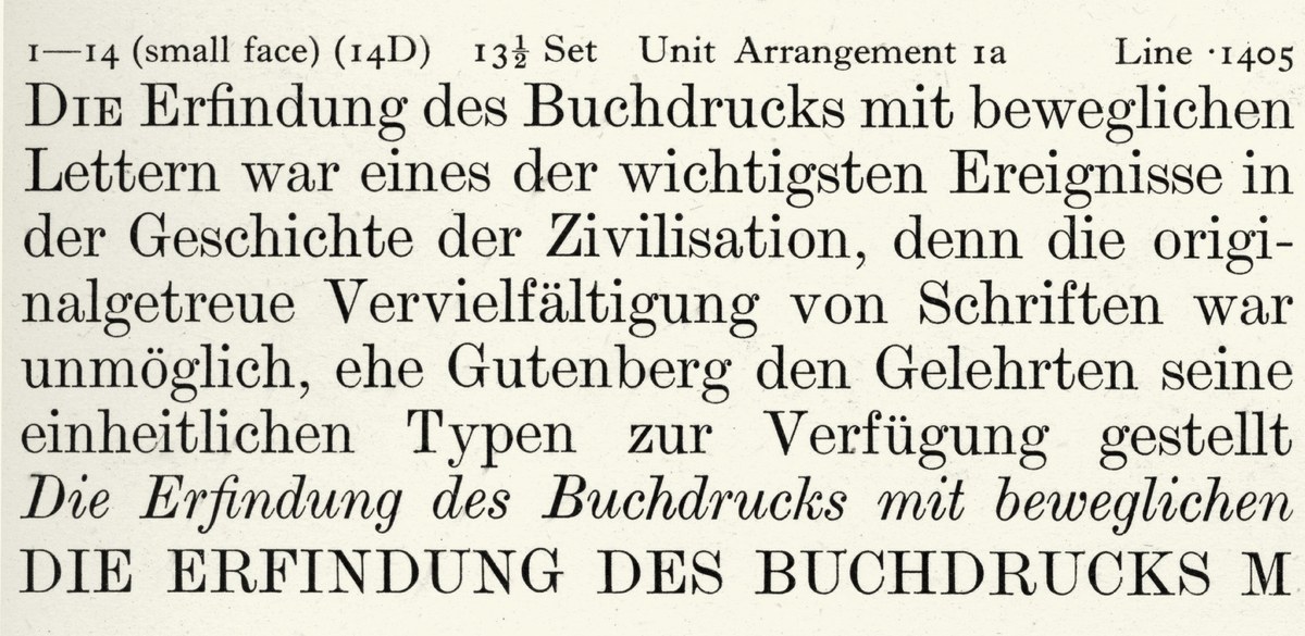
As the Modern established itself as the dominant form of serif letter in the late eighteenth century, foundries continually updated it, a reflection not just of changing tastes, but also of the steady need for new punches, matrices, and of course newly cast type as printers wore out what they had in case. So the first Modern of Richard Austin (c. 1788), the Modern of Caslon (1796), and then the Modern of the Scotch foundries at the end of the first decade of the nineteenth century (often credited to Richard Austin) show an evolving style in both roman and italic in text sizes.
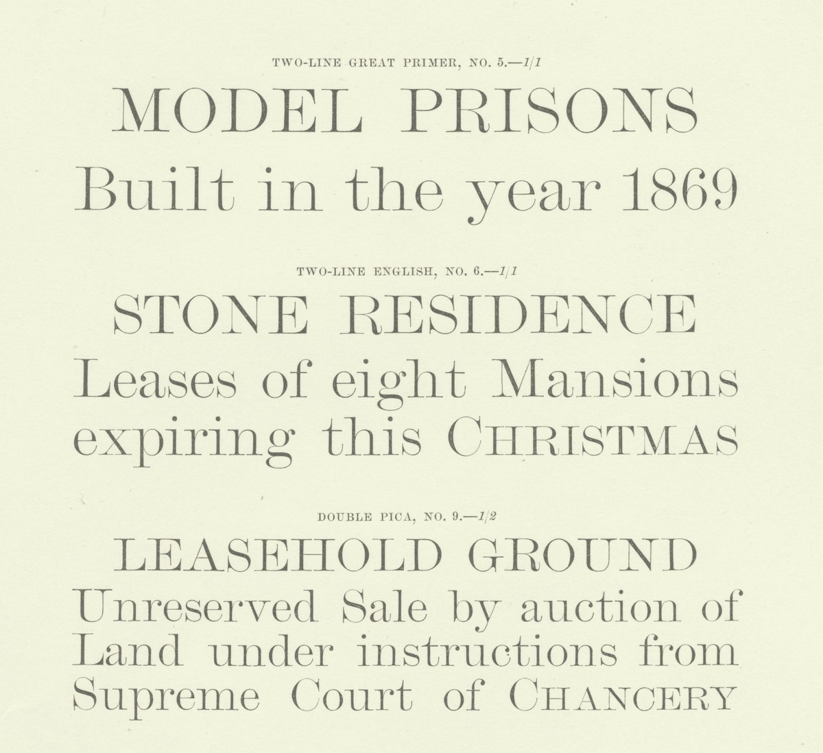
Though these changes may be subtle – the degree of bracketing in the serif, the treatment of terminals, the width and angle of the italic – they all amount to constantly changing tastes. If we take Austin’s first excursion into the form and that of the ‘Scotch Roman’ nearly twenty years later, the overall impression is one of greater sharpness; the balls for example are more defined, the change in contrast more pronounced. The italic is more upright and compact, with the tails tighter to the main strokes. Yet both, unlike the example of Caslon, have a defined tapering and bracketing of the serif, which distinguishes the form from a Didot or a Bodoni. As the century progressed, more and more styles were cut – so you get No. 1, 2, 3, 4, and so on and on, until you often reach double figures. (Miller & Richard had a Brevier No. 30 by the early twentieth century, when the foundry would have been ninety years old, suggesting a new cutting approximately every three years.)
