Delegate’s functional, incidental beauty
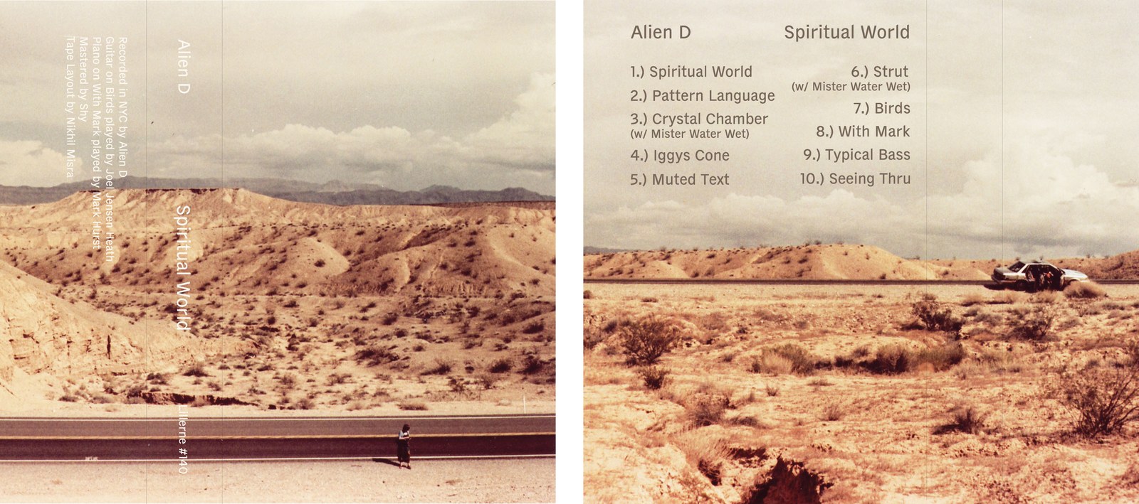
The first official use of Delegate: outer and inner cover of Spiritual World cassette by Alien D. Design by Nikhil Misra, photography by Daniel Creahan.
Like the late Tibor Kalman, designer Shiva Nallaperumal appreciates boring typefaces.1 “I've always liked this idea of a rugged typeface for documents and mundane office use—a typeface that tries to be ‘neutral’ but that succumbs to the look that comes with functionalist design considerations,” he wrote to me in an email. Largely unnoticed, these are typefaces that do the drudge work—the typefaces of telephone books, classified ads, interoffice memos, and stock listings. But take a close look at these ostensibly drab designs. Their underlying contradiction is that by working so hard to be legible and readable, they end up having strong personalities in spite of themselves.
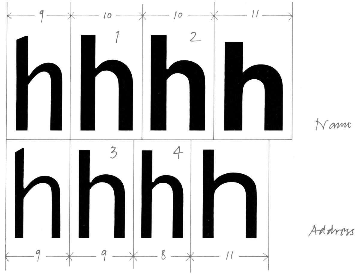
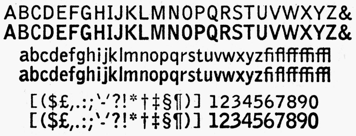
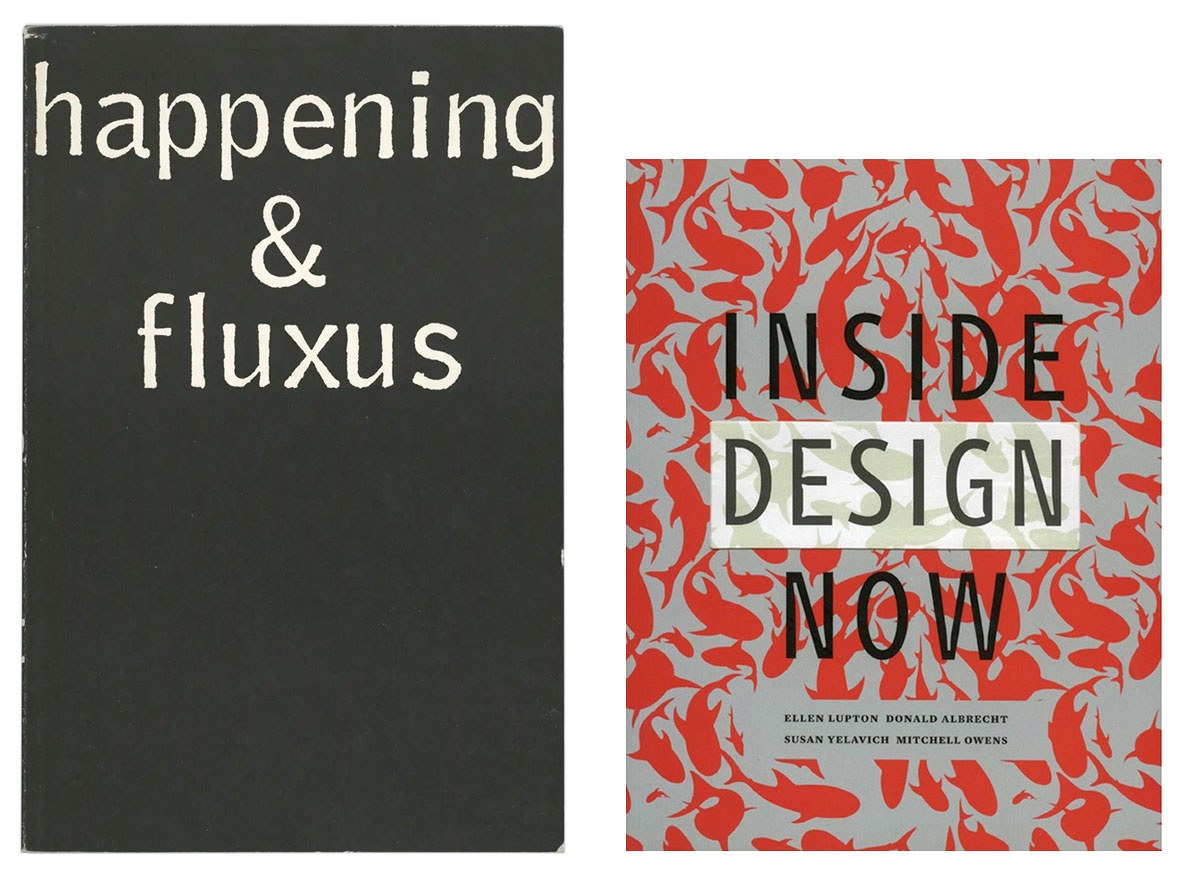
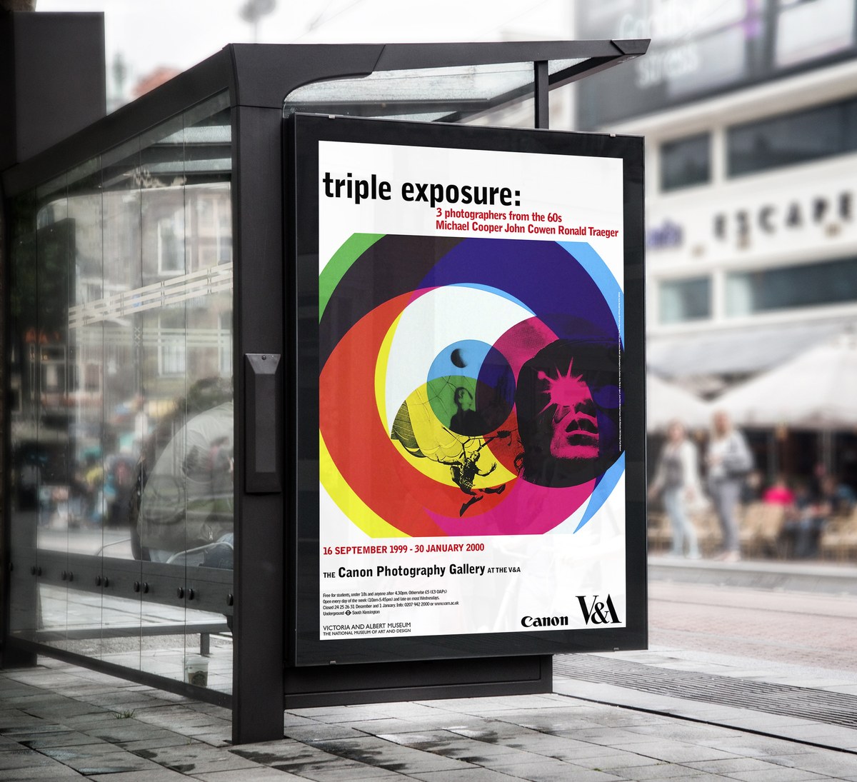
A desire to understand this tension led Shiva to embark on an in-depth analysis of agate typefaces, tiny 5.5pt printing types that were the early-nineteenth-century invention of Scottish-American typefounder and printer George Bruce. An agate’s job is to predict and mitigate ink spread by introducing compensatory defenses like wide-open counters, deep arches, and notches2 into letterforms to preserve their identity under trying conditions. Shiva first explored these compensatory strategies in the very ink-trappy Trench superfamily, released by Indian Type Foundry (ITF) in 2016. When set small, such corrective tactics are invisible. When set large, though, such methods take on a life of their own, yielding great expressivity and an unwitting beauty.
History, analysis, hypothesis
Life in mono
On Tibor and boring typefaces, see Michael Bierut, “Thirteen Ways of Looking at a Typeface,” Design Observer, May 12, 2007.
Otherwise known as ink traps. Sofie Beier, citing Harry Carter, traces the innovation of ink traps to the eighteenth century and Johann Fleischmann. See Beier, “Typeface Legibility: Towards Defining Familiarity” (PhD diss., Royal College of Art, 2009), 59.
Cf. Erik Spiekermann, Made with FontFont: Type for Independent Minds (New York: Mark Batty Publisher, 2007), 56. “FF Meta, for instance, was developed for use at very small point sizes, on low-quality stock and with bad printing techniques. Nowadays, it is also successfully used for headlines as well as signage systems, although at those large sizes certain effects may occur which remain hidden at 6 point.”
Tobias Frere-Jones, “Decompiled & Remixed History: The Making of Exchange,” Frere-Jones Type, June 20, 2017.
