Caslon Rounded
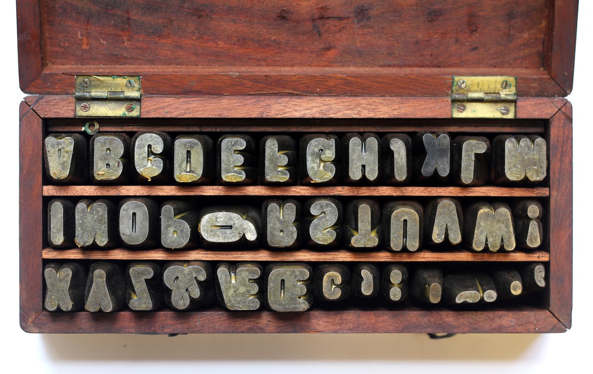
Caslon Four-Line Pica (48 Point) Rounded Punches, cut before September 1836. St Bride Library.
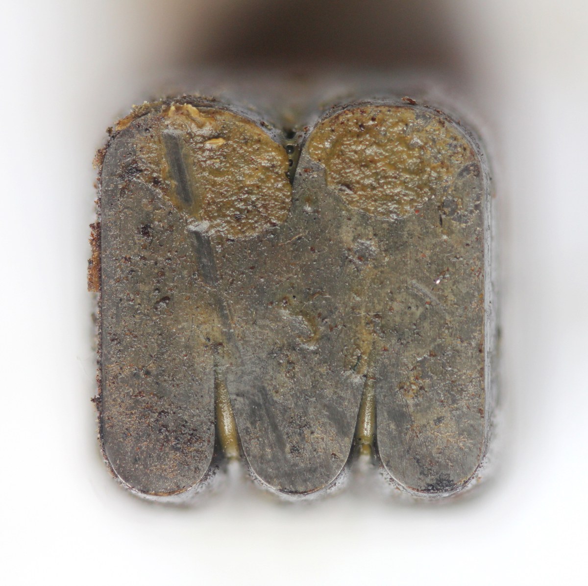
Caslon Four-Line Pica (48 point) Rounded Punch. St Bride Library.
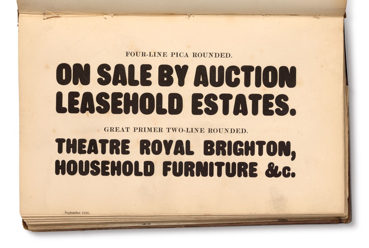
Caslon Rounded in Specimen of Printing Types by Henry Caslon, 1842. The actual page shows a date of September 1836.

Caslon Four-Line Pica (48 Point) Rounded Punches, cut before September 1836. St Bride Library.

Caslon Four-Line Pica (48 point) Rounded Punch. St Bride Library.

Caslon Rounded in Specimen of Printing Types by Henry Caslon, 1842. The actual page shows a date of September 1836.

Caslon Four-Line Pica (48 Point) Rounded Punches, cut before September 1836. St Bride Library.
Although the alteration of existing letterforms is not a trait unique to the nineteenth century, it was one of the defining trends of that period. A common, simple effect was the addition of an inline, laid onto most styles from the moderns and fat faces onwards. Other simple effects were the addition of drop shadows, internal ornaments, outlines, or any combination of these. Caslon Rounded manifests another kind of modification: the rounding of the terminals in the condensed sans form, which appeared at the beginning of the 1830s. Caslon Rounded was the first typeface to have rounded terminals. While it can be dated to September 1836, it seems to be a form we would associate with a later date. Originally produced in a heavy all-capital style, Caslon later modified his rounded type by adding an inline, giving a three-dimensional feel and, later, some ornamented styles.
The style Caslon pioneered is not a slight rounding of the corners, but rather the construction of the entire terminal as a curved form. This rounding seems to be a style suited to the router and wood type manufacture, though the form would not appear in wood until later. (Nesbitt, in the United States, shows an example in his 1838 specimen, though in style they are completely different to the British form.) As Caslon’s style of sans serif at larger sizes was always condensed, it seems that they only imagined a rounded display style could be produced in the condensed width. The style of condensed sans that appeared in the early part of the 1830s would have been an obvious style for Caslon to experiment with and, for the most part, it was a success. By around 1834, Thorowgood introduced a lowercase to his sans, but the Caslon foundry never added them to the rounded sans.1
Rounding the edges of a letterform, usually a sans serif, immediately softens the form, making it less austere and adding warmth. Rounded edges give the impression that these are letters that have been inflated or, conversely, worn away by use. The letters are nearly flat-sided with a slight bulge; the terminals are almost all rounded, apart from a hint of sharpness in the tail of the R. The Q has a descending tail and the G has a crossbar. Certain letterforms such as, the A, N, M, and W are heavier and wider than they should be and the punctuation seems large, but overall the form is pleasing and well-considered.
We can imagine what a suitable lowercase might be by studying other contemporary condensed faces; Caslon’s range of condensed slabs, Antique Compressed, is perhaps the best example, being of a similar weight and condensation. As well as the clues to how a lower case would look, we can see other forms such as numerals and additional characters such as the question can be found. No example of a rounded sans italic has been found, which is no surprise, given the rarity of the regular sans italic.
We can imagine what a suitable lowercase might be by studying other contemporary condensed faces: Caslon’s range of condensed slabs, Antique Compressed, is perhaps the best example, being of a similar weight and width. In addition, we can see other characters, such as numerals, and additional forms, like the question mark. No example of a rounded sans italic has been found, which is no surprise, given the rarity of the regular sans italic.
The first appears in the early 1840s specimens, though it could have appeared at the same time as the filled form, and was called Open. Its design involved the simple addition of a white inline on the lower left, rather like a shaded letter, with the main body of the letter being filled black with a white shadow (a key line behind ensured the shadow didn’t disappear). Rather than creating a shadow behind the heavy rounded form, the shadow or white inline is simply cut into the existing style; a quick and cheap addition. The fact that additional sizes were subsequently cut is an indicator of the style having found some favour.
The basic rounded style disappeared by the 1850s, no longer appearing in the pages of Caslon’s specimens books. Perhaps it did not find great popularity amongst printers? Did they simply prefer the basic sans serif style, and have no need for rounded corners? Did it just seem an unnecessary addition to the typographic repertoire? The style had some success in Germany and the United States, though no other foundries in Britain copied the form. After the initial basic style was released, Caslon later released two variants.
The first appears in the early 1840s specimens (though it could have appeared at the same time as the filled form) and was called Open.2 Its design involved the simple addition of a white inline on the lower left, rather like a shaded letter, with the main body of the letter being filled black with a white shadow (a key line behind ensured the shadow didn’t disappear). Rather than creating a shadow behind the heavy rounded form, the shadow or white inline is simply cut into the existing style—a quick and cheap addition. The fact that additional sizes were subsequently cut is an indicator of the style having found some favour.
This variant was then further modified, with an ornamented version following almost immediately after the Open.3 This manages to combine the simplicity of the sans form with the warmth of the rounded shapes and the exuberance of the ornament. Above the white shadow, a thick black line envelopes a white letter, on which a series of simple motifs have been added and repeated, each size of type managing differing levels of complexity, with the largest sizes being the most visually complicated.
This style appears to have been the most successful of all, as they can be found in many examples of jobbing printing and quickly crossed the Atlantic.4 The kind of ornaments—flowers, foliage, scrolls and lozenges—are typical of the printers’ ornaments all founders were then producing, though few British founders produced ornamented sans typefaces (Wood & Sharwoods being the main one, showing two sizes of large all-capital shaded ornamented forms). As letterforms, they encapsulate the early, if not yet excessive, exuberance of the Victorian era.
In the 1850s, Caslon produced a variant of the shaded style in wood type, but by the late 1880s, Caslon’s Rounded had disappeared from foundry specimens. Four sizes of punches remain at St Bride Library: one for the original style, and three for the ornamented styles. Caslon Rounded has a simple and effective idea that outlived its nineteenth century origins and reappear throughout the next century and into our own era in many different forms and styles. Although now over 180 years old, it still has a contemporary charm and quality.
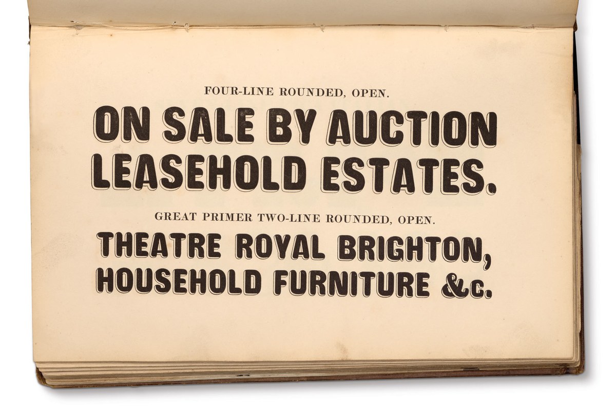
The open variant of Caslon Rounded as shown in Specimen of Printing Types by Henry Caslon, 1842.
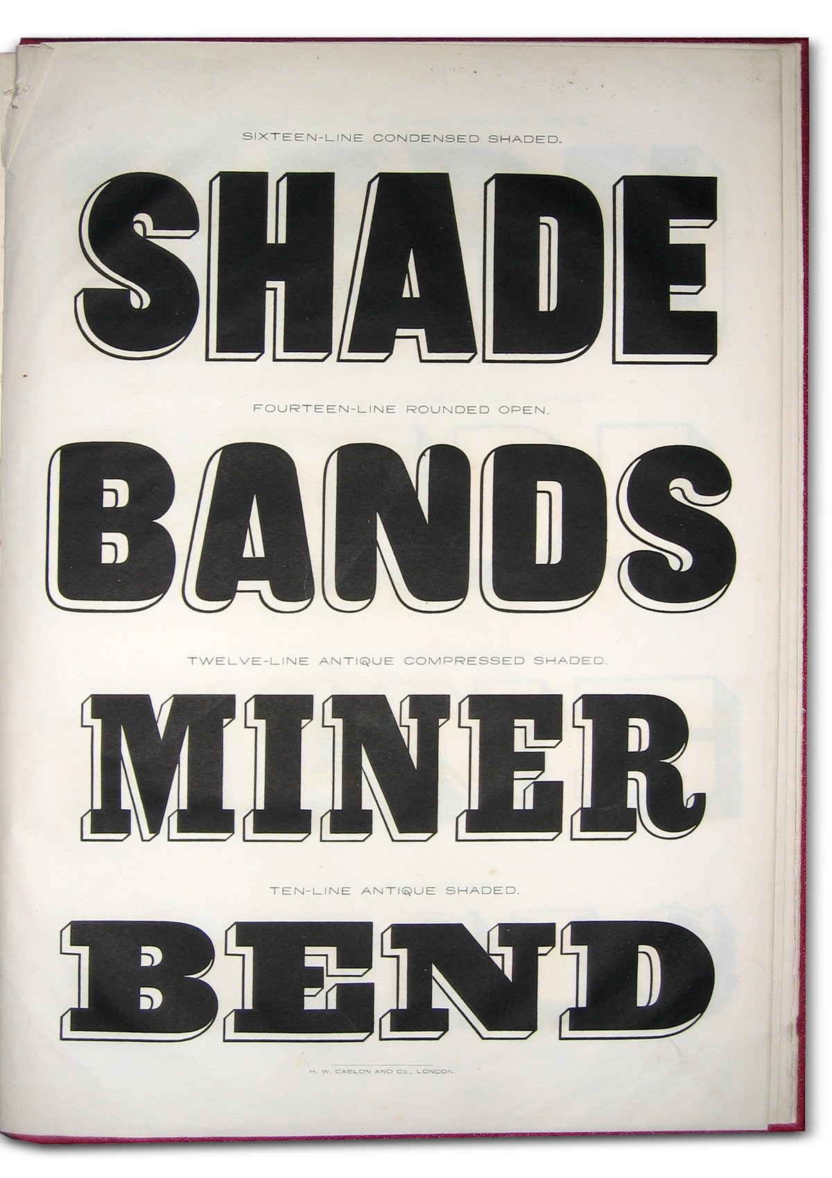
Caslon made a wood type variant of the Rounded Open style. As shown in Specimen of Wood Letter Founts, supplied by H. W. Caslon & Co., 1857. St Bride Library.
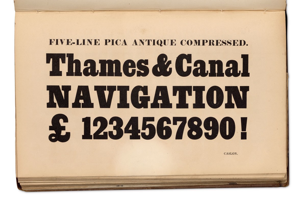
The matching lowercase is derived in part from the lowercase forms found in Caslon’s condensed slabs that first appeared in the late 1830s. Five-Line Pica (60 point) Antique Compressed, as shown in Specimen of Printing Types by Henry Caslon, 1842.
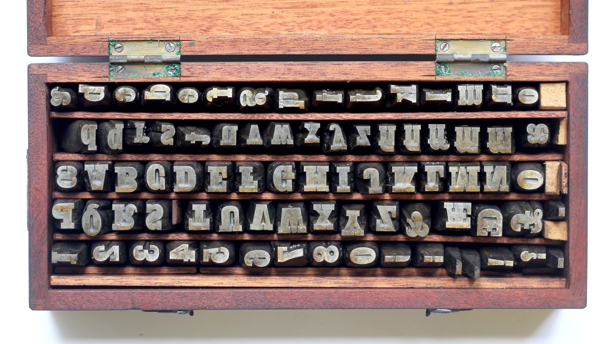
The punches of Caslon’s Two Line Double Pica (48 point), cut between the late 1830s and the early 1840s. St Bride Library.
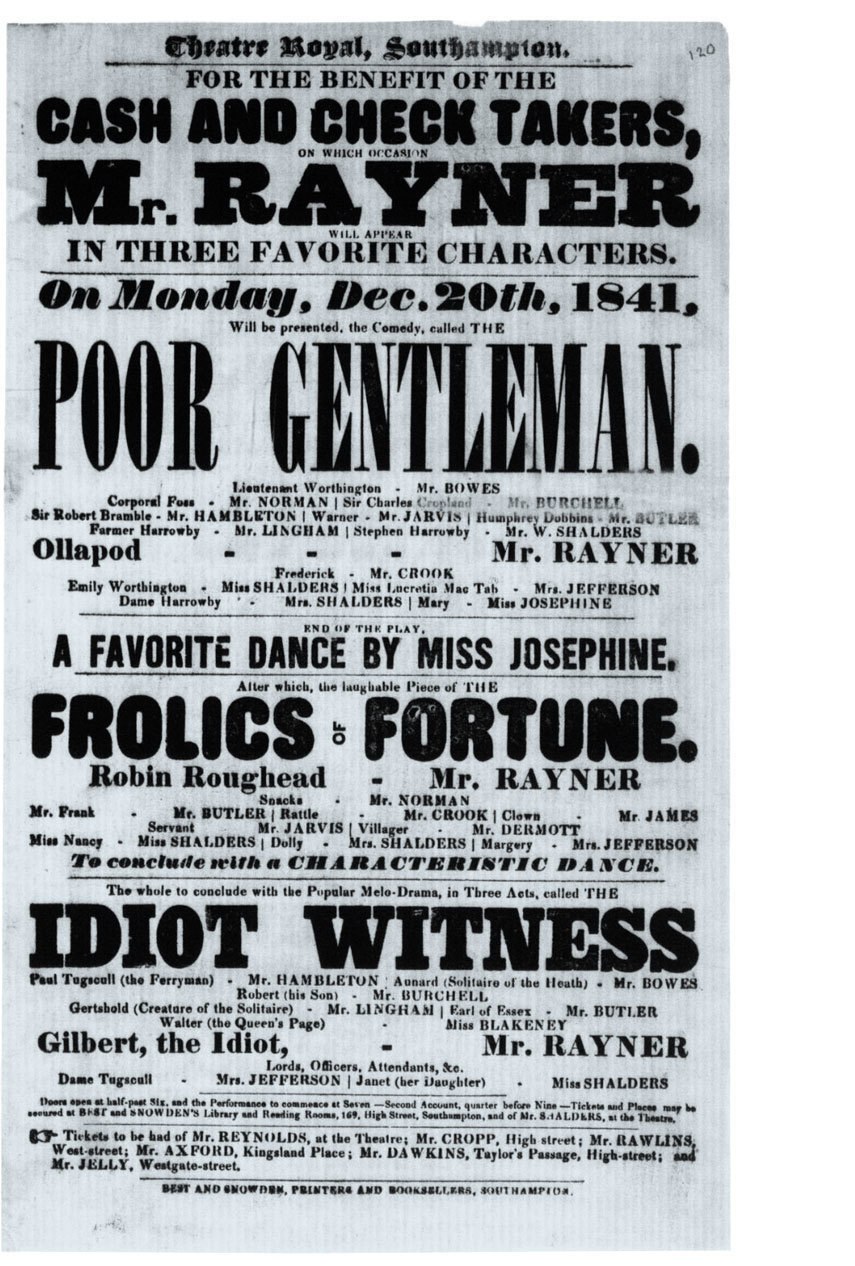
The Rounded enjoyed a certain amount of success in playbills in the 1840s. Here is an example from a playbill for Theatre Royal, Southampton, 1841. The faces are Four-Line Pica (48 point) and Great Primer Two-Line (36 point). British Library. Creative Commons.
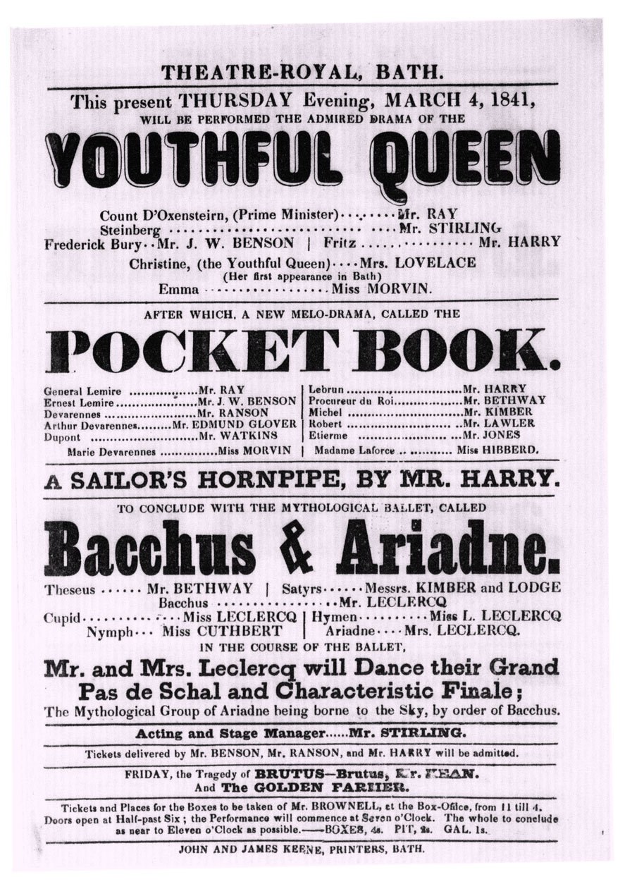
Caslon Rounded Open, as used in Bath, 1841. British Library. Creative Commons.
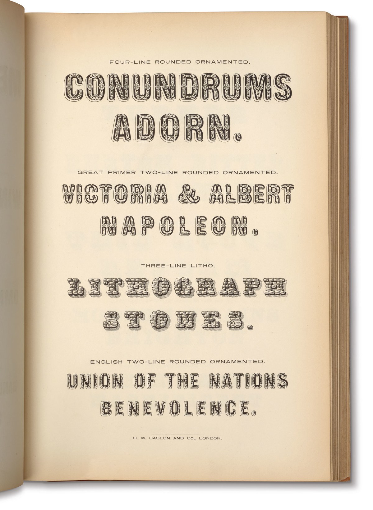
Rounded Ornamented faces as shown in Specimen of Printing Types of the Caslon and Glasgow Letter Foundry, 1854. St Bride Library.
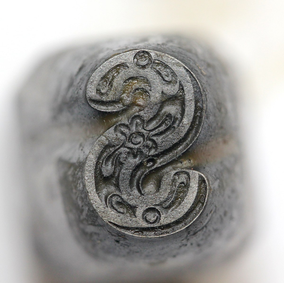
Great Primer Two-Line (36 point) Rounded Ornamented capitals. Cut by F. Boileau, c. 1846. St Bride Library