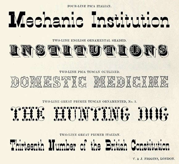
Caslon Italian
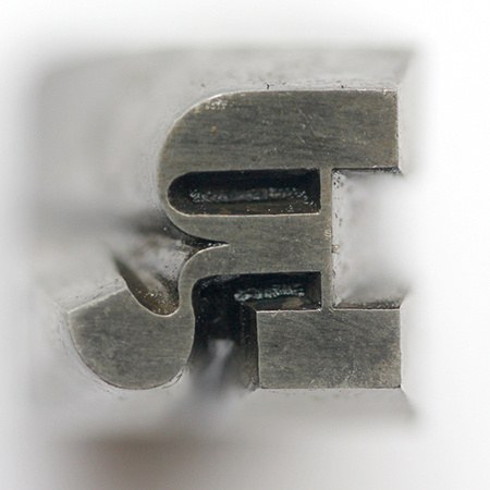
A punch from Caslon’s Two-Line Great Primer, cut by Selkirk before 1837. St Bride Library.
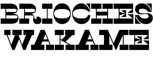
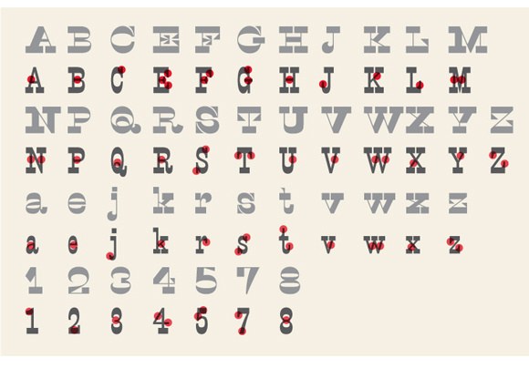
The Italian, a reverse contrast form, turns typographic norms on its head by transforming thin strokes into thicks, and thick strokes into thins. Two centuries after their first appearance, the Italian form still confuses and offends. Its inherent strangeness will always attract attention: it is a style that, in following the logic of reversing stress, can create both harmony and discord. When weight appears only on the top and bottom or on the horizontal plane (B, C, D, E, F, G, H, I, J, L, O, R, S, T, Z) it is less disturbing than when weight is on the vertical or diagonal in unexpected places (A, K, M, N, U, V, W, X, Y), which disturbs the flow of reading.
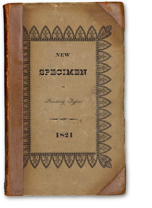
While the fat face, the fat black letter, the sans, and the Egyptian represent the breakthroughs of the first two decades of the 1800s, the Italian was the opening innovation of the third. The first typographical examples were introduced by Caslon and Catherwood in 1821. It has been speculated that the style originated in Italy (perhaps explaining the name) or France, but no evidence has been found to support this.
The redistribution of weight on horizontal and vertical strokes makes less disturbance than those on a diagonal, which seem to defy conventions too much and disturb the reader.
The first appearance of Caslon’s Italian in 1821, as shown on the cover of Printing Types by Caslon & Catherwood, 1821. (St Bride Library)
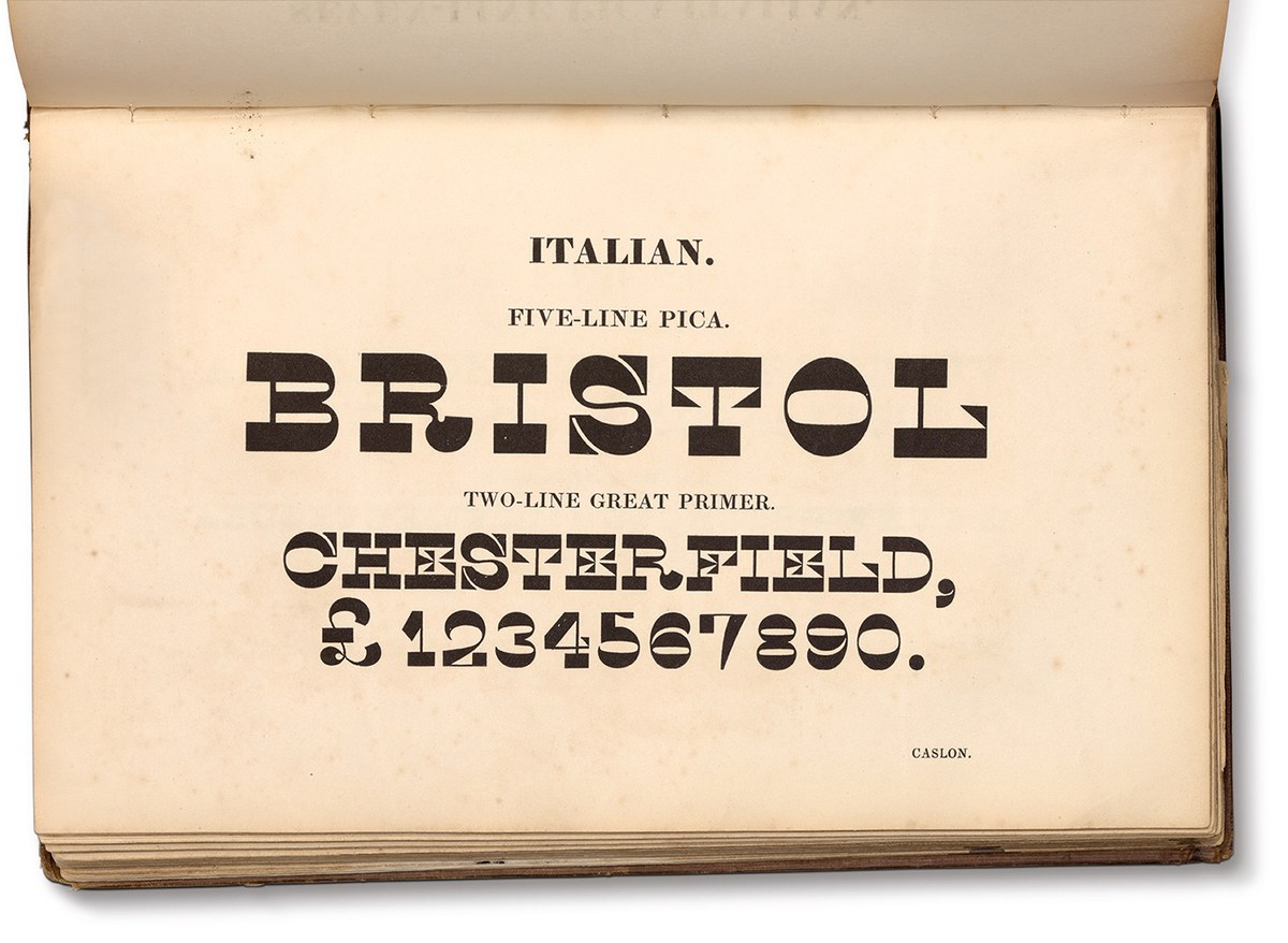
Five-Line Pica and Two-Line Great Primer Italian. Specimen of Printing Types by Henry Caslon, 1842.
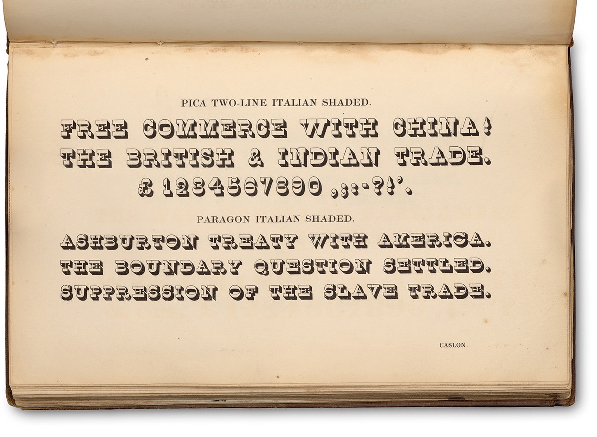
Caslon later added shaded versions. Specimen of Printing Types by Henry Caslon, 1842.
In style, it is the reverse of a flat-seriffed modern or fat face, so weight is distributed at the top and bottom of the O with the thick horizontal parts connected by thin verticals. The I is similarly weighted at the top and bottom with the stem transformed into a thin vertical stroke connecting the much heavier serifs. The E and F generate more complicated shapes: the end serifs go from thin to a flat-ended thickness; the S has a light spine with weight moved to the top and bottom, and at the end of the curves reverse triangular serifs extend outwards. In its basic skeleton, it follows the British style, as suggested by the tail of the R and the shapes of the figures.
Despite the strangeness of the form, it can be found in lettering, particularly on gravestones in the nineteenth century. But which came first, lettering or type, is not clear. In type, Caslon cut the style in many sizes from approximately 96 down to 10 point. In Nineteenth century ornamented typefaces, Nicolete Gray pulls no punches calling the Italian, ‘a crude expression of the idea of perversity’. While we could agree that the idea is perverse in the sense of a clear intent to deviate from typographic norms, most of Caslon’s Italians are considered and well-cut (seven sizes of punches remain at St Bride) and not at all crude in their expression.
Smokeproof of Two-Line Great Primer Italian; the C is in the position of the Q, on its side, as is the proper Q. St Bride Library.
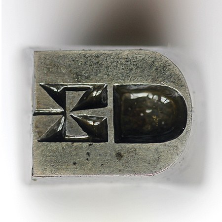
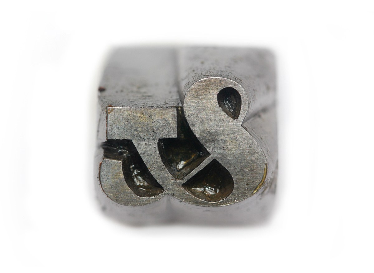
Punch from Two-Line Great Primer Italian. St Bride Library.
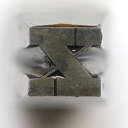
Punch from Two-Line Great Primer Italian. St Bride Library.
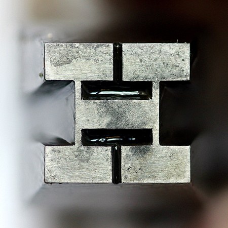
Punch from Two-Line Great Primer Italian. St Bride Library.
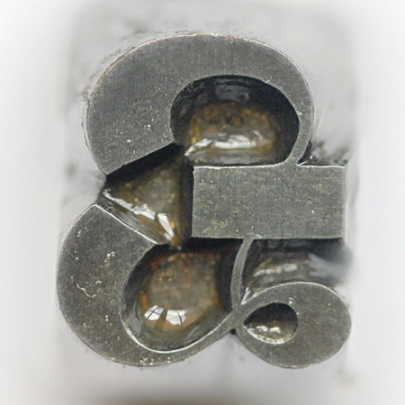
Punch from Two-Line Great Primer Italian. St Bride Library.
Punch from Two-Line Great Primer Italian. St Bride Library.
Figgins first introduced a lowercase to the Italian in the 1840s. Specimen of Plain & Ornamental Types from the foundry of V. & J. Figgins, London. c. 1850. St Bride Library.
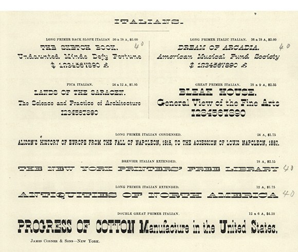
All forms of Italian; lower case, extended, condensed, italic, and contra italic as shown in Specimens of printing types by James Conner & Sons, New York, 1859. St Bride Library.
The other foundry in Britain that produced Italians in any quantity was Bower & Bacon, from Sheffield. Bower & Bacon’s Improved Specimen of Printing Types, 1830. St Bride Library.
Figgins first introduced a lowercase to the Italian in the 1840s. Specimen of Plain & Ornamental Types from the foundry of V. & J. Figgins, London. c. 1850. St Bride Library.
Caslon and Bower & Bacon, who also produced several sizes of Italian, restricted the form to capitals. In 1845, Figgins cut two sizes of a more condensed style, which have a matching lowercase. It seems strange that Figgins would go to the trouble of creating new designs when it seems that the Italian was going out of fashion. By the 1850s it was disappearing from the specimen books, and by the 1860s appears to have gone completely.
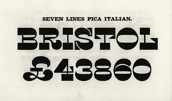
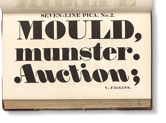
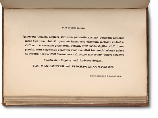
Though the form appears to fall out of favour in the British Isles, further variants of the style appear in the United States, namely an extended, italic, and contra, all shown in the specimens of James Conner & Sons of New York in 1855. On closer inspection, Conner makes a subtle but decisive change to Caslon’s model. Emphasis is completely shifted to the top and bottom of letters, so A, K, M, N, U, V, W, and Y no longer have the weight in what would originally have been the thin strokes in a fat face. In the apex of the A, M, N, V, and W, weight has been added to balance the design, which creates an even horizontal emphasis in words. In the italic and contra, the base of the strokes tapers to balance the design out. The contra form (a reverse angled italic) was pioneered by Figgins in 1817 in one large size (Seven-line Pica No. 2). Only one other British foundry followed the lead with Thorowgood producing a text variant in the 1830s. It is such a rarity, and it makes the existence of the Conner Italian Contra all the more surprising.
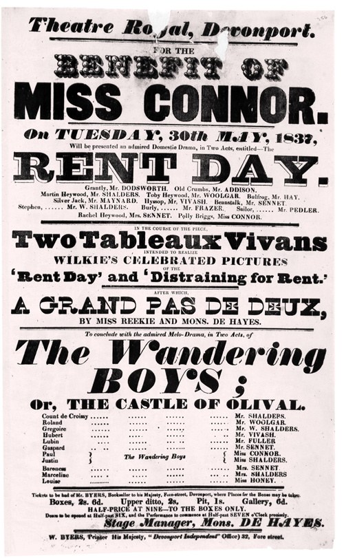
Caslon’s Two-Line Great Primer Italian in use. BENEFIT OF is Thorowgood Two Lines Great Primer Ornamented, MISS CONNOR is Caslon Eight Line Pica Condensed No. 1, RENT DAY is Caslon Five Line Pica Antique Open, Two Tableaux Vivians Caslon Two-Line Great Primer, The Wandering Boys Caslon Four Line Pica No. 1. Devonport, 1837. Creative Commons. British Library.
The reverse or contra italic rarely appeared; shown here in a fat face form in Specimen of Printing Types by Vincent Figgins, 1833, was first shown in 1817. St Bride Library.
Thorowgood’s single text size contra appears at the end of the 1830s. Thorowgood & Co. Specimen of Printing Types, 1840.
French Antique
Text sizes of Caslon French Antique cut in the 1880s. Specimens of Printing Types, H. W. Caslon, 1895.
The cousin to the Italian is the so-called French or French Antique style (the Antique one can presume refers to the alternative name of the Egyptian style). This is a condensed style Egyptian where the normally heavy vertical strokes, are light, or the horizontal strokes are unusually heavy. It has some of the strangeness of the Italian without ever being quite as perverse. So while the older Italian follows its own logic to the extent that the heavy vertical strokes in the A, K, M, N, U, V, W, X, and Y (and in the lower case k, v, w, x, and y) disturb the eye, and while an Italian A would have weight on the left diagonal as opposed to the right diagonal, the French Antique has even weight on both, creating a more even overall tone.
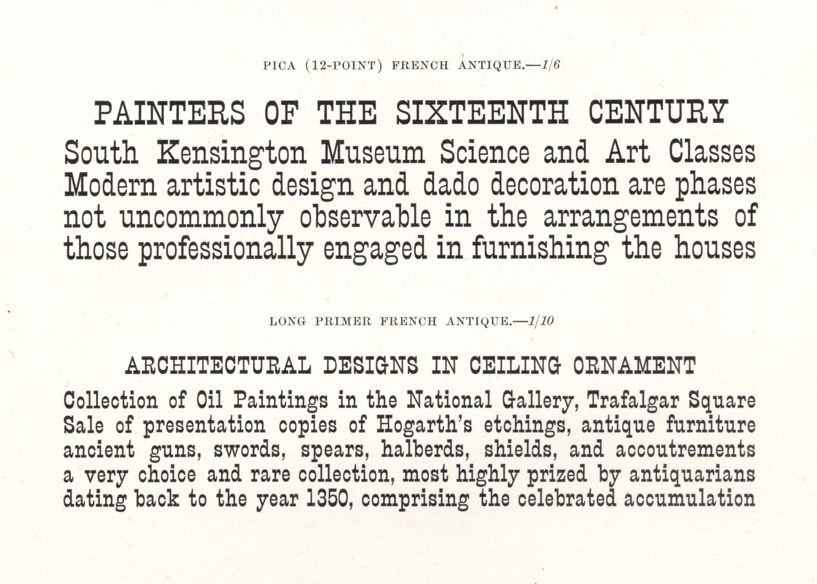
Its name would suggest that the style originated in France before it appeared amongst the British foundries in the 1850s. Besley shows it in his 1854 specimen for the Fann Street Foundry, and would eventually produce a wide range of sizes. In the 1880s Caslon would introduce a version for text sizes, from Great Primer (just under 18 point) to Nonpareil (around 6 point). Caslon would use the typeface for internal communications and it would remain in specimens until after 1919. This is the model for Caslon French Antique. The style seems to have been more successful than the Italian, and it appears with regularity both as metal and wood type. Its more conservative design saw it outlast the nineteenth century, often gaining an association with the theatrical and circus performances. Having disappeared from typefounders’ specimens it was revived in 1938 as Playbill, a design by Robert Harling for Stephenson Blake, the same year that Nicolete Gray’s Nineteenth century ornamented types and title pages was first published. Adrian Frutiger designed his own version Westside in 1989. The form has continued to fascinate designers, and both the Italian and French Antique have enjoyed a renaissance,1 but often as a display face. Caslon French Antique on the other hand is a text face; the matching italic2 a rarity then and now.
The differences in weight distribution between Caslon Italian and Caslon French Antique.
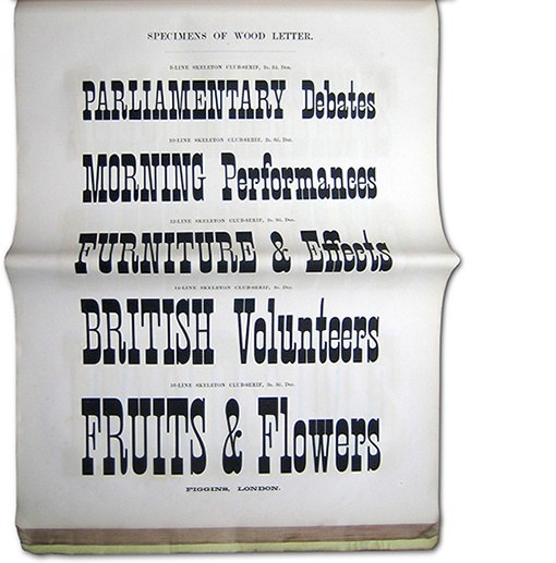
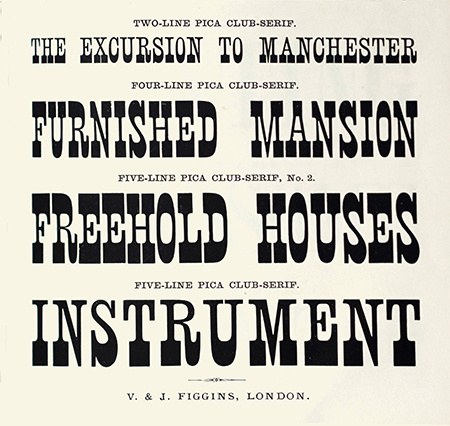
Figgins form of the French Antique was called Club-Serif; more elongated and greater in contrast, and here as often expected as large wood type for posters. Specimens of Wood Letter by V. & J. Figgins, c. 1860 St Bride Library.
Figgins produced a variant where the upper slab serif is much lighter. Specimen of Printing Types by V. & J. Figgins, 1872. St Bride Library.
In recent years several new designs, such as Peter Biľak, Pieter van Rosmalen, and Nikola Djurek’s Karloff Negative, have appeared across the globe and several essays both tracing the history of the form and modern designs.
Besley shows one in all-capital form in the 1870s