Caslon Ionic
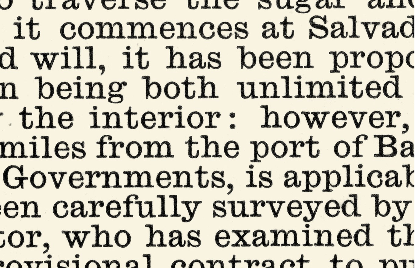
A detail of Caslon Nonpareil Ionic, No. 2, cut by Pernie, 1860. As shown in Specimen of Printing Types, H. W. Caslon, c. 1861.
The modern style, as exemplified in Brunel, dominated text typography for the first half of the nineteenth century. Gradually, it took on a more emaciated and spindly form which, printed under the typical conditions of the time, show how ill-suited it was to its circumstances. With poor presswork and longer print runs on declining quality paper, the letters quite literally began to fall apart. Hairlines and serifs would disappear and the lifespan of type diminished.
These conditions were ideal, however, for a style that would follow, the workhorse Ionic—also known as Clarendon—style. The Clarendon/Ionic is related to both the slab and the modern styles. It is an Egyptian with bracketed serifs and greater contrast or, on the other hand, a modern with reduced contrast adding strength to the serifs and thin strokes. In this way, the style offers an anonymity that is easy and pleasant to read, with a simple, timeless quality. This essential sturdiness still makes Ionics a popular choice for difficult print and screen conditions. In the nineteenth and twentieth centuries, they became the model for newspaper typefaces: economical, yet resistant to the deteriorations of rapid printing on poor quality paper. Their sturdiness of form, for example, ensured that kerns on characters (such as the f) were less likely to break. Caslon’s Ionic No. 2, which first appeared in the 1850s, is one of the finest examples of the form.
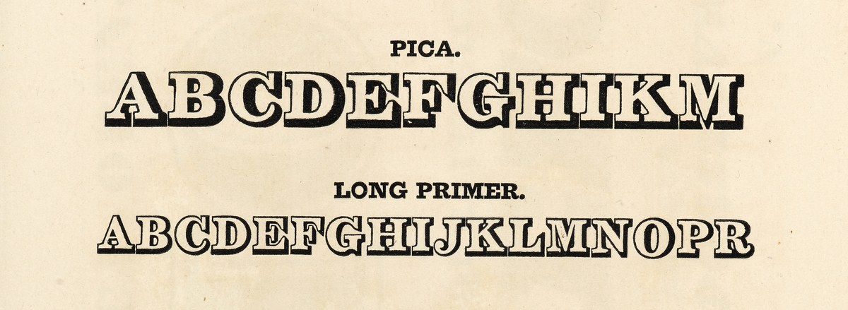
The first typeface that have the Clarendon form: shaded letters from the Figgins foundry, as shown in Specimen of Printing Types by Vincent Figgins, 1828. Tetterode Collection, University of Amsterdam.
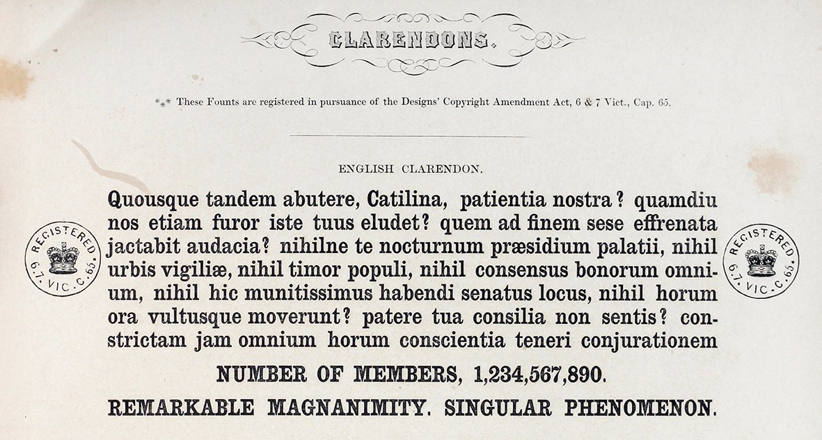
The first named Clarendon, as shown in A General Specimen of Printing Types. W. Thorowgood and Co. 1848. St Bride Library.

Caslon’s Ionic predates the Fann Street Clarendon. As shown in Specimen of Printing Types by Henry Caslon, 1842.
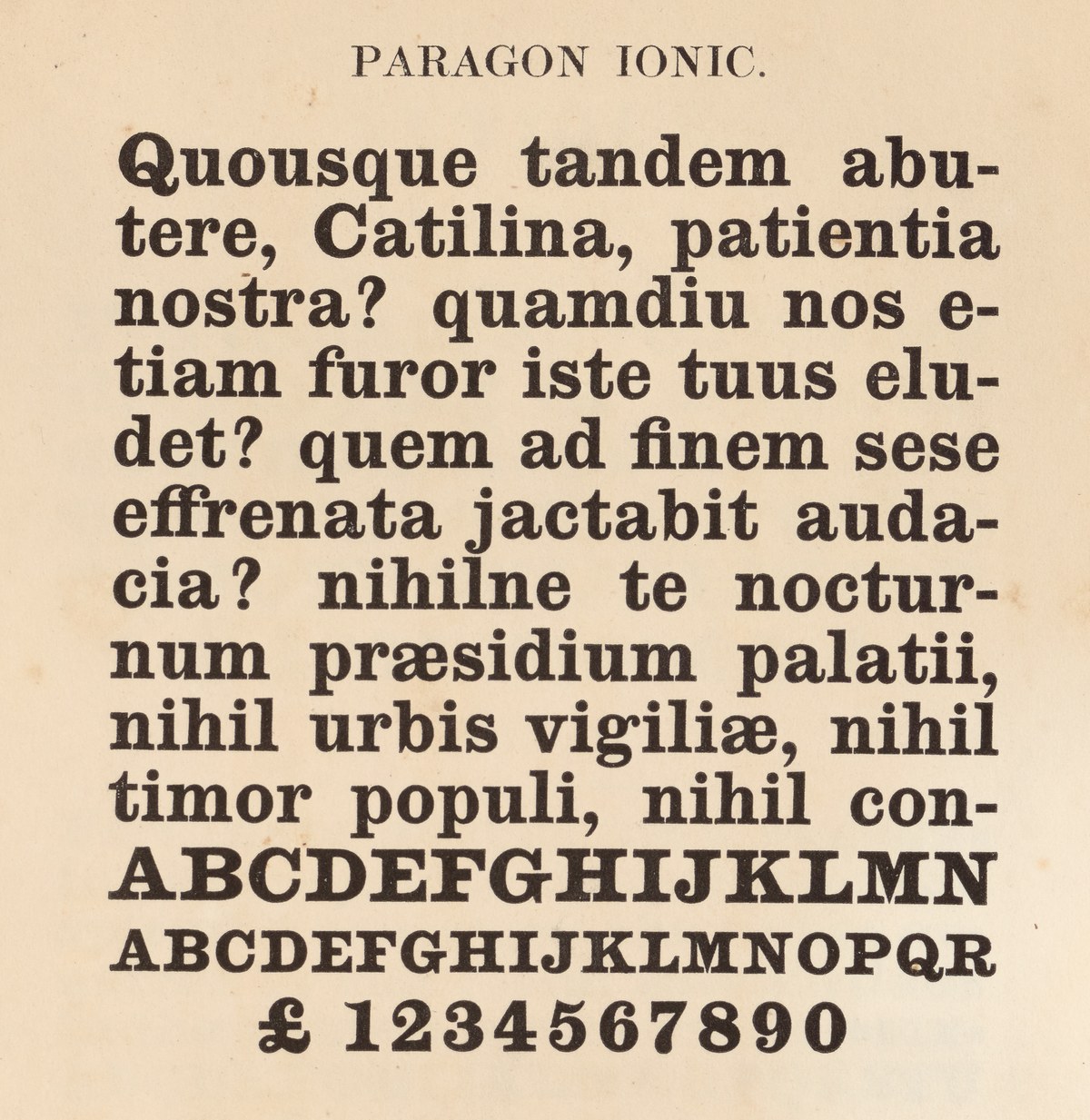
A variant with a lower case appears in the same specimen, and in form is what we would associate today as a Clarendon form. As shown in Specimen of Printing Types by Henry Caslon, 1842.
The form appeared almost simultaneously with the Egyptian; Figgins showed a shaded variant in 1817, just two years after his first Egyptian. The bracketing and contrast make it more refined than the slab, but more robust than the modern, and far more straightforward to cast in metal or to use as an alternative to a seriffed roman on shopfronts or street signs. But it was only in the 1845 that they appeared as filled-in forms and under the name Clarendon. These were the condensed typefaces of the Fann Street Foundry, which were also the first ever registered typefaces,1 though this did little to deter piracy. Predating this by at least three years was Caslon’s variant, the Ionic, named after one of the classical orders of architecture, which first appeared in the 1842 specimen of Henry Caslon.
Caslon’s Ionic was first shown as a bold in a limited number of sizes. While bold, it is not emphatically so, and has a low contrast between the heaviest and lightest strokes so that it maintains a certain softness in print. The serifs appear to have a little roundness at their ends and the ball terminals are rounded where they join strokes, giving the letters a gentler overall form than a slab. It was last shown in 1854, the same year as the first appearance of a new, lighter style listed as Ionic No. 2 (a compressed and extended form are also shown). First cut in display sizes, text versions from Pica (around 12 point) down to Pearl (around five point) appears in the 1860s.
It is these text variants that are the most refined of the sizes. As is characteristic of typeface design for reading, the text sizes work with different proportions to the display sizes: larger x-heights, shortened ascenders and descenders, wide yet less obtrusive capitals, and a narrow lowercase with robust serifs. It is the consistency and quality of the cutting that make the design work so well. The lower contrast gives it a robustness, but is not so low as to make the letters clunky. The proportions are what we would expect for a newspaper typeface, where economy and clarity is at a premium. Yet, despite the economy in execution, the design decisions informing Ionic No. 2 are balanced and considered, so the result is not miserly.

Caslon Ionic No. 2, first appears in 1854. As shown in Specimen of Printing Types, H. W. Caslon, c. 1861. St Bride Library.
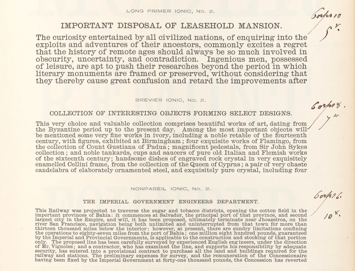
The text variants of Caslon Ionic No. 2 appeared in the early 1860s. As shown in Specimen of Printing Types, H. W. Caslon, c. 1863. The annotations show it was issued by the Paris branch of the foundry. St Bride Library.
While never marketed explicitly as a newspaper face, the influence of Ionic No. 2 can be seen in the Linotype legibility series of the 1920s, not least in Chauncey H Griffith’s decision to initiate the series with Ionic No. 5. Caslon’s Ionic No. 2 remained a part of their range until the close of the foundry in the 1930s. Of the sixteen sizes made, ten survive at St Bride Library, with one adopted as the model for Monotype’s New Clarendon, released in the 1960s.
No italic Clarendon or Ionic seems to have been cut in nineteenth century Britain, though it is easy enough to imagine one at a point somewhere along the spectrum of possibilities between a modern and an Egyptian italic: more contrasted than the Egyptian and with bracketing, heavier in the hairline than the modern, and wider to match the proportion of the Ionic. A skilled punchcutter would have quickly mastered the form, finding no issue in simplifying the g to a more open, single-storey form. A bold has more sources to draw upon, not only the original Ionic but also the fat faces and Egyptians intended for text usage.

At little more than 2mm in height, the quality of punches is a testimony to the skill of the punchcutter. All of the Caslon’s Ionics were cut by hand a skill that would all but disappear in the next century. Nonpareil (6 pt) Caslon Ionic, No. 2 punch as cut by Pernie, 1860. St Bride Library.
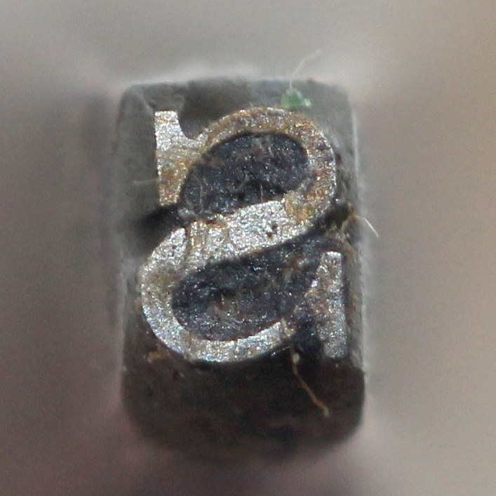
Nonpareil (6 pt) Caslon Ionic, No. 2 punch as cut by Pernie, 1860. St Bride Library.
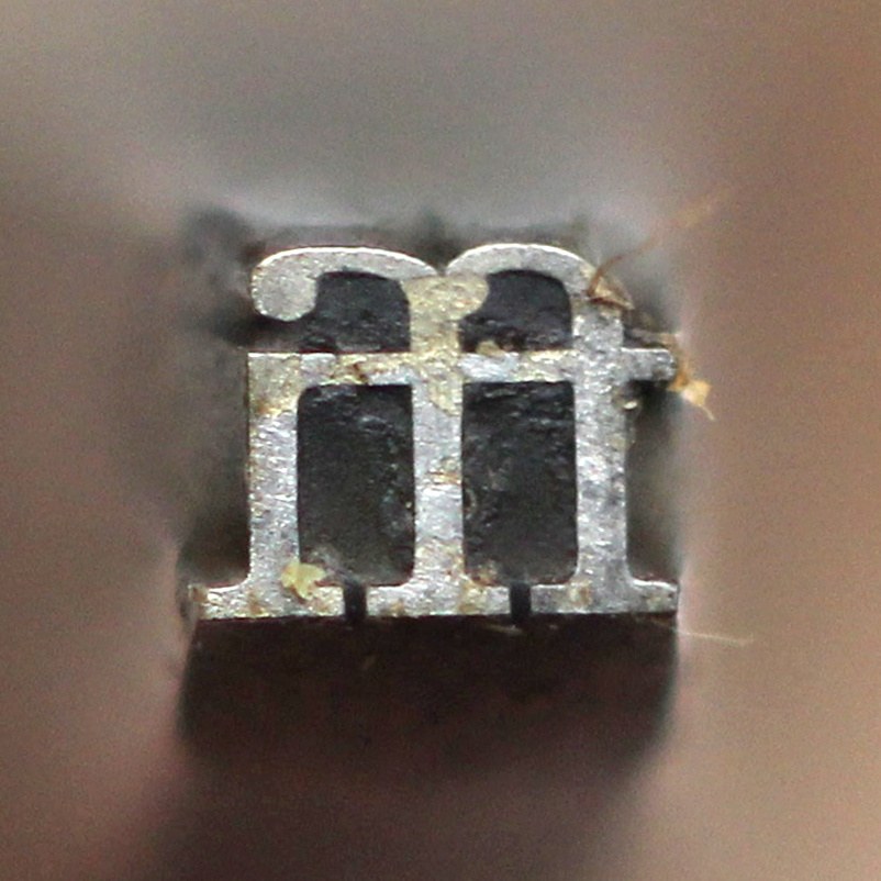
Nonpareil (6 pt) Caslon Ionic, No. 2 punch as cut by Pernie, 1860. St Bride Library.
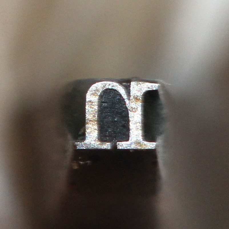
Nonpareil (6 pt) Caslon Ionic, No. 2 punch as cut by Pernie, 1860. St Bride Library.
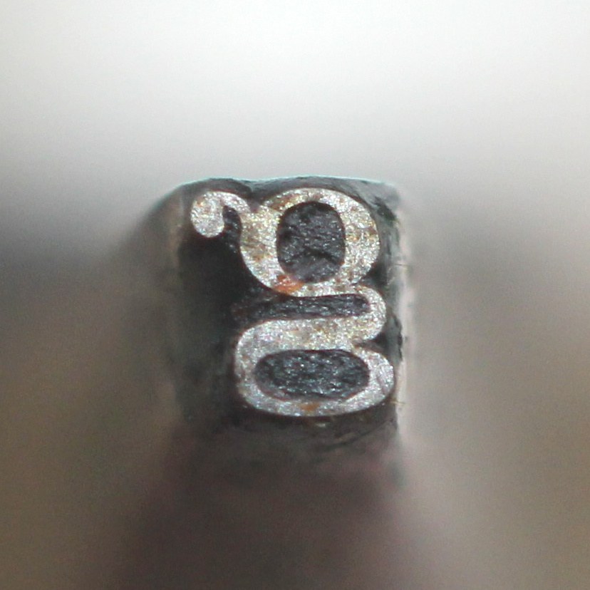
Nonpareil (6 pt) Caslon Ionic, No. 2 punch as cut by Pernie, 1860. St Bride Library.

Nonpareil No. 2 punch as cut by Pernie, 1860. St Bride Library.
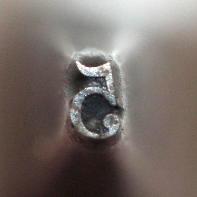
Nonpareil (6 pt) Caslon Ionic, No. 2 punch as cut by Pernie, 1860. St Bride Library.
An alternative bold
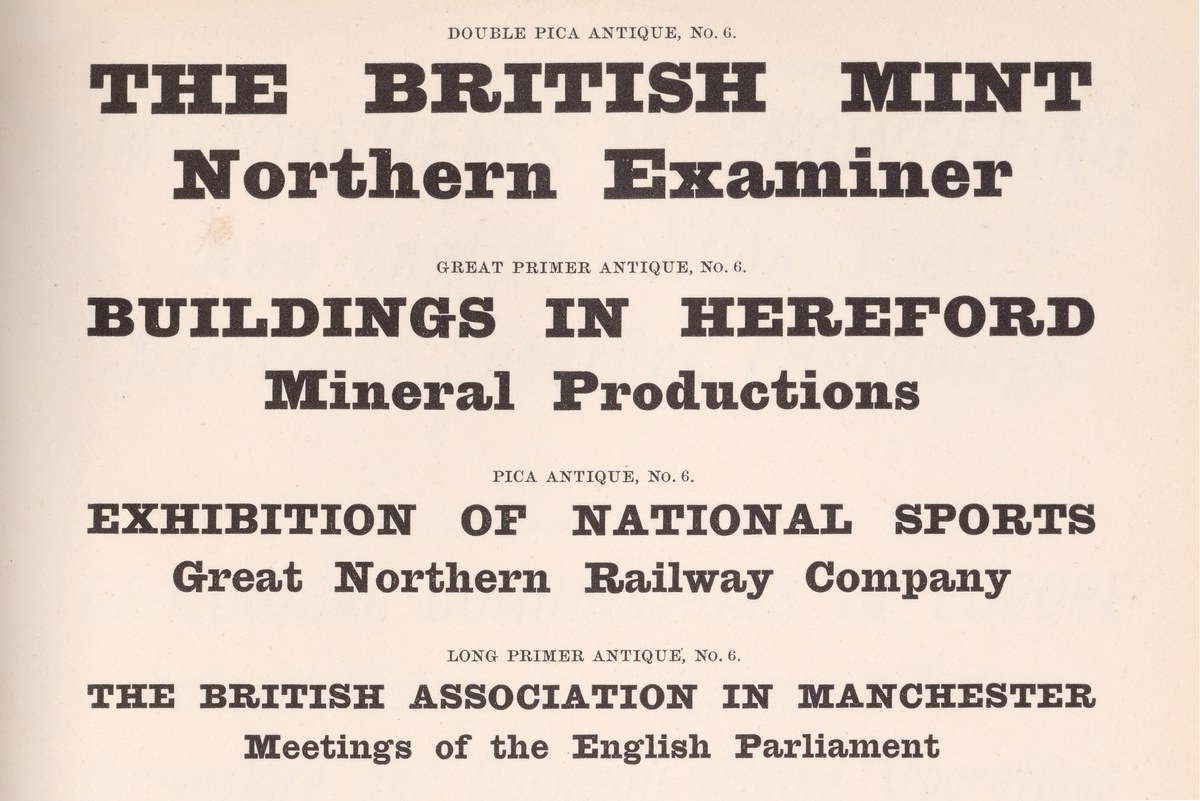
Antique No. 6 first appeared in the UK in the 1870s; it can be found later in specimens in Italy and Germany. As shown in Specimens of Type, V. & J. Figgins, 1870. St Bride Library.
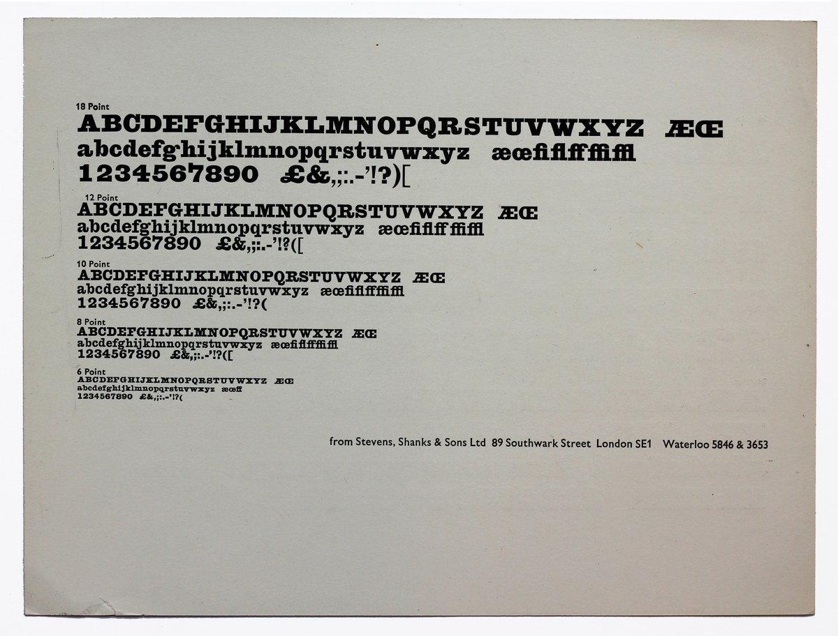
Antique No. 6 was one of the great survivors: Into the latter part of the twentieth century, it was still being cast by Figgins’s successors Stevens, Shanks & Sons, London. Circa 1960.
The issue of emphasis and articulating hierarchies within text has existed as long as text itself, with methods including the colouring of letters, increasing size, capitalization, and the use of italics. In the nineteenth century typefounders and printers identified the new bolder styles of typefaces as a solution to the problem. It was an era of particular need as the need for more public forms of information grew. Looking at a railway timetable or a dictionary from the time we can see what printers did before they had the option of using a multiple-weight typeface family. Instead, they used a range of typefaces of differing boldness, with typefounders offering different styles on the same body size. An Ionic or Clarendon offered an ideal bold accompaniment to a modern style serif typeface.
Today we have grown accustomed to having access to a single typeface design in multiple weights, rather than having to achieve different textual weightings by using completely different styles. While the use of multiple weights of a given typeface is a more obvious typographic arrangement, it is not necessarily a richer one. For this reason, we drew an accompanying secondary bold for Caslon Ionic, which follows a design from a rival foundry, Figgins’ Antique No. 6. First introduced in the 1870s, it is one of the great survivors of the Victorian era. It was still being cast by Figgins’ successor, Steven Shanks, well into the twentieth century through the end of the metal type era. More characterful in appearance than Ionic No. 2, the proportions were gently altered so they share a cap- and x-height. Antique No. 6, like Ionic No. 2, was never conceived with a matching italic. Despite the popularity of the slab form, italic variants were not common, appearing from time to time at display sizes but never enough to suggest they were seen as essential additions. Those cut by Caslon, Figgins, Thorowgood, and Stephenson Blake all show a sureness of form and a clear understanding of how to handle the variations in weight necessary to make a successful face. In text sizes, italics are even rarer; the text Egyptian had become an established form by the 1820s, but italics with a lowercase seem to only appear twice in Britain. One is from Thorowgood in the 1820s, and the other appears in the specimens of Hugh Hughes from around 1825.2
The Ionic was a stylistic development of the modern and Egyptian forms, but also a typeface that dealt with the technical problems of the time. At text sizes, poor printing exposed the weakness of the thinned modern, and the clumsiness of the slab. The Ionic was a response to this, a perfect blend of the two, creating a timeless economical text face, perfect for both print and now, screen.
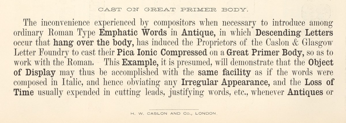
Mixing different styles of faces, with heavier Egyptians and Clarendons used as bold for emphasis, was one of the typographic innovations of the second half of the nineteenth century. Pica Ionic Compressed with matching Modern shown in Specimen of Printing Types, H. W. Caslon, c. 1861. St Bride Library.
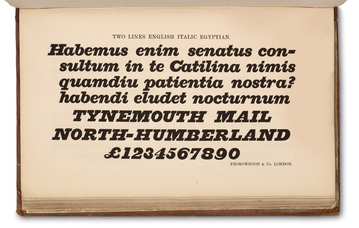
Of the major foundries, Caslon, Blake & Stephenson, Figgins, and Thorowgood all produced a small number of italic Egyptians. Two Lines English Italic Egyptian as shown in Thorowgood & Co. Specimen of Printing Types, 1840.

Text Egyptian italics were a rarity in Britain in the nineteenth century, which is a pity, as this well-cut example shows. Thorowgood’s Brevier Italic Egyptian as shown in Thorowgood & Co. Specimen of Printing Types. 1840.
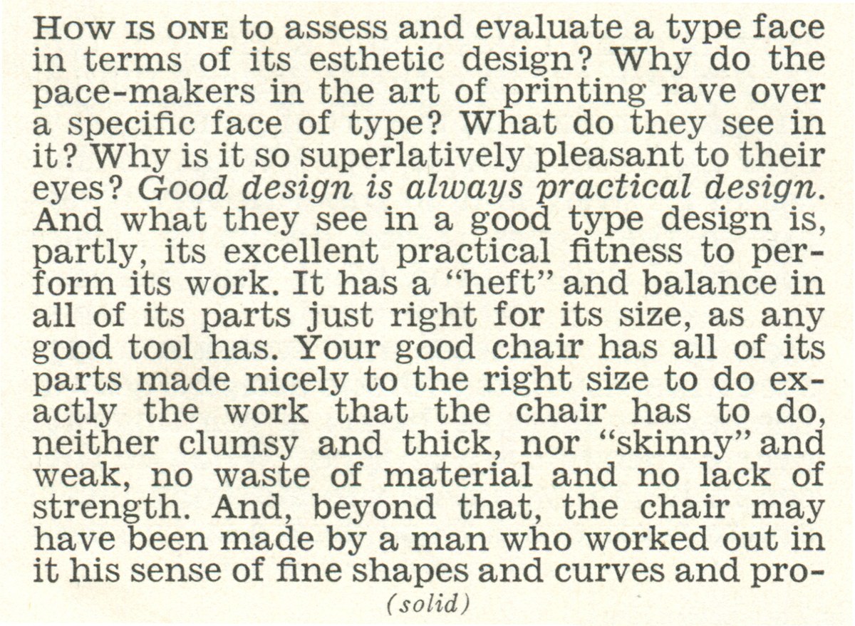
American-based Linotype’s response to the issues of text type for newspapers in the twentieth century was the so-called legibility group. It started in 1926 with C.H. Griffith’s Ionic No. 5, a descendant of Caslon’s Ionic No.2. As shown in Specimen of Linotype faces, 1938. St Bride Library.