Caslon French Antique

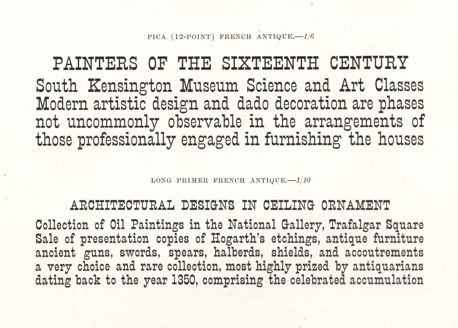
Text sizes of Caslon French Antique cut in the 1880s. Specimens of Printing Types, H. W. Caslon, 1895.
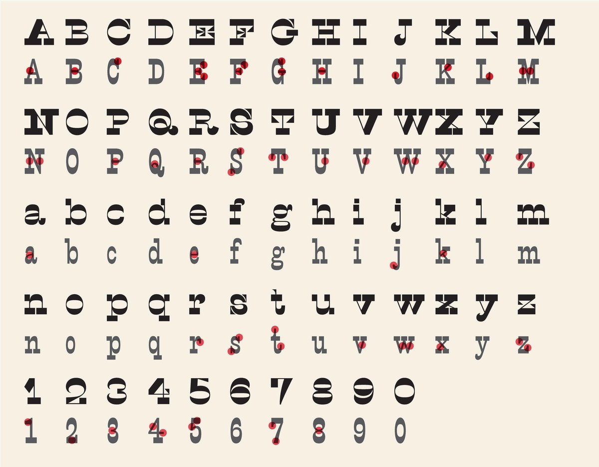
The cousin to the Italian is the so-called French or French Antique style (the Antique one can presume refers to the alternative name of the Egyptian style). This is a condensed style Egyptian where the normally heavy vertical strokes, are light, or the horizontal strokes are unusually heavy. It has some of the strangeness of the Italian without ever being quite as perverse. So while the older Italian follows its own logic to the extent that the heavy vertical strokes in the A K M N U V W X Y (and in the lower case k v w x y) disturb the eye, and while an Italian A would have weight on the left diagonal as opposed to the right diagonal, the French Antique has even weight on both creating a more even overall tone.
Its name would suggest that the style originated in France before it appeared amongst the British foundries in the 1850s; Besley shows it in his 1854 specimen for the Fann Street Foundry, and would eventually produce a wide range of sizes. In the 1880s Caslon would introduce a version for text sizes; from Great Primer (just under 18 point) to Nonpareil (around 6 point). Caslon would use the typeface for internal communications and it would remain in specimens until after 1919. While the Italian was rare, the French Antique style enjoyed greater success; it appeared with real regularity in wood type, where it was sometimes called Club Serif. And its more durable design saw it outlast the nineteenth century. Having disappeared from typefounders specimens it was revived in 1938 as Playbill, a design by Robert Harling for Stephenson Blake; the same year that Nicolet(t)e Gray’s Nineteenth century ornamented types and title pages was first published (the later edition from 1976 is retitled Nineteenth century ornamented typefaces and the author also adjusts the spelling of her own name). The form has continued to fascinate designers; Adrian Frutiger designed his own version Westside in 1989.

The differences in weight distribution between Caslon Italian and Caslon French Antique.