Caslon Doric
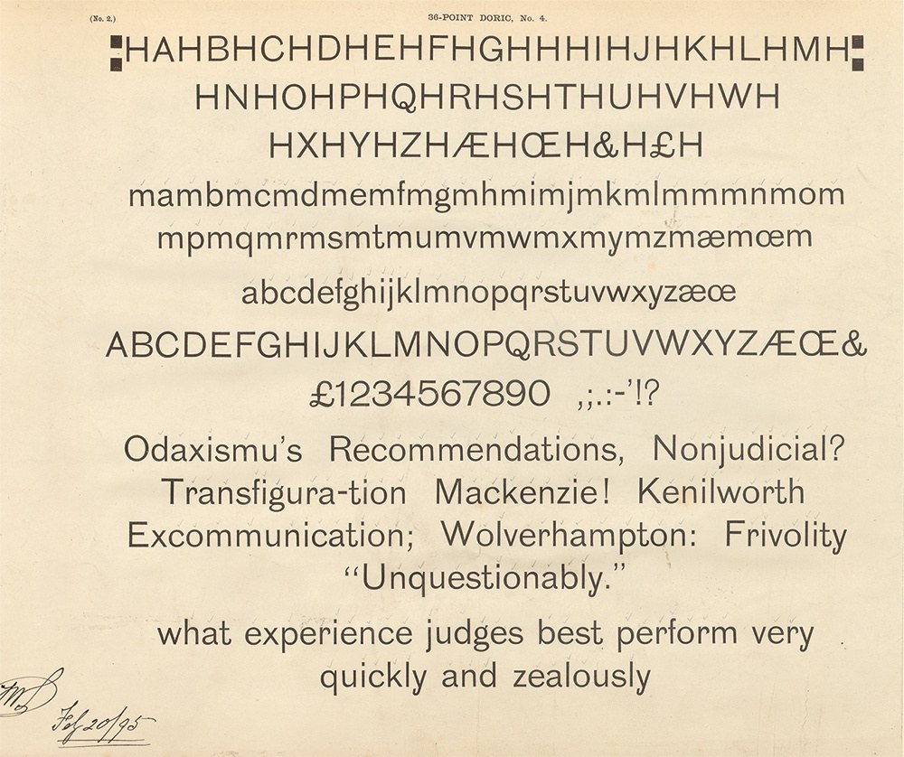
In the final quarter of the nineteenth century, the Caslon foundry invested heavily in the expansion of both its regular and narrow sans serifs. Starting in 1876, Caslon Doric No. 4 was cut as a regular weight, sans serif style in both upper- and lowercase. Here is a proof from the foundry in 1895 that shows the 36 point style (the foundry had started to use a point unit system for sizes by this date). St Bride Library.
The appearance and later acceptance of sans serif as a type form was one of the most significant changes in nineteenth-century typography. From a simple all-capital starting point, it grew through subsequent decades into the utilitarian letterform, suitable for multiple applications, that we both recognize and use today with little or no thought. Even though it is a letterform we readily accept across almost all our channels of communication, it took nearly sixty years for the British foundries to make the regular weight and width of this sans form so familiar to us today.
When William Caslon IV introduced his sans typeface sometime around 1816, it was met with disinterest. No contemporary usages of it seem to exist or survive. It was only in the late 1820s when Figgins (who first used the name sans serif), then later the Thorowgood foundry (who chose the name Grotesque), introduced styles that appear familiar to us. Created in large sizes, these early examples show the considerable impact a sans could bring to the page, at first as bold-weighted capitals of a normal width and then in a condensed form. The lowercase form, however, was a rarity. In Britain, sans serif was principally a display style, set in all-capitals, even when used at smaller sizes. It was never used for pages of continuous reading matter. The speed of acceptance of the sans can be gauged by the international spread of the form during the 1830s, with sans styles almost simultaneously appearing across Europe and the United States as a result of importing designs from Britain and local development.
The Doric first appeared as all-capitals, both filled and as outline at the beginning of the 1840s. The form is wider than Figgins’s first regular width style. It is a bold weight, round in design, but not geometric. Strokes end in flat horizontal terminals. The R has a straight-legged tail, and the G is without a crossbar. It is of a style that one might find on the pedestal of a Victorian statue. Caslon had already embraced the condensed sans form of the 1830s, though none of these types had gained a name, merely being described by size. The name Doric, like Ionic, references one of the classical orders of architecture. It seems unlikely, but not impossible, that Caslon would have related the name back to the Greek use of the sans letter. More probably, the choice of name reflects the fact that Doric was the simplest of the classical orders. It was only in the twentieth century that the Caslon foundry used the term sans serif, and only then to describe its condensed forms.
The first appearance of the sans form in a metal typeface was cut for William Caslon IV around 1816. Specimen of Printing Types, &c. by Blake, Garnett, and Co., Sheffield, c. 1819. St Bride Library.
An early example of a lowercase sans serif type cut in text sizes from Dresler’sche Giesserei, C. Meyer, Frankfurt. Journal für Buchdruckerkunst, 1858. St Bride Library.
In the same year, the same or a very similar sans appears credited to F. W. Bauer. Notice how the spelling of Grotesque is still in the British style. Journal für Buchdruckerkunst, 1858. St Bride Library.
Halbfette Grotesque Modern cut by Johann Christian Bauer in 1859. Bauer had trained at Alex. Wilson & Sons branch in Edinburgh (Edinburgh is mentioned in the copy) before starting the foundry of Bauer, Ferguson & Hill in 1846. Upon returning to Germany he set up the Bauersche Giesserei in Frankfurt. Journal für Buchdruckerkunst, 1859. St Bride Library.
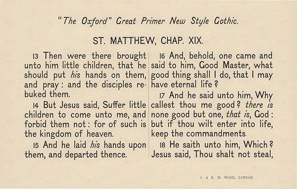
A sans serif (it is described for book work) with a full lowercase from the firm of J. & R. M. Wood. Its name, Great Primer New Style Gothic, suggests that it was originally an American design. Selected Specimens of Printing Types, cast by J. & R. M. Wood, at the Austin Letter Foundry, 1869. St Bride Library.
Both James Marr and Austin Wood & Co. show this sans serif in the early part of the 1870s, though it may have been an import from the United States. Specimen of Types by the Marr Typefounding Co. 1877. St Bride Library.
A typical British sans of the second half of the nineteenth century, as introduced by the foundry of Reed & Fox (the Fann Street Foundry). Specimens of printing types, Sir Charles Reed & Sons, 1881. This became part of the Stephenson Blake Grotesque series. St Bride Library.
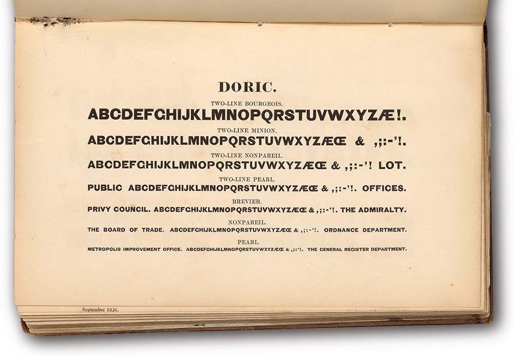
The first appearance of the ‘Doric’ sans in all-capital form in Specimen of Printing Types by Henry Caslon, 1842.
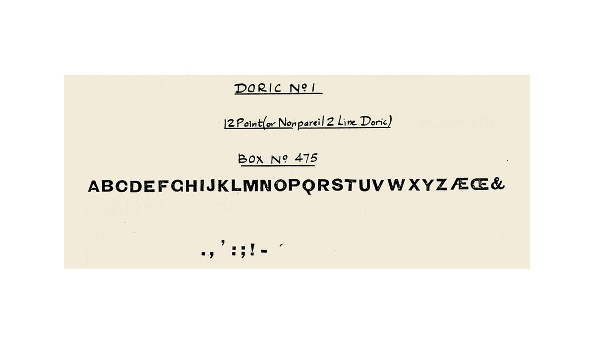
Later appearances of Doric No. 1 (it would continue to be cast until the foundry closed) show the recut G with crossbar. Specimens of Printing Types, H. W. Caslon & Co., 1895.
Later appearances of Doric No. 1 (it would continue to be cast until the foundry closed) show the recut G with crossbar. Specimens of Printing Types, H. W. Caslon & Co., 1895.
The first appearance of the ‘Doric’ sans in all-capital form in Specimen of Printing Types by Henry Caslon, 1842.
Later appearances of Doric No. 1 (it would continue to be cast until the foundry closed) show the recut G with crossbar. Specimens of Printing Types, H. W. Caslon & Co., 1895.
Later appearances of Doric No. 1 (it would continue to be cast until the foundry closed) show the recut G with crossbar. Specimens of Printing Types, H. W. Caslon & Co., 1895.
The first appearance of the ‘Doric’ sans in all-capital form in Specimen of Printing Types by Henry Caslon, 1842.
Meanwhile, the next major innovation in the sans design was introduced in Germany: sans forms at text sizes with a fully formed upper- and lowercase in the 1850s. The first homegrown examples in Britain seem to have been cut by one of Thorowgood’s successors, Reed & Fox, during the early 1870s. This light and relatively delicate weight would eventually become part of the expanded Stephenson Blake family of Grotesques, which was in turn the basis for Font Bureau’s digital series of Bureau Grotesques from the late 1980s. A number of these early sans types with lowercases, such as those issued by Scottish typefounder James Marr, may have been imported; but these new types were, on the whole, original designs or (in the case of Caslon’s Doric) expansions of existing all-capital families.
The Doric name clearly gained some currency for printers and the foundry for it was used again in the early 1850s, when Caslon reworked an all-capital design they had bought at auction of Bower Brothers foundry of Sheffield, as Doric No. 2.1 Lighter in weight and often narrower in width than the first Doric, it has a inconsistency in quality between sizes. Its naming as Doric seems to suggest that the foundry saw the commonalities and commercial possibilities, rather than the differences between these designs.
Caslon’s Doric No. 2, a typeface purchased from the sale of the Bower foundry of Sheffield in 1851, and then recut by Boileau. A specimen of Printing Types, H. W. Caslon, 1854.
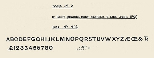
Smokeproof of Nonpareil 2 Line Doric No. 2, cut originally before 1851, with the recut G with crossbar. The flat topped 3 is a form found in several faces from Bower & Bacon, suggesting the first was added later by Caslon. St Bride Library.
Doric No. 4. Specimens of Printing Types, H. W. Caslon, 1895.
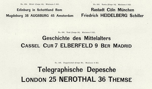
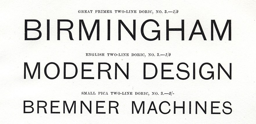
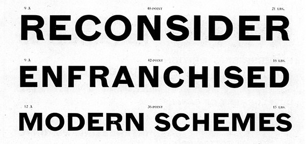
In 1876, Caslon began a new series of designs, which we will recognise as the style of the late nineteenth century British sans as exemplified in multiple variants from the major foundries. Doric No. 32 and No. 4 are the same design, No. 3 simply being the all-capital version. The weight is what we would classify as regular, the R has a curved tail, the G has a crossbar, the terminals of strokes taper in weight and are angled. The Q has the distinctly British tail with an internal loop, such as one would expect in a serif. Overall the letters are pleasing, well balanced, yet characterful.
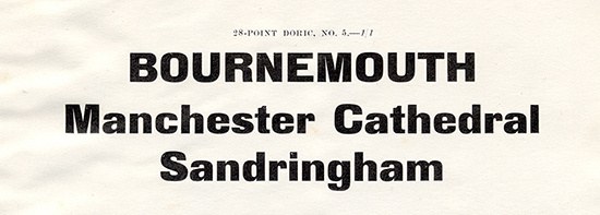
Caslon introduced the lowercase form to what became Doric No. 4 in late 1878 (records date the design to 1876), an extension encouraged, Caslon noted, by customer demand. (One wonders why it was only at this point that customers asked for this form, and not earlier. Why had Thorowgood’s lowercase in the 1830s not encouraged printers to similarly want more lowercase sans serif types?) The Caslon lowercase is defined by the hook-like shapes of several characters that noticeably come back in on themselves: the tails of the f, j, r, t, and y are distinctive (later Caslon would experiment with an f and j with straight tails). Forms vary across the nine sizes in which this type was cut (the result of the work of a number of different individuals), though overall there is a consistency across the whole design. Caslon also added a series of strange swash-like capital forms to both Doric No. 3 and No. 4: A, B, C, D, F, G, H, J, L, M, N, P, and R. Given the plainness of the type overall, these decorative-like swirls and rounded terminals are a curious addition. In fact, they did not last; these details disappeared from specimens by the end of the nineteenth century, though the Doric system of typefaces remained in Caslon specimen books until the end of the foundry. It is principally Doric No. 4 that serves as a model for the updated Caslon Doric regular width, balancing the qualities of charm and character with an underlying utility. From this design it is possible to extrapolate to lighter and bolder weights.
The appearance of a regular weight sans serif with a lowercase did not immediately lead to any further expansion of the Doric family; no italic to match, nor a bolder weight. It would be fifteen years before Doric No. 5 and Doric Italic No. 1 were cut. In this interim period, the foundry had come under the control of T W Smith, whose sons took on the Caslon name, the last of the Caslon family having died. Perhaps in such a time of business upheaval, priorities had been elsewhere, though a rapid expansion in the range of sans was implemented in the 1890s.
The next series of faces that bear the Doric name show how the foundry viewed the name: it’s a kind of sans serif (a normal width) letter rather than being a specific style. If Doric No. 1, 2, 3, and 4 share any of the same qualities and might be seen as sequential updates to the form, the next designs only share the name.
Doric No. 3. Specimens of Printing Types, H. W. Caslon, 1895.
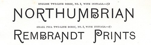
Caslon cut a series of curious swash capitalis for both Doric No. 3 and No. 4, which seems curious to modern tastes. Specimens of Printing Types, H. W. Caslon, 1895.
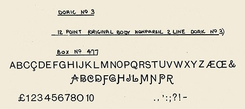
Smokeproof of Nonpareil 2 Line Doric No. 3 as cut by Martin 1877, though the swash letters were a later addition only appearing in the 1880s. St Bride Library.
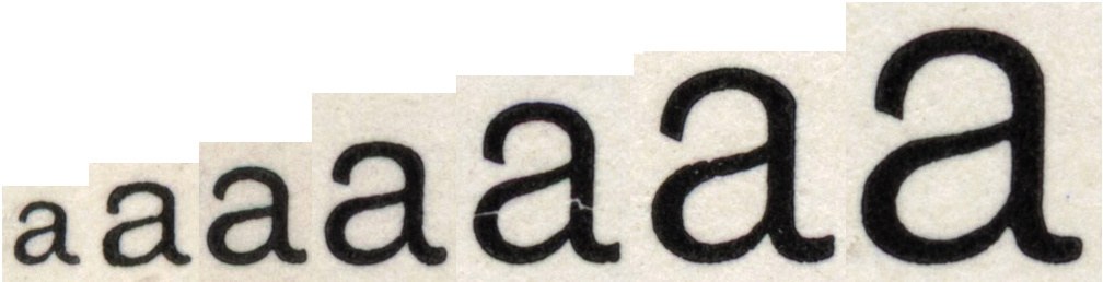
Seven sizes of Doric No. 4 showing how a design would change in the days of cutting type by hand: Nonpareil, Brevier, Long Primer, Pica, Great Primer, Double Pica, and Two-Line English.
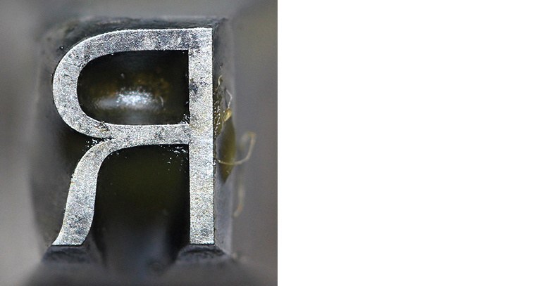
Punch of Two-Line English Doric No. 4. Capitals cut by Martin 1876 and lowercase by G. Hammond 1879. St Bride Library.
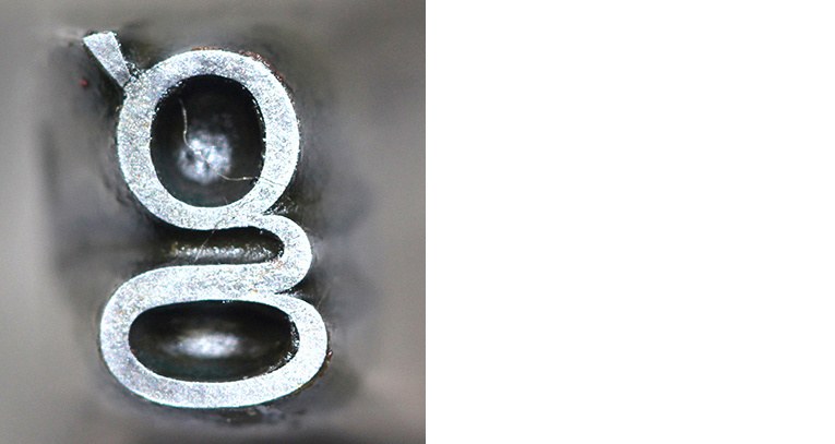
Punch of Two-Line English Doric No. 4. Capitals cut by Martin in 1876 and lowercase by G. Hammond 1879. St Bride Library.

Condensed Italic is the first showing by Caslon of a sans italic with lowercase, appearing in the early years of the 1870s. In design it shares many features with Doric No. 4, such as the hook like ending of the a, r, and y.
Bolder
Doric No. 5, which was cut starting in 1893, is a well-considered, bold, square-like design, quite unlike No. 4. It has more in common with the style of a typeface, such as the much later Eurostile, and appears in multiple sizes (it was around this time that Caslon began casting typefaces in the modern point system we know now).
Doric Italic No. 1 almost has the appearance of an italic companion to No. 5 and the two were released in the same period, though the two designs do not appear to have been marketed as such. On closer inspection, however, it is in fact a copy of a German face, Fette Kursiv-Grotesk, from J. John Söhne’s foundry. Whether it was an officially licensed face, or simply a pirated face is not clear. However, it demonstrates how foundries were happy to take the shortcut of using others’ faces, whether by legal or illegal means.
In 1897, the first bold regular width sans with an accompanying lowercase appears: Doric No. 6 (and its all-capital variant No. 7). On initial inspection, one might think that it is the bold companion to Doric No. 4 and therefore informative to how our modern Doric would look. But looking closer, several characters take on differing models: the single-storey g, the Q with its non-looping tail, the lowercase a without a tail. Though much of it does appear to have been cut in the foundry, both by hand and by machine, it owes a debt to an American source. In July 1892, the foundry purchased 12 sizes of Gothic No. 2 from The Central Type Foundry of St. Louis.3 Certain details such as the r with its downward, looping tail have been changed to the British model, but others are simply copied, as mentioned above. Overall, the family gives an appearance of being rushed and unsure of itself; the lowercase seems too light and too small compared to the capitals, the descenders too deep.
Caslon’s Doric No. 8, extended and bold in style, was cut in 1906 by Kirkwood (the records say it was cut in Germany). The lowercase is curious in its rounded form, the shapes not being symmetrical on the vertical axis, so the lowercase e is narrower at its top than its bottom. But the shapes of the a, r, and f with their hooks and the g are all similar to those we find in Doric No. 4. This was the last design that appears to have been cut by hand.
As the nineteenth century ended, production of type was speeded up with the invention of the pantographic punchcutting machine by Benton in the 1880s, and which Caslon began to employ in 1898, according to the records that remain. This would allow greater speed at producing new designs, but also greater consistency between both letters and sizes. Caslon’s Doric No. 10 (No. 9 seems to have been abandoned) was entirely machine cut in 1909. In style, it is similar to No. 5 (which disappears from the specimens) and has the advantage of being more uniform over the size range, though it may be argued that it is blander. So while No. 5 exists from 8 to 28 point, No. 10 goes from 6 to 72 point.
The last Doric, No. 12, was cut after the First World War. It is almost a regular or medium weight of No. 8, but loses the unusual bottom-heavy shapes and has a reduced x-height that looks too small. However, you can see certain letters that recall the style found in Doric No. 4: the hook tail of the r, the protruding ear of the double-storey g, the kink in the tail of the R. Cut between 1921–25, it perhaps reflects the increasingly tough financial circumstances that Caslon found itself in. Monotype released a version of Caslon Old Style in 1915, and one wonders if this dramatically altered the fortunes of the foundry as the demand for one of Caslon’s main text faces was curtailed.
Doric No. 5. Specimens of Printing Types, H. W. Caslon, 1895.
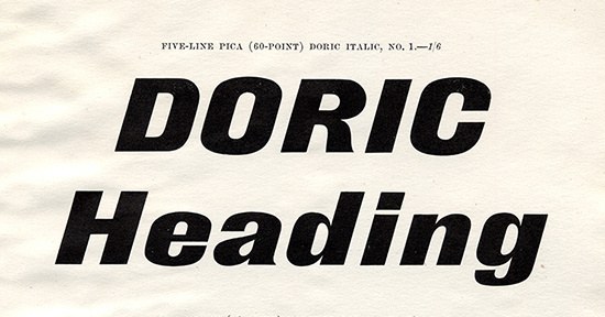
Doric No. 1 Italic (A copy of Fette Kursiv-Grotesk as cut by J. John Söhne, Hamburg). Specimens of Printing Types, H. W. Caslon, 1895.
Doric No. 6, a renamed (and in part recut) version of Gothic No. 2 of the Central Type Foundry, St. Louis, in proof 1897.
Detail of Doric No. 6. It differs from No. 4 substantially in the design; note the tail of the t, the lack of tail in the a, and the narrowness and the shape of the S, all belying its American origins. Specimens of Printing Types, H. W. Caslon, 1919
The titling all-capital version of Doric No. 6 and No. 7. Specimens of Printing Types, H. W. Caslon, 1919
Doric No. 8. Specimens of Types & Borders H. W. Caslon, 1919.
The last Doric was No. 12, as shown in the Printing Types, H. W. Caslon, 1932.
Doric No. 10. Specimens of Types & Borders H. W. Caslon, 1919.
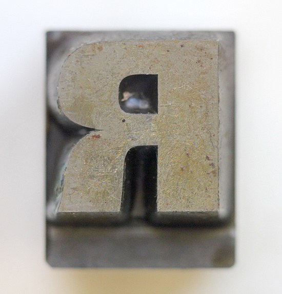
Punch of 42pt Doric No. 10, cut in 1909. At this point, the Caslon foundry for mostly had their punches cut by pantograph machines, giving a more refined line. St Bride Library.
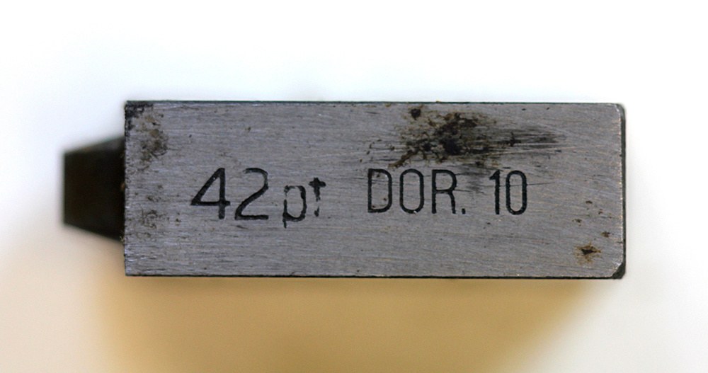
The side of a machine cut punch of 42pt Doric No. 10. St Bride Library.
Wider and Thinner
One of the earliest light sans typefaces, Pearl Skeleton. A Specimen of Printing Types by W. Thorowgood and Company, 1837.
Doric Expanded from the 1850s. Specimens of Printing Types, H. W. Caslon, 1895.
Caslon’s original Doric is a wider form than the sans of Figgins or Blake & Stephenson, but we would not necessarily recognise it as a wide design. Wide or expanded typefaces (the fat face appears to be the first to be stretched) seems a logical development after condensing forms, but as they take up more space than save and reduce the size a headline can be, they never gained the same popularity. Appearing first in the fourth decade, they gained some popularity in the 1840s and 1850s.
Certainly Doric No. 8 and No. 12 are wide, but these are not the first wide sans faces that the foundry produced. Doric Expanded appeared in the 1860s, which was used as a titling font. This light, all-capital style probably followed a letterform cut by engravers for visiting cards and announcements; its thinness is typical of the engraver rather than the typefounder. Thorowgood, for example, shows a regular width hairline style of sans in 1838, cut as we would expect at a small size. Founders at this time did not see this form as the model for a large range of sizes. The modern Doric imagines the forms of Doric No. 4 as being extrapolated into such light weights, but also in being stretched into wider than expected forms.
Narrower
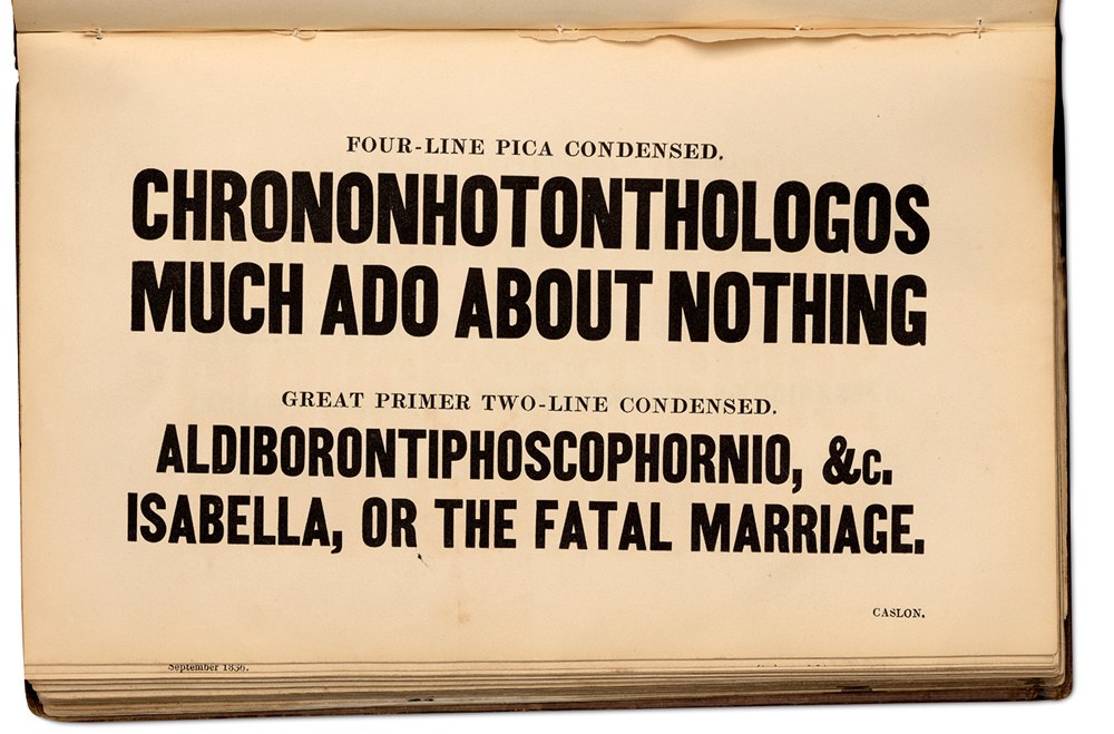
Caslon introduced the condensed sans in the 1830s following the example of the other foundries. Its usefulness is demonstrated with the setting of long titles of plays. But the typefaces remain simply titled ‘Condensed’, with Caslon only introducing the name Sans in the twentieth century. Chrononhotonthologos was the title of an eighteenth-century play, Aldiborontiphoscofornio being a character. Specimen of Printing Types by Henry Caslon, 1842.
Though Doric was the name Caslon adopted for their system of normal and wide sans serifs, condensed sans forms were called simply Condensed. Egyptians and moderns in a condensed form, on the other hand, were called ‘compressed’. This naming would continue into the twentieth century, even after the foundry began a process of expanding its range of sans styles from the 1870s onwards.
The first condensed sans from Caslon appeared in the early 1830s. It was a bold weight, though not extrabold, all-capital form. The letterforms are typical of the style, flat-sided on both the exterior and the inner counters. To confuse matters, the foundry then introduced additional styles and sizes as Condensed No. 1 and a lighter (and somewhat narrower) Condensed No. 2 in the 1840s (we might consider it a semibold or medium today). With No. 3 and No. 4 we find truly light forms.
In the second half of the nineteenth century, Caslon introduced a lighter all-capital condensed sans serif face, Condensed No. 2. Specimens of Printing Types, H. W. Caslon, 1895.
The first light weight Caslon introduced was No. 4, cut in the late 1850s, early 1860s before 1861. Specimens of Printing Types, H. W. Caslon, 1895.
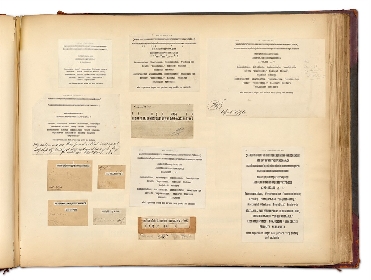
Condensed Sans-Serif No. 8 cut by Emile Bertaut, C. Chitson and J. Rochaix, 1894 onwards. Proofs and smoke proofs shown in the Caslon Scrapbook, March 1894. St Bride Library.
Condensed Sans-Serif No. 14 machine cut around 1912; the sans to the left is the original Caslon condensed sans. As shown in the Caslon Scrapbook. St Bride Library.
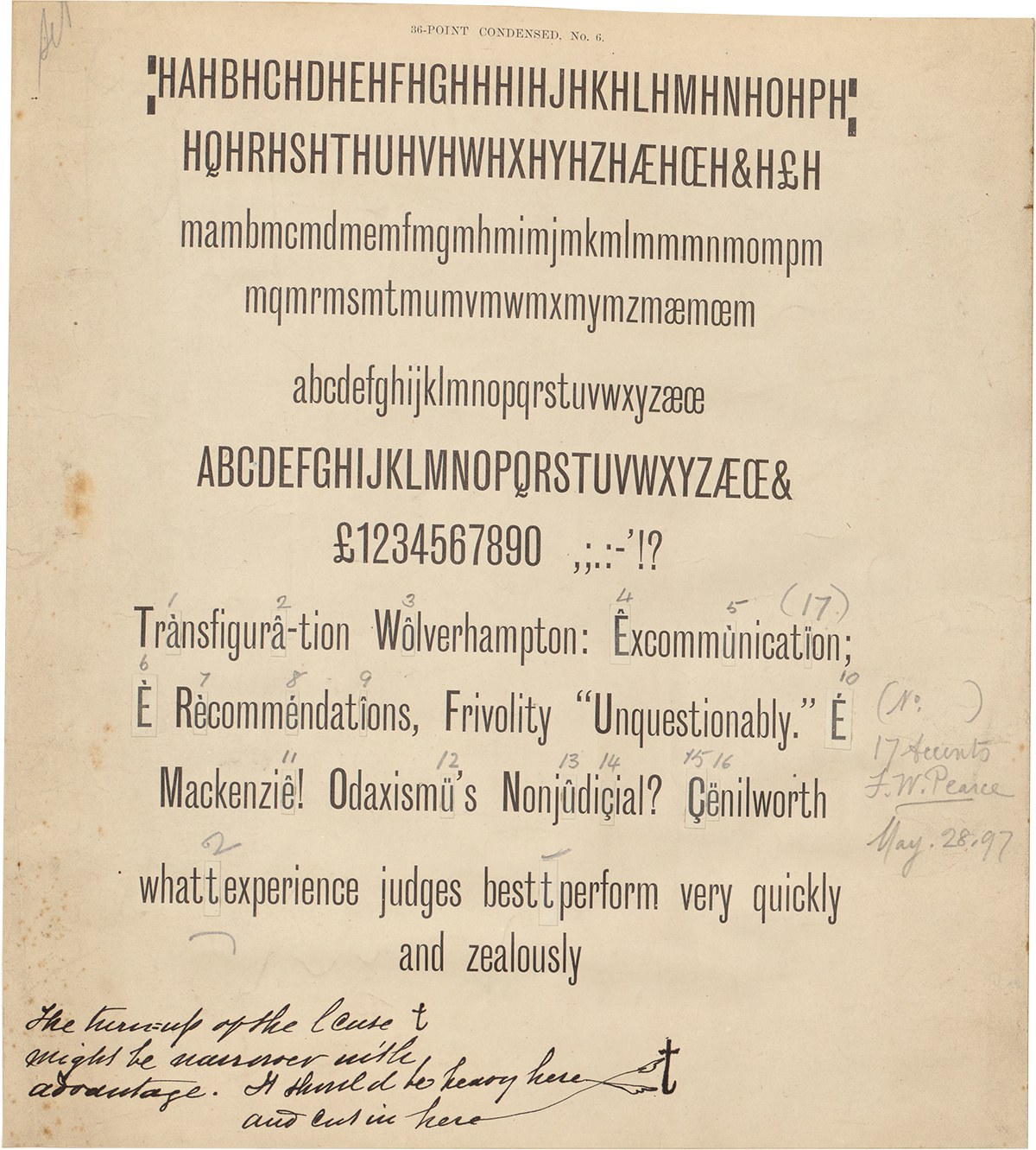
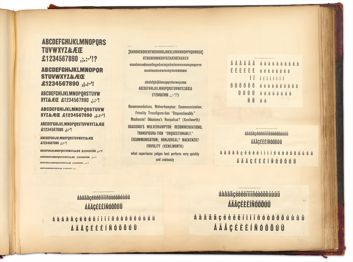
Condensed Sans-Serif No. 6 cut by George Hammond in proof. The comment about the lowercase t reads “the turn-up of the lcase t might be narrower with advantage. It should be heavy here and cut in here”. St Bride Library.
Condensed Sans-Serif No. 8 cut by Emile Bertaut, C. Chitson and J. Rochaix, 1894 onwards. Proofs and smoke proofs shown in the Caslon Scrapbook, March 1894. St Bride Library.
Condensed Sans-Serif No. 14 machine cut around 1912; the sans to the left is the original Caslon condensed sans. As shown in the Caslon Scrapbook. St Bride Library.
Condensed Sans-Serif No. 6 cut by George Hammond in proof. The comment about the lowercase t reads “the turn-up of the lcase t might be narrower with advantage. It should be heavy here and cut in here”. St Bride Library.
Condensed Sans-Serif No. 8 cut by Emile Bertaut, C. Chitson and J. Rochaix, 1894 onwards. Proofs and smoke proofs shown in the Caslon Scrapbook, March 1894. St Bride Library.
It is only with No. 6 and No. 8 in the series,4 cut in the last decade of the nineteenth century, that we see the first condensed sans with a lowercase from Caslon. Condensed No. 6, begun in 1895, is regular in weight with a relatively small x-height. It is noticeably condensed, vertically elongated with flat sides, and sharply angled horizontal terminals. The g is single-storey with a deep descender. The terminals of characters such as the S and s hook back in on themselves, with the tail of the t hooking upwards. The Q has an unexpected style of tail, a diagonal line that dissects the circle, joining a horizontal wave-like form. A condensed bold style, Condensed No. 8 was begun a year earlier in 1894. This has a larger x-height with shortened descenders but is similarly compact. The y is unusual with its parallel strokes and a tail that hooks under itself. In style, the condensed makes different design decisions than the regular Doric width; it would make perfect sense in a condensed for the letters to be flat-sided and certain characters, like the g, to be single-storeyed. Condensed No. 6 and No. 8 are the most important influences on the condensed weights of the modern Doric.
Caslon’s approach to sans serifs epitomizes the approach of many typefounders of the nineteenth century. Little attempt was made to join styles together to create harmonious families; rather, the completion of a broad range of sizes in metal type was the priority. Founders had yet to discover the economic and design benefits of creating large coordinated families with distinct names. The introduction of the regular width sans serif with upper- and lowercase some 20 years after its introduction by German founders suggests a conservative approach to the style and its slow adoption by printers.
Condensed Sans-Serif No. 6, 1895. Specimens of Types & Borders H. W. Caslon, 1919.
Condensed Sans-Serif No. 8, 1894. Specimens of Printing Types, H. W. Caslon, 1895.
Caslon Doric through the ages. Left: Doric No. 1 (first appearance c. 1840), No. 2 (cut at Bower and Bacon before 1851), No. 3 (c. 1876), No. 4 (c. 1876; No. 3 and No. 4 are the same design, with the addition of lowercase in No. 4), No. 5 (c. 1895), and No. 6. (1896, based in part on Gothic No. 2 of the Central Type Foundry, St. Louis). Right: Doric No. 7 (1896 No. 6 and No. 7 are the same design, No. 7 being the titling capitals version), No. 8 (1906), No. 10 (1909), and No. 12 (1921). The italics are Doric Italic No. 1 (c. 1893, a copy of J. John Söhne’s Fette Kursiv-Grotesk) and No. 2 (after 1895 before 1900).
Caslon Sans though the ages. Left: Sans Serif No.1 (after 1833, before 1836), Sans Serif No. 2 (before 1842), Sans Serif No. 3 (before 1861), Sans Serif No. 4 (before 1861), Sans Serif No. 5 (before 1886), Sans Serif No. 6 (1895), Sans Serif No. 7 (1893). Right: Sans Serif No. 8 (1894), Sans Serif No. 10 (1894), Sans Serif No. 12 (which was renumbered from No. 9, 1899), and Sans Serif No. 14 (1912), Fourteen-Line Pica Condensed (1830s), Condensed Italic (before 1870).
Caslon maintained its curious practice of labelling typefaces of the same style as variously Doric or sans serif into the twentieth century. It also did not adopt any of the newer humanist styles unlike other foundries, such as Stephenson Blake (Granby, 1930) and Monotype (Gill Sans, 1928), though they did market and import the geometric Elegant from the Stempel foundry. Whilst similar sans serifs, such as the German Schelter & Giesecke Grotesk or Bauer’s Venus, gained popularity amongst the continental modernists in the interwar years, no such movement existed in Britain that would champion Caslon’s Doric (or those designs of Miller & Richard or Stephenson Blake). And so, Caslon Doric dropped out of existence as the foundry collapsed in the 1930s, more than 120 years after Caslon IV first showed a sans type. In the years after the Second World War, the new wave of designers in Britain would also reject the British sans, whether it be Gill or the nineteenth-century forms, preferring the continental models, first of Monotype’s Grotesque 215 (a design similar to Venus) and latterly, the neo-grotesques of Helvetica and Univers.
With the revived Caslon Doric, we attempted to bring several disparate styles together and to make a system that makes sense to contemporary designers, while also trying to retain some of the diversity and warmth of the originals. Like many of the range of faces in Commercial Classics, much is imagined, yet feels authentic to what existed already.