Brunel
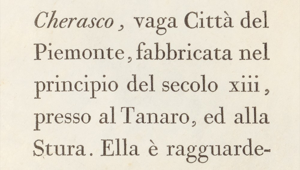
The model for Brunel Text, Caslon’s English No. 1 (14 pt), cut by John Isaac Drury at the turn of the eighteenth century for Elizabeth Caslon. As shown in Poetry of the Anti-Jacobin, 4th Edition, London, 1801. Printed by William Bulmer.
As Bodoni is Italian and Didot is French, Brunel is a British modern. Together, they share many commonalities of a style that swept away all that came before it in the late eighteenth and nineteenth centuries: each displays a higher than normal contrast between thick and thin strokes, vertical stress, and a reduction and rationalization of form. In detail, however, they are distinct in showing how regional and nuanced the style can be. While the continental moderns achieved a fame that has outlasted their masters (how many Didot and Bodoni revivals are there?), a particular name or style of a British modern has never been as dominant.
Brunel encapsulates the qualities that identify the British variant of the modern style. It combines European influences with a set of more localized details and traditions that signify a starting point for the stylistic departure of the nineteenth century and the visual revolution that followed. As such, Brunel represents the starting point for the Commercial Classics series and embodies the ideas which the first designs explore. From the structure inherent in Brunel, we can see how these were developed into the fat faces, slabs, Italians, and sans forms that were the defining styles of the nineteenth century.
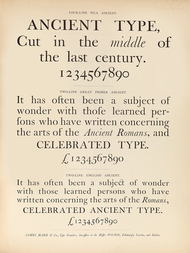
The famed transitionals of Alexander Wilson & Sons of Glasgow, cut in the second half of the eighteenth century, following the model John Baskerville pioneered. After the firm’s collapse in the 1840s, much of the stock was taken over by Marr, Gallie, & Co. In its later iteration as James Marr, they reissued the Wilson faces. Specimen of Modern and Ancient Printing Types, &c. by James Marr & Co. c. 1866. St Bride Library.
The first British modern as cut by Richard Austin, originally cut for John Bell. Austin’s modern has a gentler approach to letterforms than that of the Didot modern and remains localised in detail. A Specimen of Printing Types by S. & C. Stephenson, 1796 (facsimile edition, Printing Historical Society, 1990).
Changes in fashion, new requirements in printing, and improvements in technology all contributed to the stylistic advancement of the serif letterform from the fifteenth century onwards. In the eighteenth century, such change accelerated, and much is made of the innovations of John Baskerville (1707–1775) in letterform and printing. In style, his typefaces mark the beginning of a divide between the ‘old face’ of Caslon and the new styles yet to come. Baskerville’s influence extended throughout Britain and, eventually, across Europe. Edmund Fry and Isaac Moore of Bristol, as well as Alexander Wilson of Glasgow, imitated Baskerville and even surpassed him at times. Within a decade of Baskerville’s death in the 1780s, the Didot family produced the first truly modern typeface and, in doing so, rendered the existing roman styles dated. While foundries continued to cast their older styles into the new century (Wilson cast his transitional style of the 1770s as late as 1819), it was the modern that represented the future.
The modern style reached Britain by 1788, as shown by Richard Austin’s work for John Bell. As forms, these early British moderns retain a softness and warmth that disappear in later moderns. In their details, they remain resolutely local: for example, the tail of the R, with its gentle kink finishing in a serif, makes it a distinctly British letter. Austin, as a trade engraver, would simply have made what he was used to, emphasising the stylistic influence not only of the printed letter, but also the handmade variant. The speed of change, however, pushed this gentle style out within a decade, a shift clearly marked by the Caslon foundry’s adoption of the modern.
Within three decades of William Caslon’s death, Elizabeth Caslon (the widow of his grandson, who had become the owner of the foundry), ordered the first moderns. Like John Bell, she employed a trade engraver, John Isaac Drury, to cut the modern design in multiple sizes. From his work we can see that Drury, like Austin, was a skilled and talented individual who quickly mastered the form.
The famed moderns of Bodoni first appeared in the latter part of the eighteenth century. With the faces of the Didot family, they were widely influential, displacing all before them. A detailed account of the faces of Bodoni throughout his career is examined in Bodoni and his roman and italic types by James Clough published by CAST types online here. Manuale tipografico of 1788, Giambattista Bodoni, Parma. St Bride Library.

Throughout his oeuvre, Bodoni had a penchant for the italic style and a love for exuberant swash letters, unfound in the work of the Didots. Manuale tipografico of 1788, Giambattista Bodoni, Parma. St Bride Library.
The sheer volume of Bodoni’s work defies easy categorisation. It’s at times sharp and, at others, retains a more humane elegance, such as the face above. As shown in Manuale tipografico of 1788, Giambattista Bodoni, Parma. St Bride Library.

Parallel to Bodoni’s work were the French moderns pioneered by the Didot family. Bodoni and the Didots share an elegant yet austere approach, but the early moderns of Bodoni (that still showed the influence of Fournier) have a gentler and warmer character compared to the sharper nature of the Didot faces of this time. However, the sheer productivity and volume of Bodoni and the multiple Didots defy an easy categorization of what a Bodoni and Didot might be defined as. Essai de Fables Nouvelles printed by Farncois Ambroise Didot L’Aîné, the type was cut by Firmin Didot in 1785.
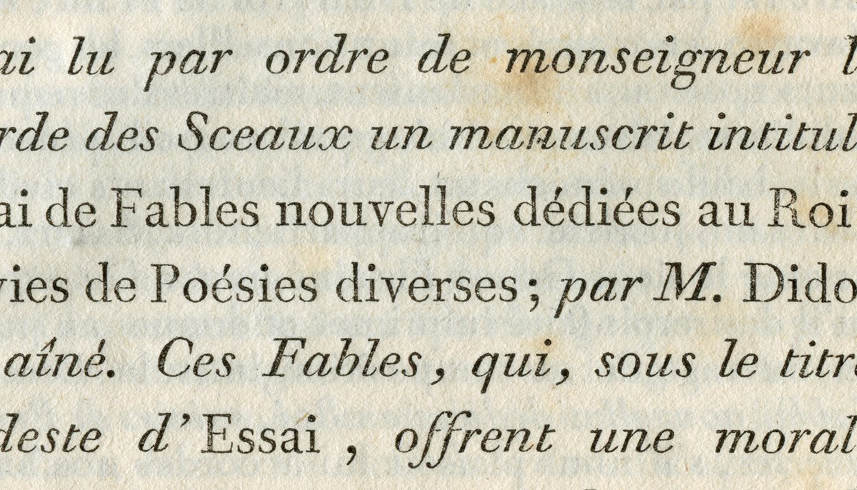
Detail of Didot type cut by Firmin Didot, as shown in Essai de Fables Nouvelles, 1785. Compared to Bodoni (and to Drury’s work), the shape of letters is sharper in line, with an almost rational elegance and a reduction of form, such as the removal of the left of the cross bar of the lowercase f and a more dramatic contrast between thick and thin strokes.
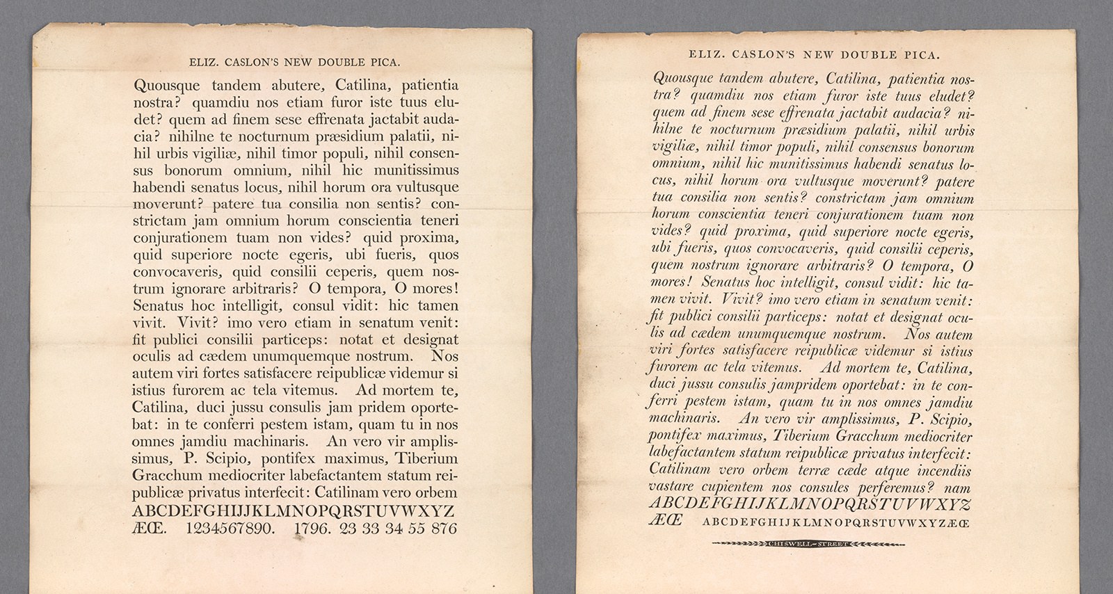
The first moderns for the Caslon foundry were cut by John Isaac Drury at the end of the eighteenth century for Elizabeth Caslon. The Double Pica was cut in 1796, of which the punches survive at St Bride Library. The smaller size Pica is dated 1799 and the English size (on which Brunel is based) was cut before 1801. This specimen is unique and from the New York Public Library.
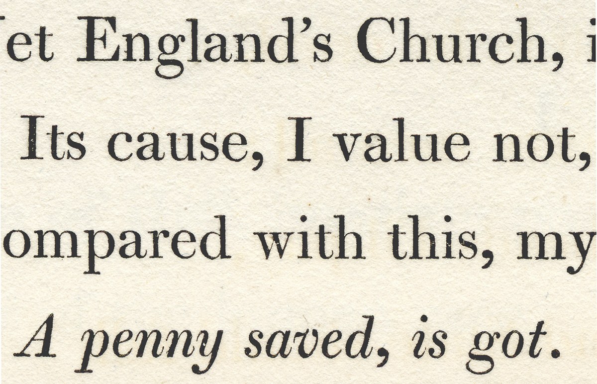
These first moderns from Caslon are shown in sheets dated 1796 and 1799, now held at New York Public Library. The Pica size of the Caslon modern (around 12 point today) and the later-cut English size (around 14 point) achieved some fame and praise. In 1825, the famed typographical writer T C Hansard marvelled in Typographia at its popularity and claimed that the work of Bodoni had been improved upon by Drury. In his Printing Types of 1922, Updike reproduces Drury’s type as used in the volume, Poetry of the Anti-Jacobin, printed by Bulmer in 1801. These are the main models for Brunel.
Just what is it that makes these forms so appealing? Why did Hansard and Updike mark them out as being of such high quality? Caslon was not the only foundry who produced moderns during this period in Britain; certainly by 1803, Robert Thorne produced an entire specimen that contains many modern style faces. It seems that what makes them of such high quality is that Drury was one of the earliest punchcutters to successfully marry continental style with British sensibilities. In the English size, we find a form that is confident in what it is. It clearly shows the direction that the serif form would take in Britain during the next few decades.
Drury’s work manages to mix the high contrast and simplification of the continental modern with the sensibility of a British style as it had evolved during the eighteenth century. The capitals are more regularized in width; the italics are narrower and more upright in angle. The Q has a tail with a loop; the R has a tail that curves up; the bottom half of the C does not end with a serif, differing from the continental model. These are forms that would be repeated in later styles. Look at the sharpness of the top serif of the E, F, and T. The numerals are not quite capital height (like those of Bell, the 6 ascends and the 7 and 9 descend) and, in style, would not be out of place on an eighteenth-century gravestone or a clock face. We see how forms were still not fixed: alternative forms of the K in the roman and the Q in the italic, the unusual swash Z, or the lowercase t with both the continental flat-topped version and the British curved version. The swash letter that Baskerville and Austin employed would appear with some regularity in the British modern; swash A, N, M, V, W, and Y are common features of the fat face form. The tail of the italic ampersand descends below the baseline and curves back on itself. It is in the italic where the departures from the continental model are most obvious. At text sizes, the letters are more condensed than the typical Bodoni or Didot, and the italic is much more obviously compact and denser on the page than the continental form.
The popularity of Drury’s work during the early nineteenth century allows easy examination of his output. Poetry of the Anti-Jacobin is one of the best showcases for his work, as are the specimens from Caslon in its various guises at the end of turn of nineteenth century. A further source is Cabel Stower’s The printer’s grammar from 1808, which features ten pages of specimens from the Caslon and Catherwood foundry. These types continued to appear in Caslon specimens into the second decade of the nineteenth century. By the third decade of the nineteenth century, Drury’s work was increasingly being surpassed by new and more austere modern style faces which, to our eyes, often lack the elegance and quality of his work.
Remarkably, many different sets of Drury’s punches survive. Retained by the foundry until bankruptcy in 1936, they were purchased at auction by the Monotype Corporation, which set about recording the punches by taking smoke proofs, a process curtailed by the outbreak of war in 1939. Smoke proofs were taken for around 250 of 1050 boxes. Monotype’s original intention appears to have been to use some of the types as models for future revivals. In the end, only one typeface was made from the material: Monotype New Clarendon (series 617 & 618) in 1960. The punches were eventually donated to the Oxford University Press in 1964 before being deposited at St Bride Library in 1973.
The St Bride materials include the particular punches and smoke proofs for Drury’s English No.1 roman and italic (they were initially donated by Monotype to the College of Art in Canterbury, but were later returned in the 1970s). Despite the wear and tear of nearly 200 years, it is clear how talented the punchcutter was; they still sparkle and impress with their confidence and quality.

Caslon and Catherwood’s English, cut by John Isaac Drury. The printer’s grammar, by C. Stower, 1808.

Smoke proof of English No. 1, made by the Monotype Corporation after purchasing the remains of the Caslon foundry at auction at the end of the 1930s. Though several characters are missing from the set, it shows the limited number of letters that were cut in this era. Those in the bottom right are not from the face. St Bride Library.

Caslon & Catherwood Great Primer Italic capitals, cut before 1808. The alternative swash forms of K and Z were moderately popular at the beginning of the nineteenth century, but disappeared in normal weight text sizes by the third decade of the century. As shown in Specimen of Printing Types, Caslon & Catherwood, undated, but before 1821. St Bride Library.
The swash capital form in the italic came into its own in heavier weights. Virtually all fat face italics came with swash variants of A, N, M, V, W, and Y. Caslon & Livermore’s Two Line English No. 3 as shown in Specimen of Printing Types by Henry Caslon, 1840.
Punch from English No. 1 cut by John Isaac Drury, before 1801. St Bride Library.

Punch from English No. 1 cut by John Isaac Drury, before 1801. St Bride Library.

Punch from English No. 1 cut by John Isaac Drury, before 1801. St Bride Library.
Larger and Larger
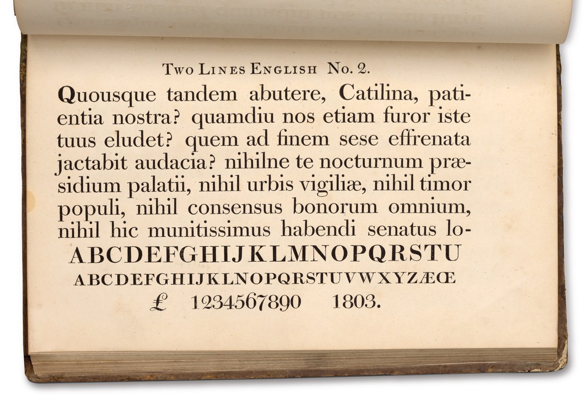
Two Lines English No. 2, cut in 1803. The punchcutter is unidentified, though it could be speculated they are the work of John Isaac Drury. Specimen of Printing Types by Caslon & Catherwood, undated, but before 1821. St Bride Library.
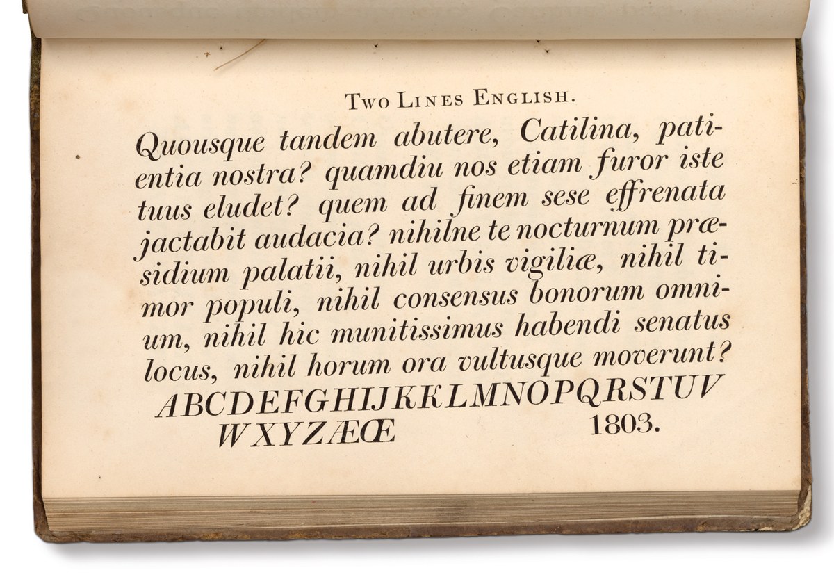
Italic of Two Lines English, cut in 1803. The italic is both wider and more angled than the text sizes; note the unusual K and swash form. Specimen of Printing Types by Caslon & Catherwood, undated, but before 1821. St Bride Library.
As a modern, one of Brunel’s defining features is its high contrast. In the early nineteenth century, each size of a typeface would have been individually adjusted in terms of its design, so that contrast could be controlled across the range of sizes. As size increased, so did contrast. To achieve the same contrast between sizes of type today, we have to create a set of separate master designs, though digitally and not in steel.
Large sizes of type had always existed, but it was in the nineteenth century that they began to really proliferate in terms of the range of sizes and variations available for the new demands of printers, for the increasing display and advertising-based typography we associate with the nineteenth century. Competition between foundries was constant in producing larger and (later) bolder type. A Caslon and Catherwood specimen from the first two decades of the nineteenth century, for example, shows type at sizes ranging from Five-line Pica (around 60 point) downwards, though many of the larger sizes are the bolder style that would dominate the founder’s specimens in the second decade of the century. Some of the regular weighted examples, such as the Two Line English, influenced the larger sizes of Brunel. Though these designs cannot be attributed to Drury himself they share much with his text sizes and offer clues to what larger sizes of his letters would look like.
As size increases, the features become more defined: hairlines thin out, modulation between thick and thin strokes become more abrupt, bracketing of serifs is less generous, and the rounding where balls join strokes gets smaller and tighter. With increased size, the angle of the italic also becomes steeper and the letters wider; for example, from an angle of 14 degrees for the English No. 1 (14 point) to over 19 degrees for the Two-line Great Primer (36 point).
The changes between sizes would have been in part a design decision (in part also the human factor in making letters over multiple sizes) and in part a response to the effects of printing and ink spread, which is greater at smaller sizes. The changes in the ratio between thick and thin strokes at the different type sizes illustrate this. For the English size, for example, the thick to thin stroke contrast of Drury’s type is around 2.7:1 (the actual punch has a ratio of 5.45:1 showing how much ink spread effects the final printed appearance of a type) and for Two-line Great Primer, the ratio is 5:1. The size range of Brunel extends beyond Great Primer, with a range of four masters: text and deck at 5.45:1, poster at 10.9:1, and then 36.33:1 for the largest sizes at the roman weight. This contrast between thick and thin strokes is even higher than that of the largest continental moderns; the French typefounder Molé made types with a ratio of approximately 20:1. Modern digital type can be made to any size, and modern printing can reproduce the finest of Brunel’s hairlines.

As size increases, contrast also (generally) increases. From Caslon & Catherwood’s Specimen of Printing Types before 1821; Pica (12pt), English (14pt), Double Pica No. 2 (24pt), Two Line English No. 2 (28pt), Two Line Great Primer (36pt). St Bride Library.

Brunel has four size masters: Text (equivalent to Drury’s English), Deck (Double Pica), Poster (Six Line), and Hairline. The fineness of the Hairline would not be found in metal type in the nineteenth century.
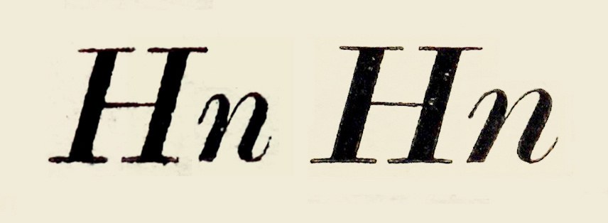
As size increases, so does the angle of the italic in the lowercase, and the letters become wider. The capitals appear to be virtually the same angle. On the left the English No. 1, on the right Two-line Great Primer. St Bride Library.
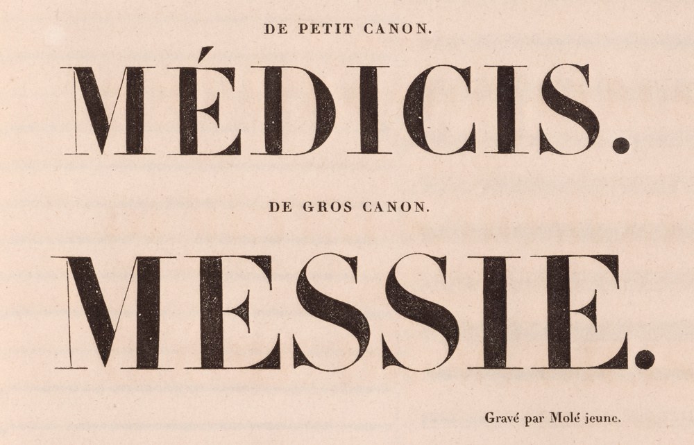
Titling capitals, cut by Molé Jeune, showing some of the finest hairlines produced in the nineteenth century. They are not as fine as Brunel Hairline as the manufacturing process of making metal type could not make finer hairlines. Caractères gravés et fondus par Molé jeune, 1830. St Bride Library.
Bolder and Bolder
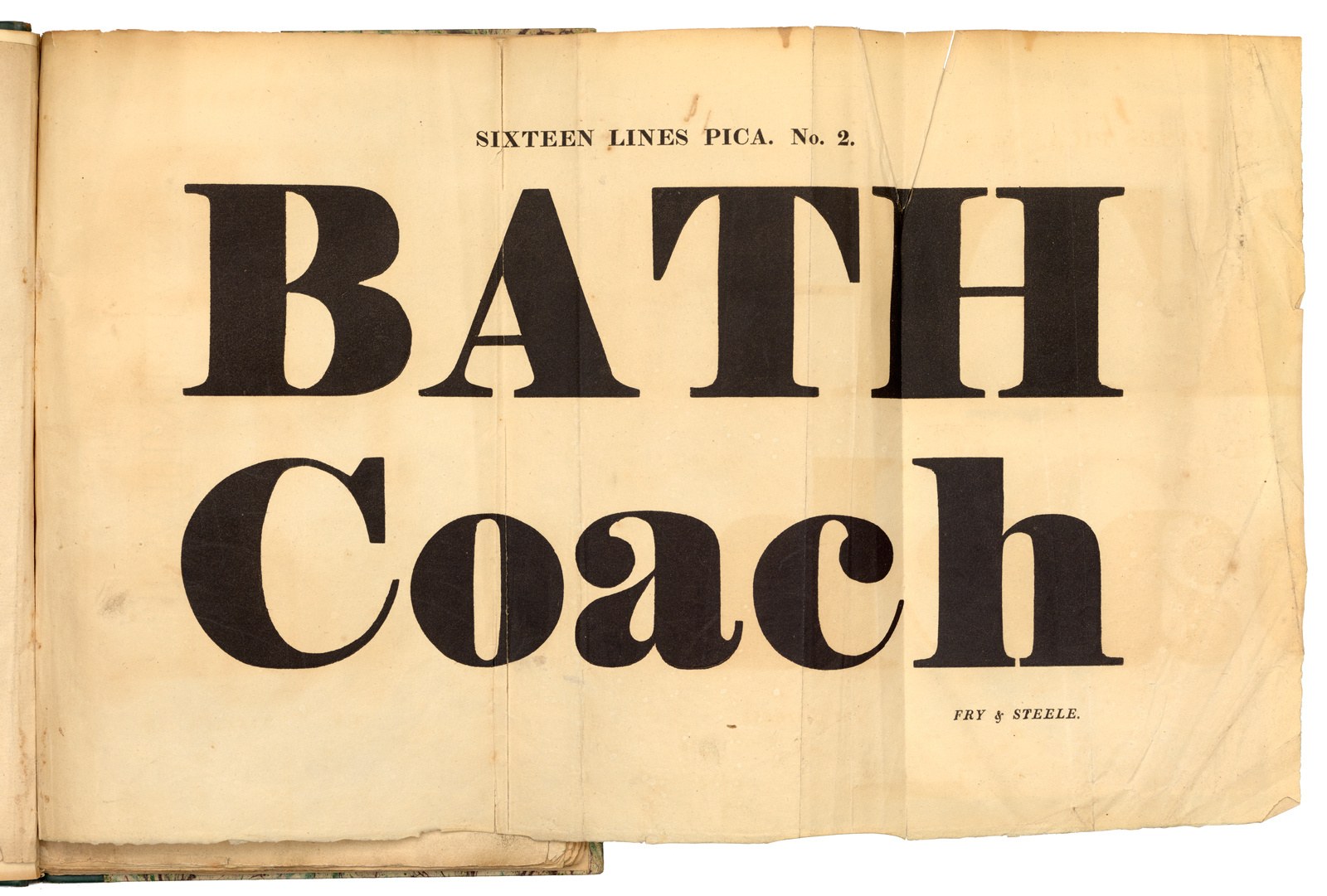
Large-sized bold modern type, produced by Fry and Steele during the first decade of the nineteenth century. This sample shows the direction that all foundries would follow in the next decade, culminating in the heaviest fat faces. Specimen is undated, but has various pages and watermarks dated between 1804–10. St Bride Library.
The increase in the size of the letters would not have surprised Drury—he would be surrounded by examples of large-scale letterforms, painted, carved, and manufactured. However, what would have surprised any engraver is how bold letters would become in the nineteenth century. The vertical stress and the simplicity of form make the modern a style where weight can be added logically to thick strokes, as much as the modern is suitable for increasing contrast. Though one can find examples of bolder old faces, these cannot compare with the modern letters introduced in the first thirty years of the nineteenth century. It is hard to be certain who is responsible for this change towards more exaggeratedly bolder forms, and it may be assumed that bold lettering predates bold type. We know that around 1808, Fry showed a bold style of letter and, from this time, letters would only become bolder with each year. By 1810, Thorne was certainly showing faces that we would consider fat faces.
Foundries continued to produce normal weights of the seriffed letter, although visually these became secondary to the bolder new styles. If we compare a version of Caslon and Catherwood’s Two-line Great Primer from 1803 with a version cut by the same foundry no later than 1821, the increase in the weight of thick stroke is over 60%, yet the thin remains almost the same and the x-height is only slightly larger. This was a time before large systematic type families of related weights, so no intermediate weights existed and the typography relied on extreme contrasts between size and weight. Brunel, on the other hand, follows contemporary models unifing multiple weights in one family. It comes in multiple weights: five in the text and eight in the hairline, including a light weight unseen in the nineteenth century.

Two Lines Great Primer, cut c. 1803. Specimen of Printing Types by Caslon and Catherwood, undated but before 1821. St Bride Library.

The bolder weight of the Two Lines Great Primer No.1. Specimen of Printing Types by Caslon and Catherwood, undated, but before 1821. St Bride Library.

Brunel differs from the model in that all the weights were designed to join together, from the roman that Drury would have cut, through to a black that belongs to the following decade. Modern methods also allow the designer to create great modulation in the weight range quickly.
The modern marks the beginning of the nineteenth-century explosion in new letterforms. The first of the moderns created by Drury for the Caslon foundry were exemplary of the style, showing a maturity and confidence in execution that match those of the continental masters. In Brunel, Drury also becomes the starting point for Commercial Classics, with this revival encapsulating the aims of the new venture, taking the past as a starting point from which to recreate and expand, offering something new, and—most importantly—useful with what contemporary designers expect from modern families.