Blanchard
Detail of Nonpareil Hair-Line, dated May 1834, shown in Specimen of Printing Types by Blake & Stephenson, Letter-Founders, Sheffield (Undated, with 1839 added by hand). St Bride Library, London.
The first third of the nineteenth century saw typefounders obsessed with making faces that were bigger, bolder, and as emphatic as possible. This was a movement centred in display typography. Counter to this was a fashion for imitating the qualities of engraving, in particular the lightness of line, often at small sizes. Founders had already created imitations of the copperplate script in the eighteenth century, which became one of the stock faces of any printer who needed to create stationery-related items. In the 1830s, typefaces that followed the distinct style of the engraver, such as the outline letter (a simple thin line around a form) began to appear. This was applied to many forms, even fat faces and blackletter. The addition of a light shadow, as can be seen in Caslon Doric Outline, or Blake & Stephenson Shaded, was a further development.
Such delicacy of form is testimony to the punchcutter’s skill to cut such fine letters―often at a small size―but also to the founders who had to strike the matrices and cast the type. This was only possible with ever-improving printing and smoother paper. The typefaces’ use is suggested by the copy: these are faces for small titles―names on cards, headings in text, and descriptions of imagery. Examples can be found in specimens of most of the major British foundries; Caslon, Figgins, Thorowgood, and Blake & Stephenson all show examples.
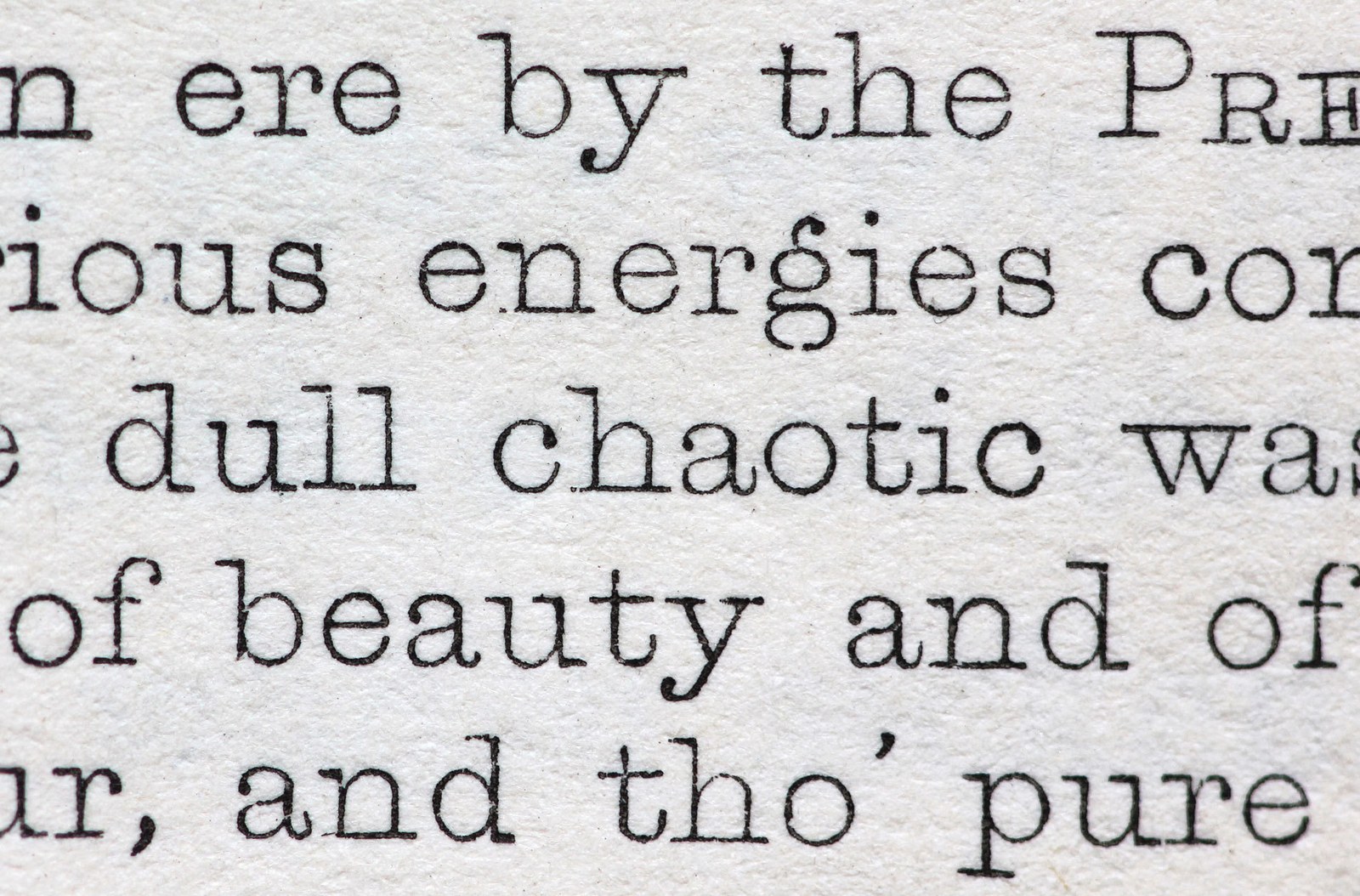
In 1834, Blake & Stephenson produced two sizes of Hair-Line, Pearl and Nonpareil, an ultra thin weight of slab, which is the model for Blanchard. In style, it seems to anticipate the lighter Clarendon/Ionic forms (but precedes them by several decades), which would in turn influence the monolinear typewriter faces. With such an evenness of weight, letters are reduced to minimums; the only obvious place that letters gain weight is in their ball terminals. On closer inspection, an interesting design decision is noticeable: many counters that are usually open are now closed. For example, the bottom serifs of the lowercase n join together. Such a conscious decision (was it easier for the punchcutter?) does not appear to affect legibility, for the reader hardly notices them. The letters are round in shape and well cut, with elegant proportions. The serifs are long, the capitals are wide, and the lowercase boasts a large x-height. The setting is of an entire block of text, rather than just a few words, suggesting that the face, with its lowercase, was intended for larger bodies of copy. The lightness of character also complements the fashions for light hairline ornamentation.
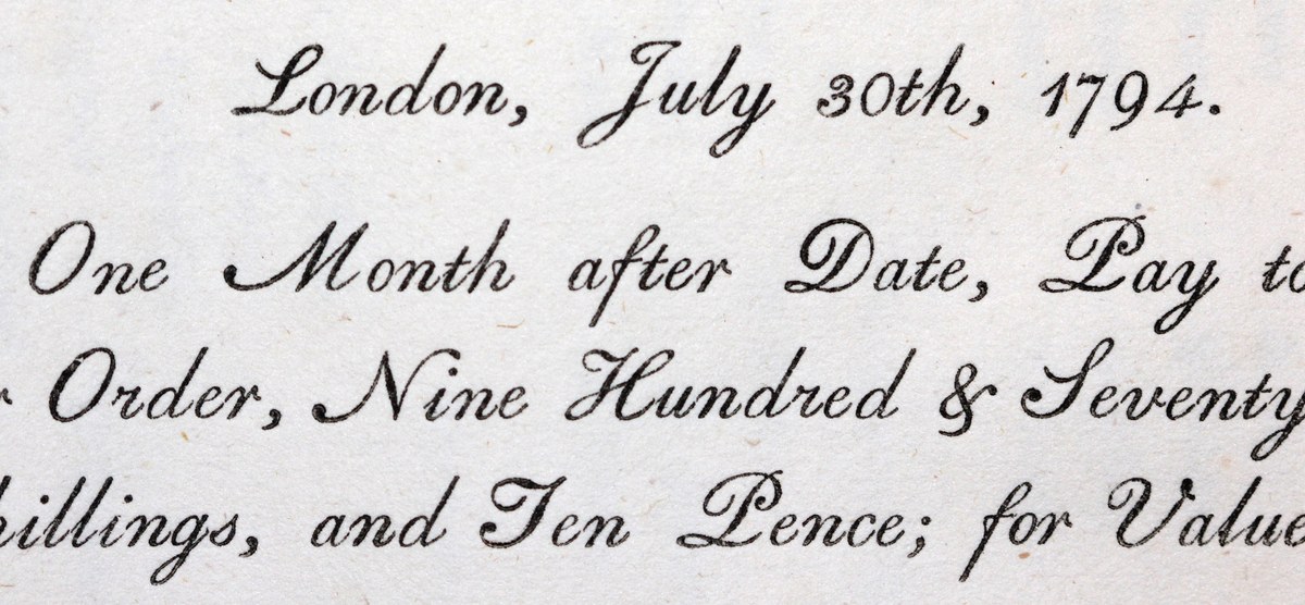
Copperplate script as imitated in type form: Two Lines Pica Script, as shown in A Specimen of Printing Types by Fry, Steele, & Co. letter-founders to the Prince of Wales, Type-Street. London, 1799. St Bride Library, London.
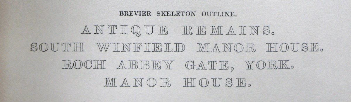
A bold outline serif letter, Brevier Skeleton Outline, as cut by Blake & Stephenson, in the 1830s. As shown in Specimens of Printing Types used by W. Blanchard & Sons, Printer, 62 Millbank Street, Westminster. c. 1860. St Bride Library, London.
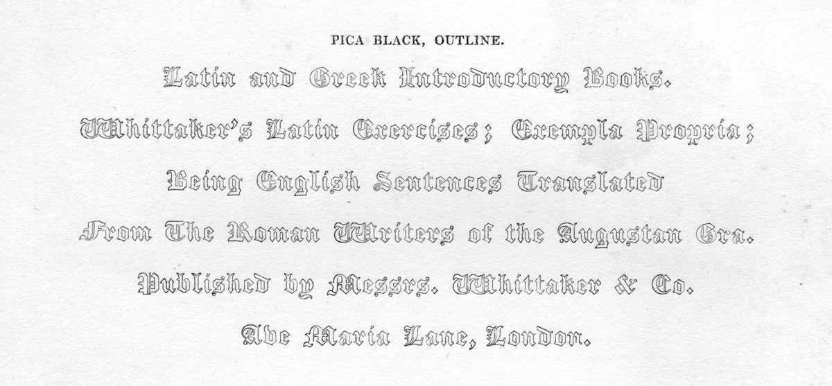
Pica Black, Outline, as shown in Specimen of Plain & Ornamental Types, from the foundry of V. & J. Figgins, 17 West Street, Smithfield, London, c. 1845.
Engraved letters from 1832, showing the influence of form upon the typefounders.
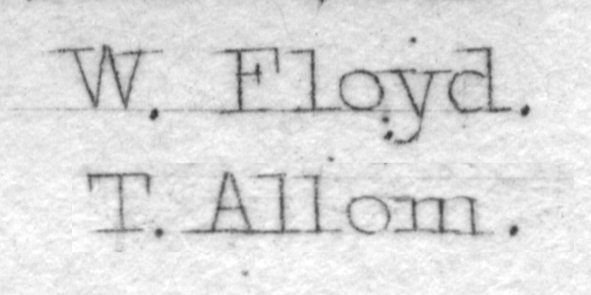
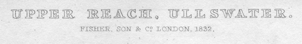
Blanchard simple structure with elongated slabs was clearly influenced by the style favoured by engravers. Like Blanchard, serifs often join each other. Steel Engraving by Allom & R. Sands, London, 1832.
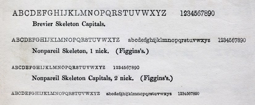
Long Primer and Nonpareil Skeleton, as shown in Specimen of Plain & Ornamental Types, from the foundry of V. & J. Figgins, 17 West Street, Smithfield, London, c. 1845.
During the 1840s, Figgins produced their own variant of the style, called Skeleton. The larger size, Long Primer, does have modulation in weight and the letterforms have proportions closer to the modern text faces of the time. The roundness of the ball terminals and the lack of serifs in the s give the forms softness. The smaller size, Nonpareil, is closer to those of Blake & Stephenson, but is not as refined in form. None of the serifs join, giving it a more conservative appearance.
Italics
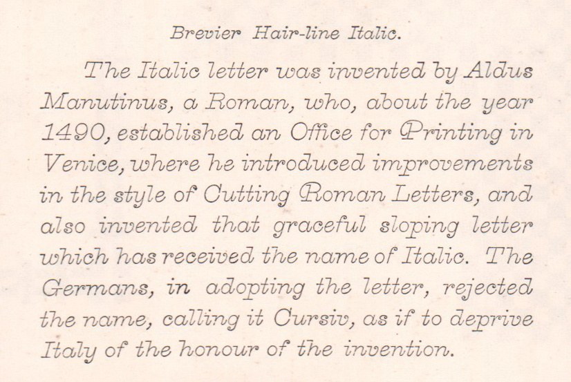
Brevier Hair-line Italic. As shown in Printing Types by Wood and Sharwoods, 1869. St Bride Library, London.
Neither Figgins or Blake & Stephenson produced italic variants of their hairline faces, suggesting the founders didn’t deem them necessary for setting, or that demand was great enough. At some point, American foundries began producing hairline italics of a more decorative nature1 in small sizes, though they are not matched with romans, nor did they appear to have produced hairline forms of romans or the light outline faces. The British foundries began to import these styles, though they also cut their own. Although less decorative than their American counterparts, the British foundries retained some flourishes, such as the spirals as ball terminals in the lowercase. Blanchard’s italic, a modern creation, is a paired-down cursive, with its flat introduction serifs and curved outward, tailward strokes.
Blake & Stephenson and Figgins faces as shown in Specimens of some of the Types, Ornaments, &c. in use by Spottiswoode & Co. New Street Square, London. c.1860s. St Bride Library, London.
In Britain, the appearance of roman thin slab serifs in specimens is limited to the 1830s and 1840s, though they continue to appear in printers specimens, such as Blanchard and Spotiswoode, into the 1860s. Cut in a small range of sizes, one can imagine its limited impact. In France, the style would gain greater success; the style appears in multiple sizes in the specimens of Deberny in the late nineteenth century, and can be seen in printers specimens in the first half of the next century.
Blanchard marks one of the lesser known styles of the nineteenth century2 and highlights one of many different directions that type forms developed. It demonstrates that trends can go in opposite directions, often at the same time. The appearance of such light forms is contemporary with the large, heavy condensed sans serif that dominated the founders specimens. It reveals how influenced the style of letterform could be by processes and techniques outside of typefounding, and how the hand-craft of engraving could be replicated in metal type in a cheaper and quicker way. Such lightness of letter suggests how fine punchcutters could make letterforms, and how well they could be produced by the founders. The style shows how different the slab serif form could be, the exact opposite of the large display faces we normally associate with the style. Blanchard is made not to grab attention with its density, but rather, seduce with its delicacy and sensitivity.
The French style of the hairline slab serif: elegant and delicate, its capital R follows its local tradition. It can be found into the twentieth century, as late as 1949, in the specimen of Benteli AG in Bern. This sample is in Le Livret Typographique Spécimen de Caractères, Deberny et Cie., Paris, c. 1890.
They are shown in the Condensed Specimen Book from the Boston Type Foundry, 1860.
Nicolette Gray ignores both Blake & Stephenson and Figgins hairline faces.