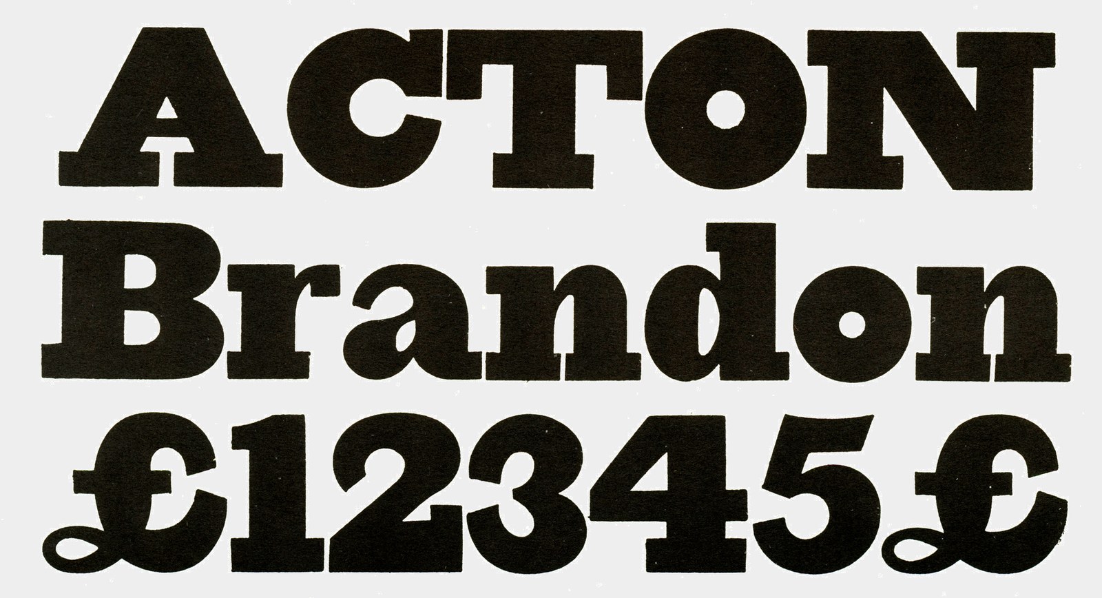
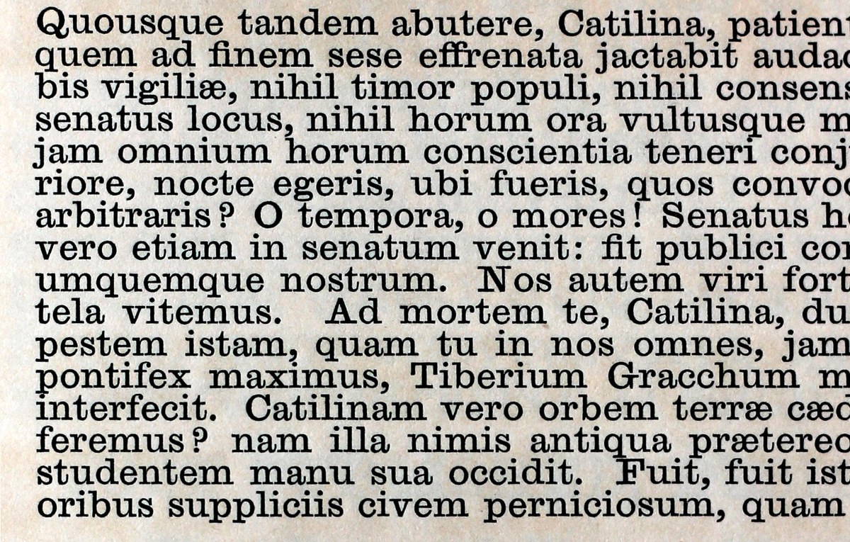
Antique No 6
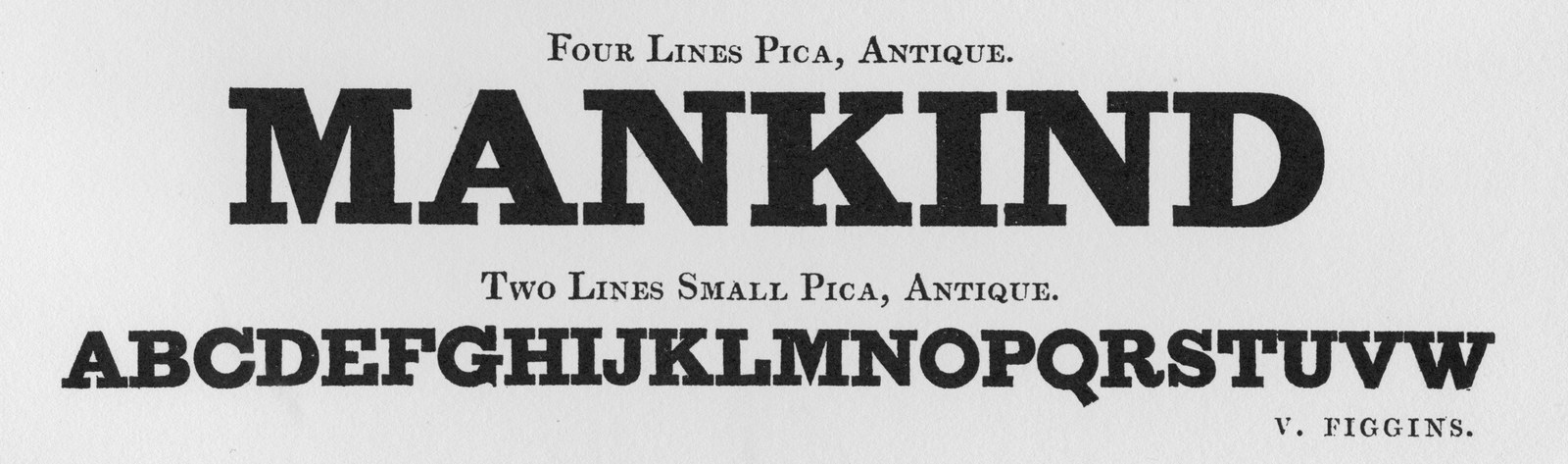
The first appearance of the slab serif: Four Lines and Two Lines Small Pica Antique. As shown in Vincent Figgins: Type Specimens, 1801 and 1815, Reproduced in facsimile, 1967.
An early slab by Edmund Fry suggests how some foundries wrestled with the new style. Geometry is clearly used in the O, C, and o characters, their lack of weight variation distracting from the overall colour. As shown in Specimen of Modern Printing Types by Edmund Fry, 1828. Facsimile, Printing Historical Society, 1986.
‘The most brilliant typographic invention of the century’
The slab serif first appeared in an 18151 Vincent Figgins specimen where four bold all-capitals styles were shown under the name Antique. Thorowgood’s later models used the alternative name Egyptian,2 as all things Egyptian were in vogue following Napoleon’s expedition in 1798. After the fat face, slabs were the second major typographic innovation of the nineteenth century. Considered a continuation of punchcutters’ experimentation with ways to make type darker, they reduced contrast even further and simplified serifs and terminals.
Slab faces offered new challenges: early variants often deferred to geometry in round characters, revealing where punchcutters struggled with the question of how much weight to add on thick versus thin strokes. Like most new designs of this period, the style originated in the world of lettering, and can be found on lottery bills dating back to 1810.3Nicolete Gray’s Nineteenth Century Ornamented Typefaces calls slab serifs “the most brilliant typographic invention of the century.”4
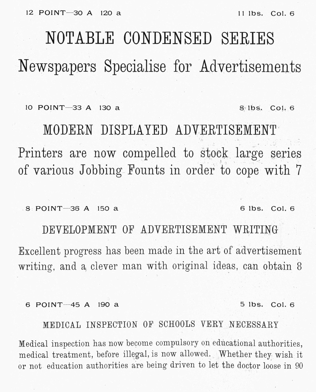
Immediately popular with printers for their eye-catching weight, founders increased production of slab serifs to meet the rising demand. Slabs are found in countless specimens of all the main protagonists: Caslon, Thorne and his successor Thorowgood, Fry, Wilson, Bower & Bacon, and Blake & Stephenson. Both exported and home-made variants swept continental Europe and the United States.
The variety of terminals in slab serifs from the first half of the nineteenth century. From left to right: Thorowgood 14-Line Egyptian (1825), Thorowgood Pica Egyptian (1837), Figgins 4-Line Antique No. 2 (1828), Figgins 4-Line Antique No.1 (1821), Austin 2-Line English Antique (1838), Blake & Stephenson 4-Line Antique (1832), Caslon 5-Line Antique (1825), Caslon 2-Line English Antique (1821), Caslon 4-Line Antique (1820), Bower & Bacon 12-Line Antique (1826), Fry 10-Line Antique (1824), Fry 6-Line Antique (1824).
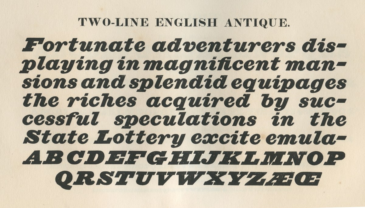
Two-Line English Antique Italic, Caslon & Catherwood, capitals 1821, lowercase 1825. As shown in Specimen of Printing Types by Henry Caslon, 1842.
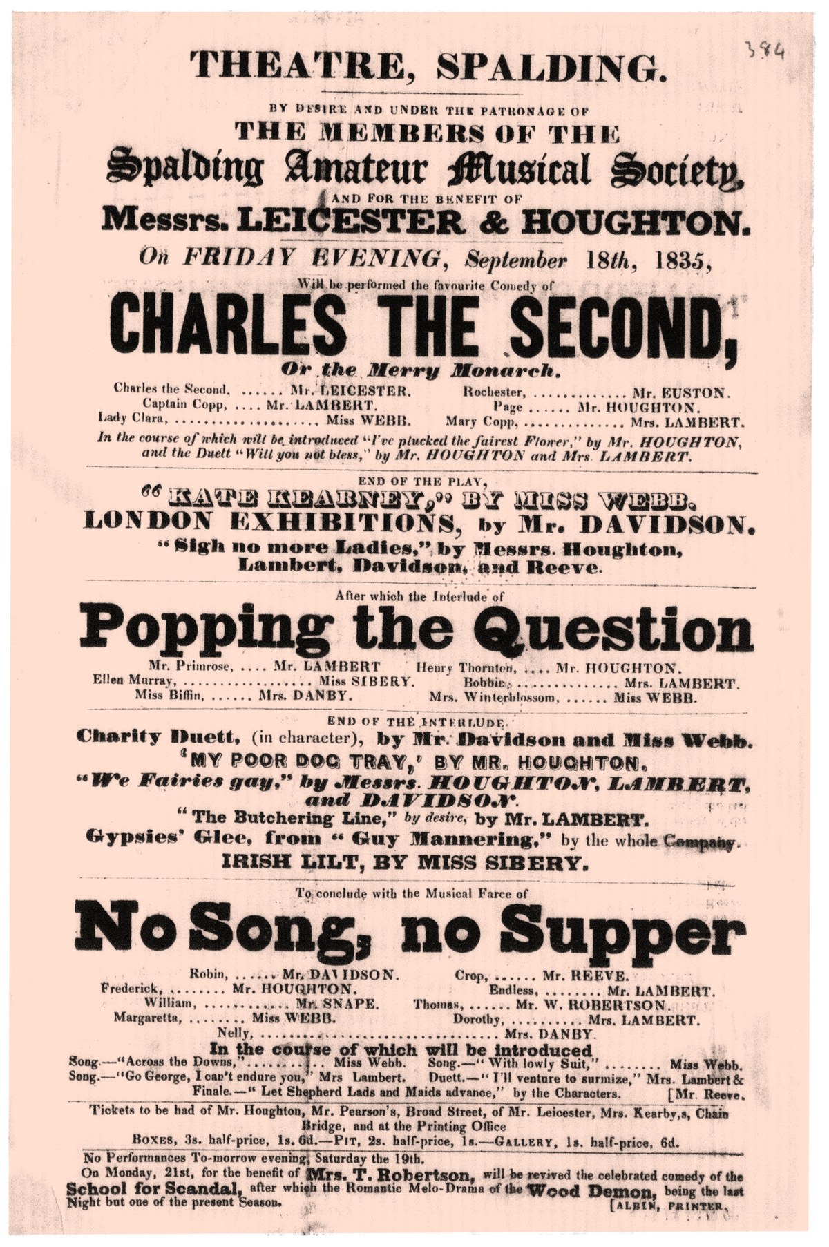
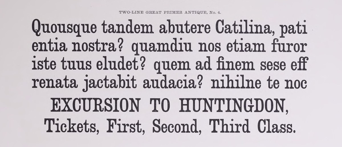
Slab serif in use in display titles, then in short bursts at text size for emphasis in the lower half of the playbill. Theatre, Spalding, 1835. British Library.
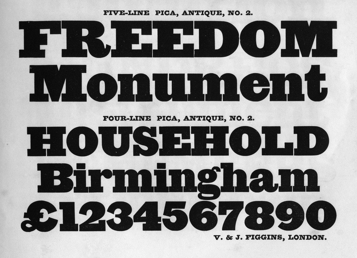
Four-Line & Five-Line Pica, Antique No. 2, c. 1825. As shown in Specimen of Plain and Ornamental Types. From the Foundry of V. & J. Figgins, c. 1845.
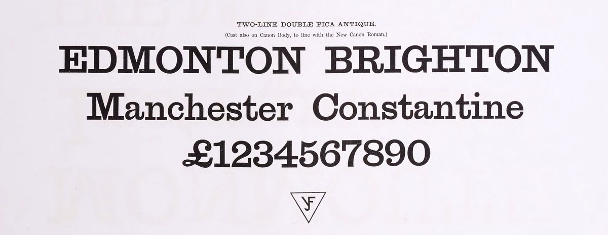
Lighter slabs appeared in the 1840s. Two-Line Double Pica Antique as shown in Specimen of Plain & Ornamental Types from the Foundry of V. and J. Figgins, 1858. British Library
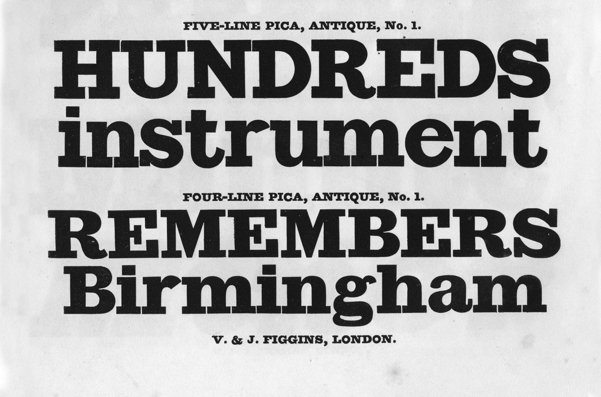
Four-Line & Five-Line Pica, Antique No. 1, Capitals c. 1817, lowercase c. 1821. As shown in Specimen of Plain and Ornamental Types. From the Foundry of V. & J. Figgins, c. 1845.
Four-Line & Five-Line Pica, Antique No. 2, c. 1825. As shown in Specimen of Plain and Ornamental Types. From the Foundry of V. & J. Figgins, c. 1845.
Lighter slabs appeared in the 1840s. Two-Line Double Pica Antique as shown in Specimen of Plain & Ornamental Types from the Foundry of V. and J. Figgins, 1858. British Library
Four-Line & Five-Line Pica, Antique No. 1, Capitals c. 1817, lowercase c. 1821. As shown in Specimen of Plain and Ornamental Types. From the Foundry of V. & J. Figgins, c. 1845.
Four-Line & Five-Line Pica, Antique No. 2, c. 1825. As shown in Specimen of Plain and Ornamental Types. From the Foundry of V. & J. Figgins, c. 1845.
Antique No. 6
Antique No. 2: Appearing only it text sizes, it is described as ‘Baskerville Series.’ In design and proportion they are close to the Ionic or Clarendon. Specimen of Plain & Ornamental Types from the Foundry of V. and J. Figgins, 1850. St Bride Library.
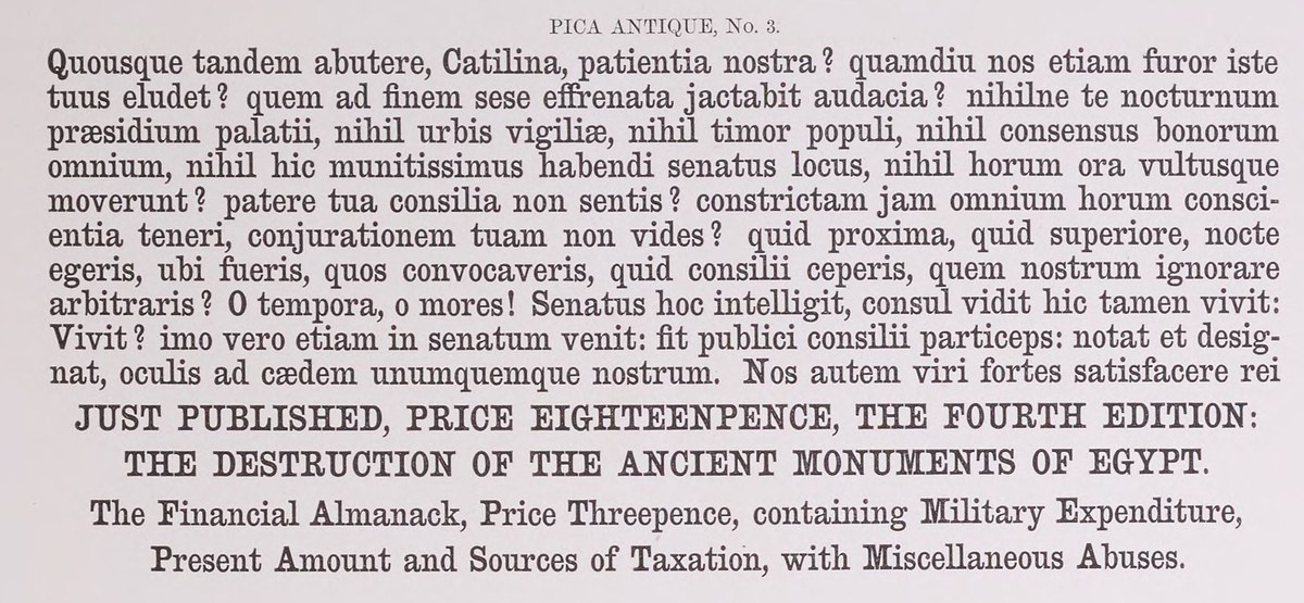
Antique No. 3: A condensed design with bracketed serifs. As shown in Specimen of Plain & Ornamental Types from the Foundry of V. and J. Figgins, 1858. British Library.
Antique No. 2: Appearing only it text sizes, it is described as ‘Baskerville Series.’ In design and proportion they are close to the Ionic or Clarendon. Specimen of Plain & Ornamental Types from the Foundry of V. and J. Figgins, 1850. St Bride Library.
Antique No. 3: A condensed design with bracketed serifs. As shown in Specimen of Plain & Ornamental Types from the Foundry of V. and J. Figgins, 1858. British Library.
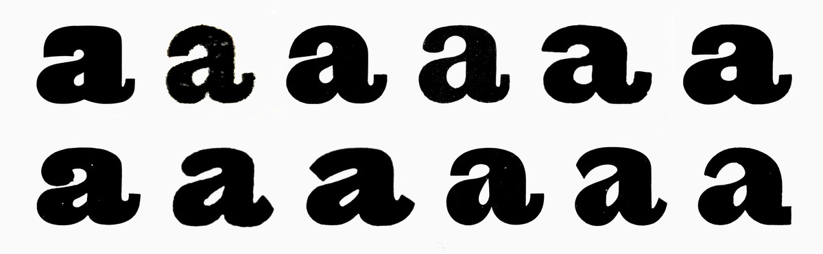
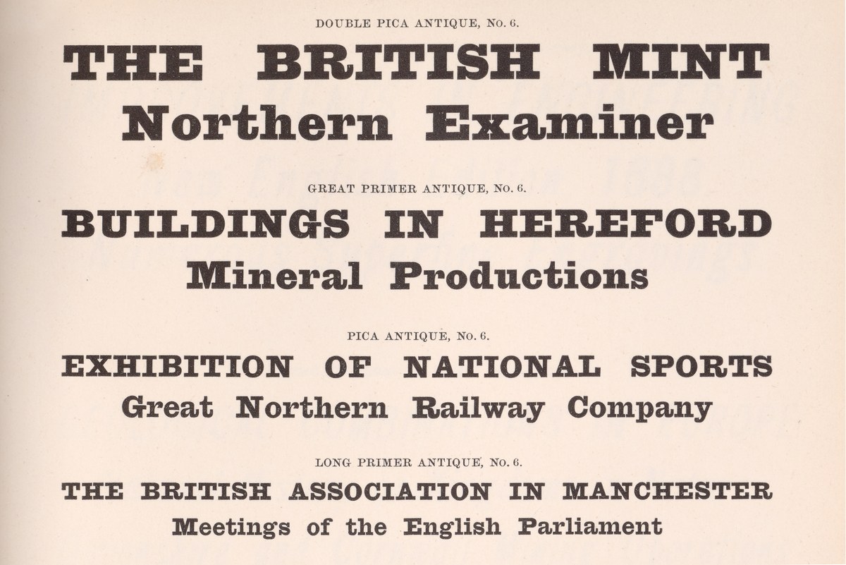
In the second half of the nineteenth century, the Figgins foundry produced a series of new slab designs. Sequentially numbered 2 to 6, they do not form an obvious family bar that they are slab serifs. Antique No. 6 first appears at some point in the 1870s, in a series of sizes 24pt and below. Bolder than Antique No. 2, its weight is closer to the slabs of the first half of the century, but departs structurally from its predecessors. The overall character is squarer and have thickening horizontal flat terminals . As the first slabs followed the skeleton of the modern style of this period, these later slabs reflect the modern of the time. The exaggerated tail of the a is similar to one you might find in a face such as Modern No. 20. The strokes turning inward in the a and r is also typical of many sans of this period, as seen in Caslon Doric.
The face remained in production even as the design was transferred to the successors of the Figgins foundry: first to R. H. Stevens, and then to Stevens, Shanks & Sons. The latter continued to produce the face into the 1970s, making it one of the last genuine nineteenth-century slabs casted. In twentieth-century Italy,5 the Nebolio foundry acquired and renamed it Egiziano. As Egiziano, it gained popularity in the United States in the 1970s, where it was adopted by art director Roger Black.

The modern and the slab share the prominent tails on the bottom of the c, a, t, and R, the curved upper to the t, the ear of the g, and the inward top of the c. The slab and sans have the inward stroke endings of the a, r, and y. Figgins Canon No. 4 Modern, Antique No. 6 Medium, and Caslon Doric Bold.
The modern and the slab share the prominent tails on the bottom of the c, a, t, and R, the curved upper to the t, the ear of the g, and the inward top of the c. The slab and sans have the inward stroke endings of the a, r, and y. Figgins Canon No. 4 Modern, Antique No. 6 Medium, and Caslon Doric Bold.
From top: Thorowgood Pica Egyptian (c. 1837), Figgins Antique No. 6 (1870), Caslon Ionic No. 2 (1860s). The early Egyptians often had dramatically heavy capitals (frequently cut as standalone alphabets, with lowercase added much later) and a rounder appearance than Antique No. 6. Read more about the family tree of slab serifs in the story for Caslon Ionic.
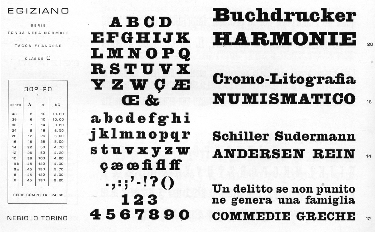
Antique No. 6 reappeared in Italy as Egiziano. As shown in a Nebiolio specimen from the 1960s.
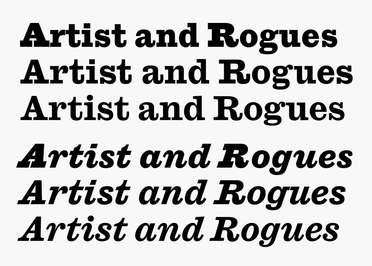
Antique No. 6 Reborn
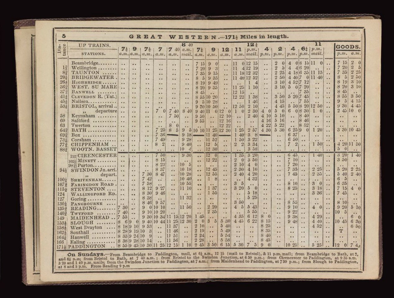
Slab serif used as a bold companion to a modern. Nineteenth-century printers mixed and matched styles where emphasis was needed, such as in this early example of a railway timetable. As shown in Bradshaw's Railway Companion timetable, 1843. Science Museum Group, reproduced under Creative Commons.
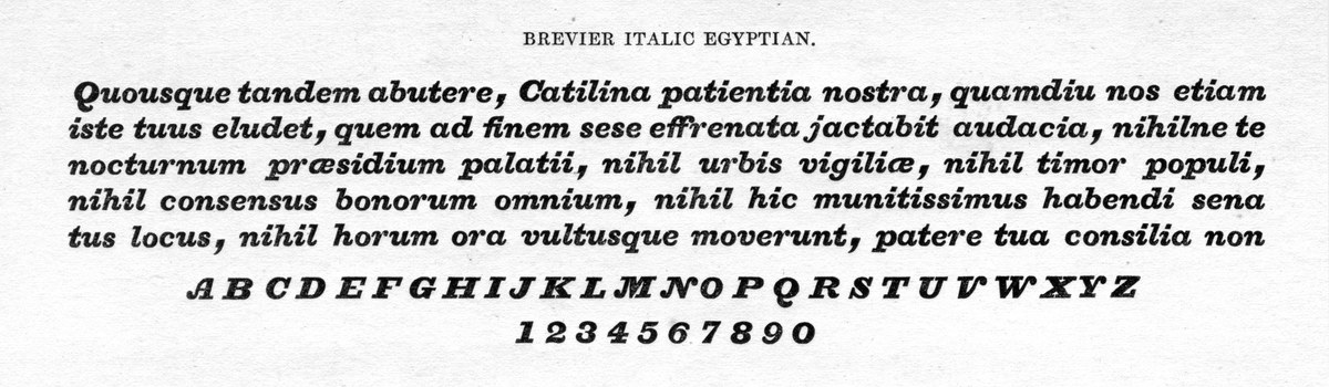
The original premise of remaking Antique No. 6 was as a bold companion to Caslon Ionic, much as nineteenth-century printers mixed and matched styles where emphasis was needed. To this end, the proportions were gently altered to match the Ionic, and an italic was added, as none was originally cut. Rather than being cut as a complement to every size of roman, italics appear sparingly, though a study of playbills suggest they enjoyed a degree of popularity in the British isles. In text, they are a rarity: only Thorowgood, Blake & Stephenson, and the small foundry of Hugh Hughes,6 showing them. Hughes work is little known and his italics show a refreshing approach to style with tails that are flat on the inside with little curvature on the outsides. Antique No. 6 italic is a cursive, rather than slanted but with a stiffness found in the roman, with flat upper serifs in the lowercase that contrast with the round lower tails. Other letters have been simplified such as the tailless f, the lack of terminals on the s, and the v and w.
With seven weights, Antique No. 6 offers a slab serif that has the authenticity and character of the historical model, while offering the variety of a modern workhorse face.
Slab serif by Hugh Hughes, with the rarity of the single storey a and g in the roman. As shown in A specimen of Book and Newspaper Printing Types by Hugh Hughes, London, 1825. St Bride Library.
The specimen has a watermark for 1817, which suggests that the type itself may be dated to then.
Confusingly, Egyptian was the name Caslon IV had used for the first sans serif type, and can be seen in contemporary literature referencing the sans form.
A lottery bill by Swift & Co., 1810 from the British Library as shown in James Mosley’s, The Nymph and the Grot, an update.
Second edition, 1976. See also “Slab-serif type design in England 1815–1845,” Journal of the Printing Historical Society, No. 15, 1980/81, which is the most comprehensive study of this period.
The design can also be seen in German founders’ specimens. For example, in Stempel, it’s called Bret Fette Egyptienne.
Hugh Hughes was a punchcutter, famed for his music type, who worked for both Thorowgood and Caslon before setting up his own foundry.