The proof is in the proof: Action Grotesque
Some typefaces look good large.
Some typefaces look good small.
Some typefaces were designed to look good large.
Some typefaces were designed to look good small.
Some typefaces were designed to be read at large sizes.
Some typefaces were designed to be read at small sizes.
Some typefaces were designed for paper.
Some typefaces were designed for screen.
Action Grotesque was designed to be read at small sizes onscreen. It would work equally well set small on paper. Yet the decisions that make it excel at small sizes give it a distinct personality when used at large sizes. Rather than paying lip service to small-sized demands with exaggerated quirks, Action Grotesque does its job with quiet authority—a dependable workhorse for complex typographic tasks that reveals unexpected character at display sizes.
Designed by Dutch master Erik van Blokland, Action Grotesque follows in the footsteps of its siblings, Action Condensed and Action Text, while moving into new territory. Where the earlier faces are condensed, the Grotesque is wider and more open. Van Blokland originally called it ‘Action Micro’, conceiving of it purely as a small-sized face. In this ambition it echoes the classified-advertising types designed by Walter Tracy for Linotype, such as Adsans and Doric—pragmatic designs shaped by the realities of reproduction and scale.
By widening the letterforms and giving the lowercase greater presence, Van Blokland enhances clarity at small sizes, making the typeface ideal for websites and apps, where legibility is critical. In doing so, he reconnects with a long typographic tradition: designing forms for specific sizes rather than assuming one drawing can serve all purposes. The punchcutters of the past adjusted each size by eye, a practice described succinctly by Harry Carter in his essay ‘Optical Scale in Typefounding’ (Typography 4, 1937). As Carter observed of the best craftsmen, ‘They did so instinctively because they corrected their work by eye, and they had the wisdom not to let mathematical rules override their judgment.’
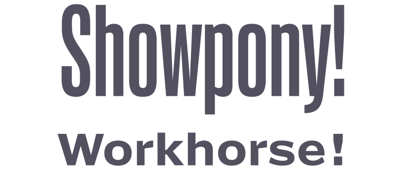
Action Condensed Medium Grade 3 with Action Grotesque Heavy
Details such as the tail of the f, which so dramatically opens up as the weight of the face increases, begin to take on a chiselled style. Designed to avoid the filling-in between the ascending tail and the bar, the tail lightens and a large diagonal cut is made into the bar. This all seems to recall some of the audacious visual tricks Van Blokland has developed in his groundbreaking display families. Yet it feels entirely in character with the rest of the face.
The term Grotesque—an English spelling predating the German Grotesk, first used in London in the 1830s by Thorowgood and later adopted by Stephenson Blake for the foundry’s sans serifs—might suggest a historical face. Yet Action Grotesque feels entirely contemporary. Drawn digitally for digital use, it makes no nostalgic concessions. Familiar shapes appear only where they serve clarity. The confidence of the drawing is evident: every detail feels resolved.
Like many typefaces, Action Grotesque grew from Van Blokland’s own need for a face that functioned impeccably under demanding conditions. His thinking begins with the reader. People do not simply consume text; they adjust their viewing distance, their device, their posture. Type choice is only one factor in legibility, but here legibility has been pursued rigorously. The speed of on-screen proofing allowed Van Blokland to test ideas constantly. Even the italic—set at a precise 9.4623°—strikes a careful balance: distinct from the roman without being distracting, it produces pleasing anti-aliased transitions across the pixel grid.
Conceived as a variable font, Action Grotesque offers five defined weights from Thin to Extra Bold. They provide range without excess. None are so light as to teeter ‘on the edge of observable,’ as Van Blokland writes in his essay on Action Grotesque, nor so heavy that they fail at small sizes. The steps between weights are clear enough to support complex hierarchies. The Thin and Regular share almost the same width—a vestige of an early intention to duplex them—and now differ only subtly.
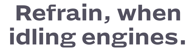
Action Grotesque Heavy, showing the distinctive f and g and unambiguous punctuation
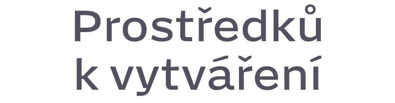
Action Grotesque Regular, in Czech
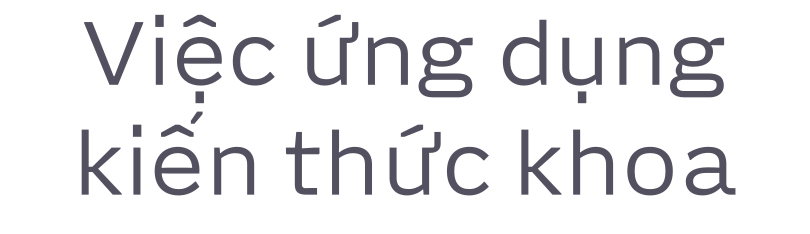
Action Grotesque Light, in Vietnamese