A spiky-soft text serif from Sandrine Nugue is a playful response to one of the most iconic French typefaces of the twentieth century.
Delusse, Sandrine Nugue’s third release with Commercial Type, is not a revival of François Ganeau’s legendary Vendôme. It’s more like a conversation with Vendôme—a lively weaving in and out, a strategic divagation that produces a design extremely well suited to longform text. It’s also a continuation of Nugue’s long-standing interest in Ganeau, a curious figure in design history after whom she named her first typeface, a serif family in three optical sizes that she developed as a degree project while a graduate student at ÉSAD Amiens. Nugue named the new release after Marguerite Delusse, a talented music engraver from the late eighteenth century who used her maiden name, Marguerite Vendôme, professionally.
Published in 1950, Vendôme was one of the Fonderie Olive’s greatest successes. Together with Antique Olive, Vendôme was ubiquitous in France in the buoyant post-war years known as les Trente Glorieuses, and was even widely imitated by sign painters. It was the only typeface designed by Ganeau, an artist and set designer who had no previous experience drawing type—although, according to his colleagues Gérard Blanchard and José Mendoza, it was closely supervised by Roger Excoffon, if not almost entirely shaped by him. Vendôme’s remit was to compete with Deberny & Peignot’s hugely bankable Garamont. Perhaps inevitably, though, given the relative “outsiderness” of its designer(s), Vendôme ended up looking wildly original. And whereas Garamont enjoyed the status of an eminent book face in France for many decades, Vendôme got more traction in advertising and signage, perhaps because of its kinetic appearance and the slight but discernible slope of its stems.
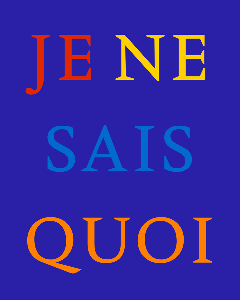
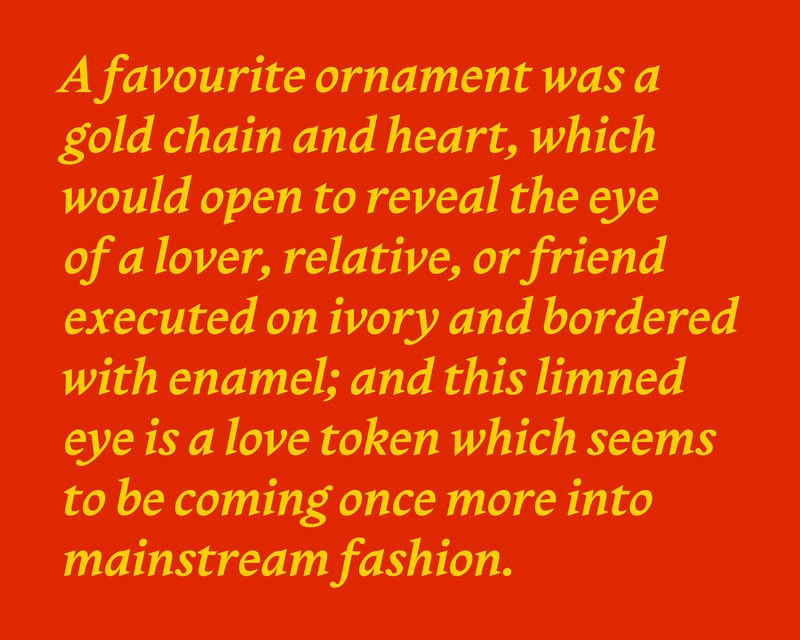
Delusse has a fairly low overall contrast and stands plumb, which produces a dense color and a stable presence for immersive reading, whether on pages or on screens. Ample, flat feet on many of the glyphs combine with substantial, jaunty spurs on a, d, and u, both anchoring and propelling words in and across lines of text. Whereas Vendôme’s comma, semicolon, and quotation marks look like sleet on a windshield—barely there, rapidly vanishing—Delusse’s punctuation is dark, strong, and legible, providing clear, unambiguous beacons for readers.
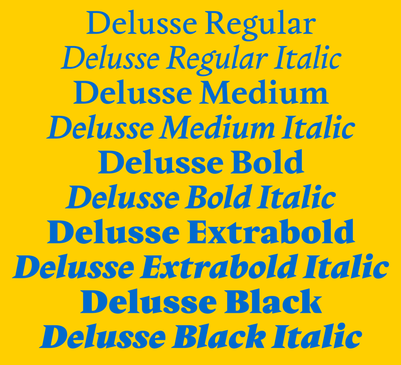
The regular weight is already pretty dark, and the family only gets deeper and darker from there, gaining contrast and proceeding to a Black that, in the roman, would almost seem to gesture toward the glyphic Latin typefaces from Stephenson, Blake—with sharp wedge serifs on some letters—if not for the sinuous curves that materialize elsewhere. Instead of following a predictable system of rules, Delusse organizes itself around a surprising network of spikes, points, beaks, teardrops, and inflections.

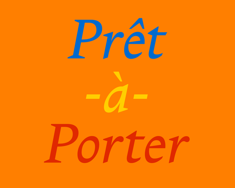
Another important way Delusse departs from Vendôme is in the italic. Vendôme’s “italic” is in fact an oblique roman, a particularly twentieth-century conceit. Nugue gives us a real italic, albeit somewhat romanized, with sharp serifs prevailing over more traditional cursive forms in spots. Because we tend to use italics less frequently than uprights, the italic can be a fantastic playground for experimentation, and Nugue takes full advantage of this. Pointed, capuchin-like hoods on a and q add a wonderful, offbeat texture; it’s a move that recurs in other Nugue faces as well. The italic k with its triangular top serif and ribbonlike looped bowl nods to the Garamond italics we may be more familiar with—but that’s pretty much the only way it resembles a classic Garamond. At first glance, especially in the Regular weight, you might not think of Delusse’s italic as reverse-contrast. It sneaks up on you. As weight and contrast increase, you become aware of just how fully bonkers this italic is. Look at the countershapes. Look at the intuitive, astonishing way Nugue swings the weight around.
Although Nugue found her way into type design through a fascination with the neural mechanics of reading, Delusse is the first typeface she has published that could be decisively classified as a book serif. Camelion, the mischievous humanist sans she released with OH no, originated in a lapidary all-caps display alphabet for a book-cover commission before she added a lower case; it’s ideal for body text, but also works well large. Other designs of Nugue’s, like Moulin and Infini, would be more readily considered display faces, but perform remarkably well at smaller sizes and in running text. If reading and readability remain paramount for Nugue, so does a strong personality—and somehow, throughout her work, she never sacrifices one for the other. She has designed Delusse specifically with immersive reading in mind, but its quirks, its oddities—its delights—ensure that it will also be an entrancing choice for everything from headlines and pull quotes to signage and supergraphics.
Delusse doesn’t imitate or even pay tribute to Vendôme. Nugue in fact prefers not to look too closely at a source for fear of copying it or attempting to redesign it. Instead, she metabolizes it. She musters memory and a strong sense of type history when drawing a new face (first by hand, then on screen). The upshot is that Delusse is uncanny in the strongest sense of the word. When you first lay eyes on it, you might think you are looking at Vendôme. If you look more closely, though, you start to unwind layers of complexities. Delusse is both deeply familiar and—particularly in the italic—utterly strange.
There’s a beautiful scene in Agnès Varda’s Jacquot de Nantes where an adolescent Jacques Demy goes to a showing of To Have and Have Not with a couple of friends. After the movie, Jacquot explains how to shoot a moonlight scene in full daylight by bouncing the sun off a reflective surface through a red filter. His friends stare at him. “How do you know all that?” one of them asks. Jacquot seems surprised by the question. Finally he shrugs and responds: “I learned it.” This is how we learn: We fall in love with things. We metabolize them. Jacquot doesn’t know how he learned what he learned or how he knows what he knows—he just knows. Nugue just knows.
Because Delusse scales up and down so well, you could set all elements of a book or magazine in it to great effect. But you could also reserve Delusse for body text, combining it with the narrower and more sculptural Moulin for titles, headlines, pull quotes, and captions. The two faces share similar darkness, robustness, and vertical proportions—as well as some of the same preoccupations. Moulin was Sandrine Nugue’s second release with Commercial Type.

Pair quirk with quirk. Paul Barnes, with help from Dave Foster, drew Marr Sans based on a few lines in three sizes and a single weight of a grotesque found in an 1870s specimen from James Marr & Co. The seven-style family proceeds from a Thin to an Ultra Black that serves as a wider complement to the six lighter weights. Departing from the drive toward homogeneity and systematization so prevalent in twentieth-century sans serifs, Marr Sans exhibits the organic shapes and eccentricities of a new form still finding its way. It’s an ideal companion for a serif with a strong personality, like Delusse.
Royal Gothic taps roughly the same time frame as Marr Sans, but approaches it from a different direction. Although it clearly exists in a lineage with earlier British grotesques, it experiments with unprecedented contours and features that push it into an entirely new subgenre: the square sans, one of the great innovations of the period. Drawn by Paul Barnes with assistance from Luke Charsley and Tim Ripper, Royal Gothic shares Delusse’s darkness and vertical proportions, but parries the serif’s points and spikes and unexpected softness with a square sobriety.
 |
 |
 |
