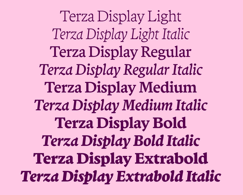
After releasing Terza, Greg Gazdowicz noticed that some designers were using Terza Reader—crafted with continuous text and immersive reading in mind—at large sizes. So he made a proper display cut. People especially seem to love the italic.
It’s always interesting to see a typeface that was designed for a particular context doing something entirely different. You can be innocently walking up Sixth Avenue, for example, and stumble upon a new burger joint using Georgia at an absolutely gargantuan point size for its signage. Or you can be riding a crosstown bus when you glance up and notice that a designer has used Unibody 8, originally made for use on the web at 8pt, as a display face in a print ad. Some people might consider this a mistake. Is it?
Desire lines are departures from “official” imperatives. Spontaneous erosions carved into the earth over time by pedestrians who want to chart their own path, desire lines have been likened to scars. But they are also opportunities. After releasing the Terza Collection in 2021, Greg Gazdowicz noticed that people seemed to want to use Terza Reader as a display face. They were tracking it in, but then struggling with colliding extenders when trying to tighten up the leading accordingly. Greg figured that if people wanted to use the typeface this way, he might as well help them out. He started filing away ideas that turned into Terza Display.
Terza explores the various ways people interact with a piece of digital text throughout its life cycle—and the tempos at which they interact. We made a website showing Terza’s original three modes, or “speeds,” in play. The Reader variant, the “fastest” of the three, draws on and takes its place in the rich tradition of book types; it served as the collection’s starting point, from which the other variants, Author and Editor, deviated. Engineered with the sustained energy and quiet immersion of longform text in mind rather than the concentrated oomph and slower tempo of headlines, titles, or wall text, Reader was in part influenced by the late artist Mirtha Dermisache’s work, which strips written language down to its most basic impulses, shapes, and textures. Greg also looked to Bembo, Centaur, and Poliphilus, all based on the Aldine text types cut by Griffo—in use since the Renaissance—for their fairly low contrast, diagonal stress, and shapes informed by cursive handwriting and the broad-nibbed pen.
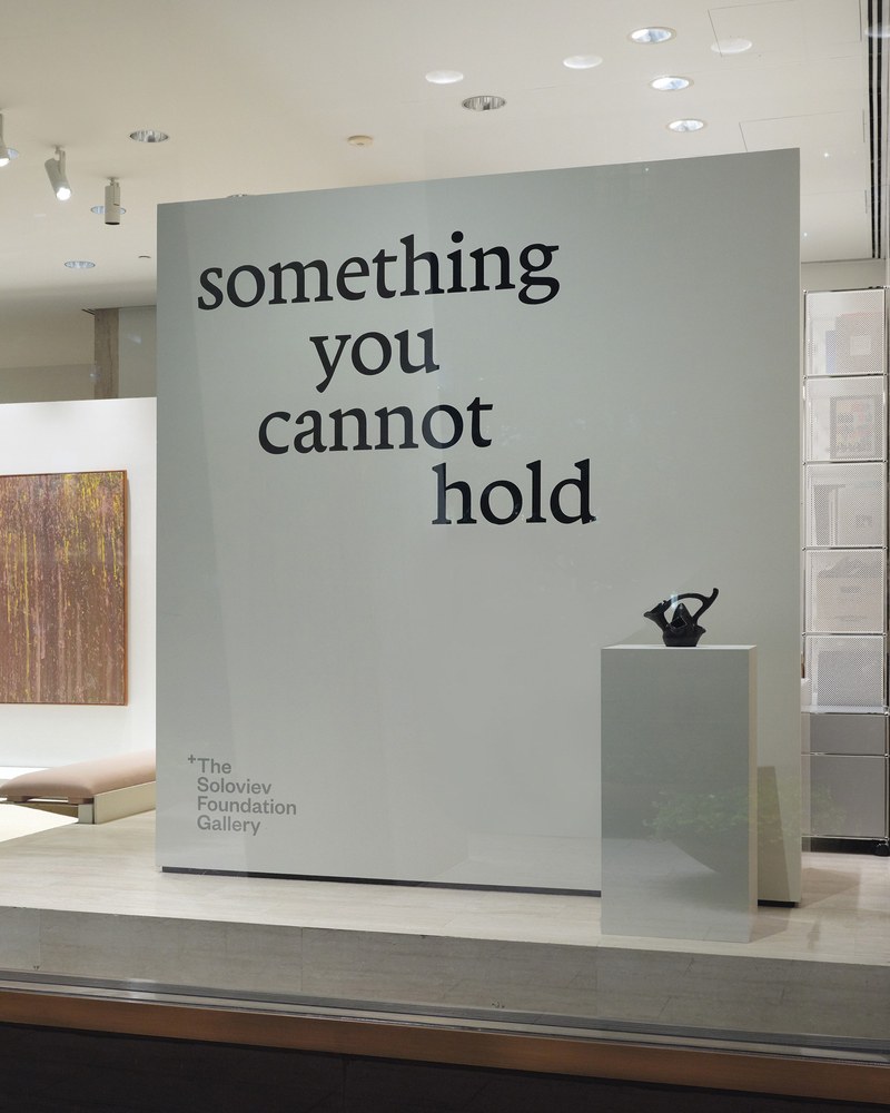
The product of all of this research and experimentation was a text face that excels at furnishing a comfortable immersive reading experience on screen and in print. And yet something about Terza Reader compelled people to want to set it big from the jump. Designer Taylor Loutsis started using it for his publication The Canvas, not only for running text but also for things like pull quotes and headlines. (Loutsis later chose Terza Display for the redesign of AN Interior, debuting with the Fall/Winter 2024 issue, on newsstands now.) Yotam Hadar used the Reader variant for wall text in an exhibition at the Soloviev Foundation called something you cannot hold. Adam Ho initially used Terza Reader tracked tight and slightly modified in a logotype for the financial services company Paradigm (the company has since switched to Terza Display). And Jonny Sikov of Pentagram told Greg that he had tried to set Terza Reader large for a project but that he hadn’t been entirely satisfied with the results. The writing was on the wall, so to speak: Terza’s users indicated which moves Greg could make to transform Terza Reader into a display face.
Display serifs often dial up the contrast as their intended size increases and can become quite attenuated, but Terza Display remains as muscular as the text cut. Its low contrast highlights the lively tension between its soft and crisp shapes—its hard softness. And whereas Terza Reader engaged Renaissance book types, the Display cut invokes a more recent history: the meaty, low-contrast serifs like Cushing, Novarese, Symbol, and Veljovic that ITC was putting out in the 1970s and ’80s.
The italic mixes sloped roman caps with a cursive lower case to create a syncopated rhythm. Curvy, bouncy, and dynamic, the italic nevertheless maintains a cohesive, even texture. Greg wound up modifying the angles of some of the lowercase glyphs to make Reader Display’s italic a little less “wandering” than that of the text cut.
Desire lines have much to teach us. Designers wanted to go their own way with Terza Reader and Greg paid attention, creating a useful extension to Terza and furthering the same exploratory, heuristic spirit that drove the original collection. Sometimes design is less about planning and more about watching, listening, and doing.
Photo: Bonnie Morrison
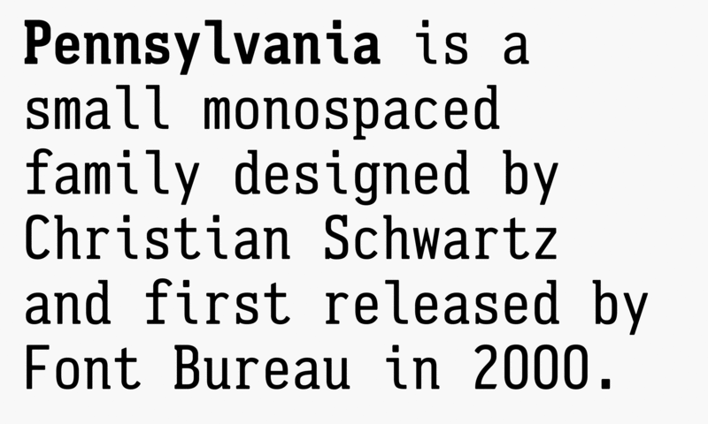
Drawn when he was a design student at Carnegie Mellon and released by Font Bureau in 2000, Pennsylvania allowed Christian Schwartz to fill a perceived gap—most monospaced type in the nineties seemed to be based only on computer or typewriter fonts—and to explore his interest in letterforms specific to a particular place. Using the stamped-metal semi-serif capitals of Pennsylvania’s license plates at the time as a starting point, Christian added a lower case, small caps, and punctuation to make a petite family with an unusually even overall color. Earlier this year, Inga Plönnigs deftly picked up where Christian left off, taking his rough sketches for a proportional sans companion to make a full family in regular and condensed widths. She also drew a slab family, referencing the serifs on some of the letterforms in the original mono. “Going back into work I started 25 years ago was strange and surreal and not something I would recommend to anyone,” Christian wrote on Mastodon. The full collection of four families is now in the Vault.
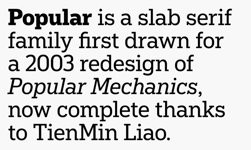
Christian Schwartz designed Popular for Robb Rice’s redesign of Popular Mechanics in 2004. Rice was looking for a slab that would fuse the awkward, industrial appeal of DIN standard lettering with the 1930s powerhouses Rockwell and Stymie. Aside from the magazine it was originally commissioned for, Popular has appeared in other publications over the years, including the Minnesota Star Tribune, which has used the family for over two decades, electing to keep it around in the paper’s latest, sweeping redesign. Popular is at long last available for licensing thanks to an update and italics by TienMin Liao.
Paul Barnes and Greg Gazdowicz published Caslon Ionic in 2019, basing it on the influential Ionic No. 2. A lighter variant released by Caslon in 1854, its text sizes featured a generous x-height, compact extenders, wide capitals, and a narrow lowercase. Paul and Greg updated it for contemporary use, supplementing it with three additional weights and a freshly imagined italic. Not long after its release, though, designers started letting us know that they would appreciate even lighter weights that preserved the low contrast associated with Ionics. We listened, and in 2023 Paul and Greg added Thin and Light weights to the family. Caslon Ionic’s robustness means that it works exceptionally well on screens and in running text, even in its lightest weights. Pairing a serif for display with an entirely different serif for body text takes guts, but, if done with care, the results can be stunning. Now that Terza Display is out in the world, you could of course pair it with Terza Reader for body text. Or, for a little extra intrigue and crispness, you could pair it with Caslon Ionic. Try it.
 |
 |
 |