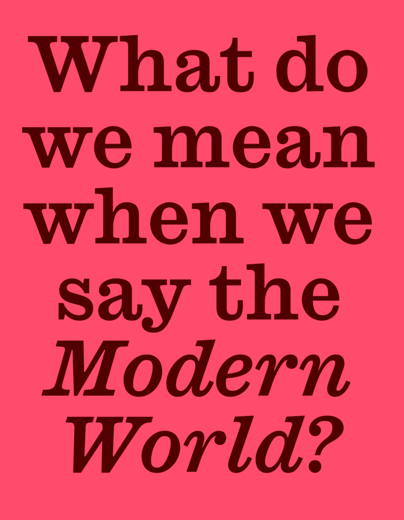
A new variable font designed by Paul Barnes and Greg Gazdowicz fuses the highly contrasted Modern and the rugged Ionic along the axes of contrast and weight, opening up a range of possibilities in the space between them.
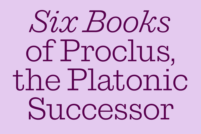
Whereas most of the families initially released by Commercial Classics mined the first half of the nineteenth century – when a flurry of innovation produced forms we take for granted today like the sans serif, the slab serif, and the fat face – Ionic Modern explores the period immediately after that: the Victorian era. Designed by Paul Barnes and Greg Gazdowicz, Ionic Modern is a variable font that strives to capture the spirit of the two sources it taps: the sturdy Ionic pioneered by Caslon and the very attenuated Modern style of the second half of the nineteenth century.
The Modern had established itself as the dominant serif form by the end of the 1700s, and foundries continually tweaked it as technologies improved, tastes changed, and the sorts they had on hand wore out. By the middle of the following century, the Moderns’ earlier roundness and softness had largely been lost, giving way to greater sharpness and higher contrast. This was fine until it wasn’t: in fraught printing contexts, and as the type itself frayed, the forms could appear spindly and even broken rather than graceful.
Responses to this began to emerge, such as the Ionics from the Caslon Foundry and the Clarendons from the Fann Street Foundry, which lowered the contrast almost to that of an abrupt slab, but bracketed the serifs for extra heft. And in the US, similar ideas later took hold in the Century series of typefaces. Nonetheless, the latter Modern style remained broadly popular as an ideal of refinement. Stephenson & Blake’s Modern No. 20, originally cut in 1870, remained in production until the end of metal in the mid-twentieth century.
The overarching goal with Ionic Modern was to design a typeface that preserved the spirit of these willowy late Moderns. Although adjacent to the Modern embodied by Brunel, Ionic Modern sheds the earlier form’s softness, and is a broader interpretation of the genre rather than a restoration project. Ionic Modern’s serifs are more bracketed and elongated than Brunel’s; contrast is more pronounced; balls are more crisply defined; and the rounds move toward a diamond shape rather than an elliptical one. The counters are narrower, but the letters are wider, with a taller x-height. Tails on the R and t are longer and finish on a vertical, approaching Century types in that regard. This latter form, which continues to evoke high fashion and luxury today, is closer to the archetype most designers think of as a “Modern.”
When Paul and Greg began to explore the idea of developing this resilient Victorian form using today’s technology for today’s use, they realized that it shared the Ionic’s structure and could in fact be derived from it. In other words, this pair that historically addressed quite different needs – the Ionic emerged as a solution to the later Modern’s fragility – could effectively form a single, very versatile family.
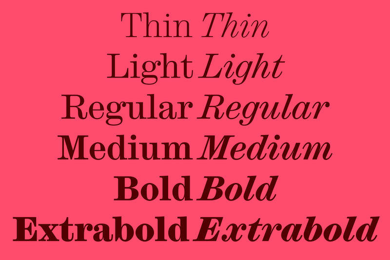
As you turn up the contrast, you can transform the robust Ionic into a moderately contrasted Modern that works beautifully for running text. Increase the weight, and you have a slightly heavier text Modern for knocking out of a dark background. If you keep increasing the contrast, you eventually arrive at a graceful, highly modulated headline face. Along the way, a high-contrast Ionic, again conjuring Century types, might be a good candidate for passages of larger text like decks and subheads. Play with it. Fine-tune it. The control is in your hands.
For those who either don’t need the flexibility of variable fonts or are using tools that don’t yet support them, Ionic Modern also comes in static styles, with three optical sizes: Micro, Text, and Poster. Whether static or variable, though, this is a family well equipped to address the complex hierarchical and typographic needs of today’s projects. A website set entirely in Ionic Modern would be a thing of beauty. As would a book. As would a magazine. As would a poster. As would a menu. As would a—
Read Paul Barnes’s essay about Ionic Modern, which goes into depth about the family’s history, genesis, and design.
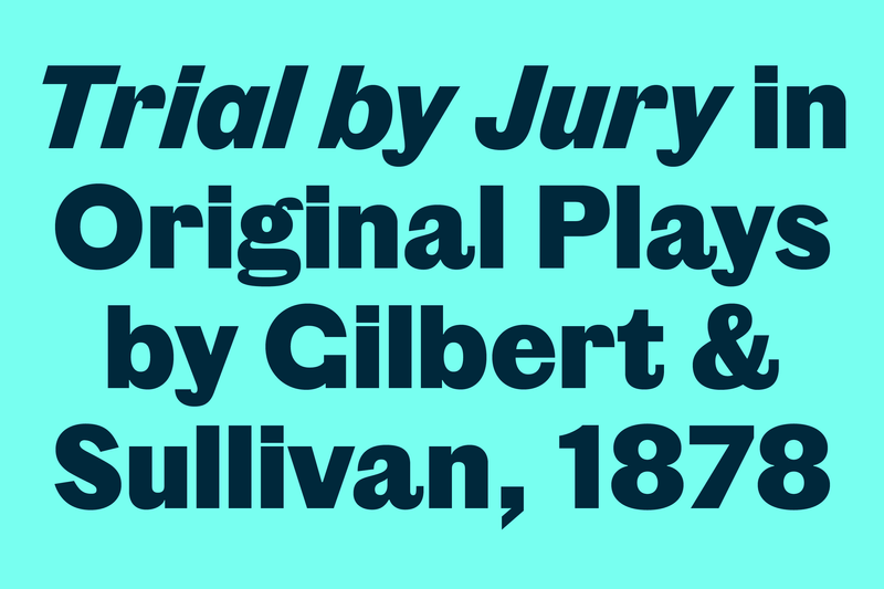
Successor builds a logical, harmonious narrative from the disjointed trajectory of the subset of bracketless nineteenth-century slabs known as Egyptians. This unprecedented form, an organic response to the later high-contrast Modern styles that Ionic Modern approximates, quickly became popular and set a new standard for display typography. Various foundries offered Egyptians – moving from all-caps alphabets to designs with a lower case, italics, and a range of weights, widths, and sizes – but no single foundry carried all of these variants together as a coordinated whole. Tim Ripper attempts to plug these gaps and hazards an educated guess about what a cohesive Egyptian might have looked like if it had been drawn by the same person. The boxy, almost completely unmodulated Successor would play nicely off the elegant Ionic Modern.
Vincent Figgins’s earliest all-capital sans serif alphabets came onto the scene between 1828 and 1832 and were the first typefaces ever to be called sans serifs. Paul Barnes and Christian Schwartz have resuscitated and amplified Figgins’s model for the twenty-first century. Focusing on his Eight-Line Pica Sans-Serif and Two-Line Primer Sans-Serif, Paul and Christian have added a simple italic and a brand-new lowercase that draws on Figgins’s slab serifs to come up with a bold, contemporary typeface in two styles: Original Sans Three (a lighter and somewhat rougher face) and Original Sans Four (a heavier, rounder, more geometric cut). Like Champagne, Original Sans goes well with everything—from fancy to whatever the opposite of fancy is. You should definitely try pairing it with Ionic Modern.
Punch, drawn by Paul Barnes with Tim Ripper, is an informal rounded headline typeface that revives and expands Miller & Richard’s News Bill Italic with a matching roman. Created for Fraser Muggeridge studio’s catalog for Yayoi Kusama’s 2023 exhibition You, Me and the Balloons exhibition at Factory International in Manchester, England, Punch is a narrow design that features sans serif caps mixed with a serif lower case. Our first release of 2024, it is now in the Vault. Elaine Lopez has already used it to great effect for Parsons 👏
 |
 |
 |