An “American grotesk” combines function and beauty. Meet its designer.
Type designers and graphic designers are natural allies, but their respective disciplines can seem asymptotic, traveling along companionably while never quite overlapping. Graphic designers (mostly) love type, and, perhaps especially since the 1990s when a Mac with Fontographer installed on it became fairly commonplace in MFA programs and in design studios, plenty of graphic designers have tried their hand at making a display typeface or two. But the subset of graphic designers who also practice designing text typefaces with any regularity or success is minuscule. Shiva Nallaperumal is one of those designers.
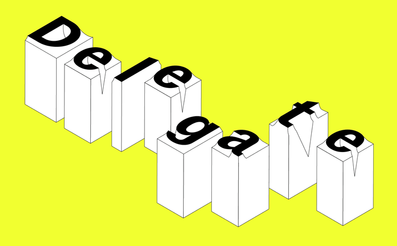
In late 2023, Commercial Type released Delegate. Although it’s Shiva’s first release with Commercial Type, it’s not his first exploration of agates and grotesks—they have fascinated him throughout his career. The family continues Shiva’s investigation into agates, but also advances a hypothesis about how an “American grotesk” might reasonably look and behave. Long-distance correspondents Caren Litherland and Shiva met up via text for a conversation about Delegate, design, and November’s new website.
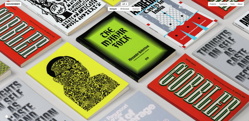
Caren Litherland: So, Shiva, I need to congratulate you on multiple fronts. First of all, huge congratulations on November’s new website, which I understand was a fairly long time in the works. It’s so you: the supercut at the beginning seems like a nod both to the splash pages of the early web, which frankly I miss, and to your love of film, which seems so central to who you are as a designer. One of my favorite parts of the site is the Log, which is kind of like a hidden treasure; users have to toggle a switch to even know that it’s there, and then it’s like this magic door opens that reveals this marvelous repository of cultural artifacts that inform November’s work. Do you want to talk a bit about the new site—what the development process was like, how you plan to use it, how you think it might evolve?
Shiva: Thank you very much! The website is a reflection of both Juhi’s and my obsessions and interests (cinema being a shared love). It has been a very long and arduous process. It was also very iterative: We originally started designing it a year into our studio (2019) and it went through many different versions. When we returned to India in 2023 we started over from scratch—because for the first time we were clear about our own identity, and what we wanted to say to the world. We wanted the website not just to be a portfolio showcase but also a way for us to communicate with the world. When we were younger and in college, the only way we could keep in touch with what our favorite designers and studios were doing was to religiously check their websites at regular intervals. Each studio’s website echoed the studio’s specific identity and because there was no other medium (like Instagram), we experienced someone’s work on their own terms. There were hardly any preset templates, so every site was a surprise. We detest the centralized communication that Instagram has created, where everyone is fighting for two microseconds of your attention. We wanted our site to echo our early experiences of the web: surprise, fun, and personality. Most importantly: We want people to waste time on it, reading, looking, searching, and finding. I remember losing hours to “the internet” but coming out smarter and energized, unlike the doom-fatigue I feel today.
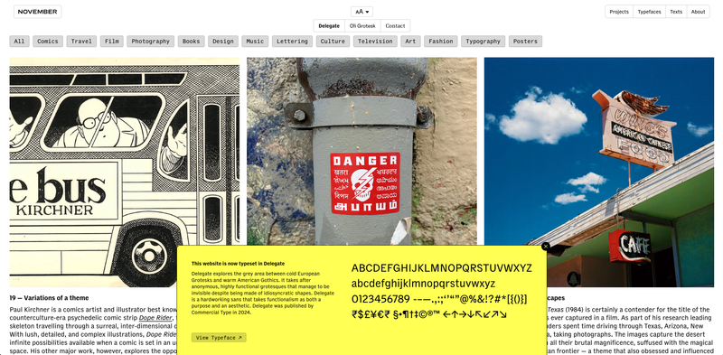
The log is our tribute to Tumblr and FFFFOUND!, the bookmarking site. We are always reading and consuming, and we enjoy sharing with and learning from friends and colleagues about the books, films, art, writing, music, and TV we’re consuming. I have long been an ardent reader of music and culture magazines (I spent most of my formative years reading back issues of Spin that I found in a bargain bin at a local bookstore in Chennai) and love the short, quick opinion columns they’ve always carried. The log is both our way of sharing knowledge and also practicing writing more seriously. I’ve always wanted to be a better writer, but essays just seem very intimidating.
Shiva, you write beautifully. I’m just saying.
Ha, that means a lot coming from an actual writer! So these short pieces, about things we know well, could be a good start, we thought. Another reason we started the Log was also because we are seeing a marked drop in young designers’ and students’ exposure to the larger cultural field. I don’t know what it is, but young designers, at least here in India, haven’t seen the films, read the books, or heard of the creatives that they should have. It’s not their fault—they’re all super eager and interested but I’ve heard the same problem multiple times: one of not knowing where to start.
It’s understandable, all our platforms today are designed to keep people within and not venturing out to explore more. For example, the other day I was shocked that our junior designer had never heard of The Terminator. I gave her the day off to watch the first two films. When I was a student, design schools took cinema very seriously; my school had mandatory film screenings Tuesdays and Fridays followed by intense discussions, and we watched everything: from Fritz Lang to John Carpenter to Werner Herzog to Die Hard. It’s just not the case today. Maybe it isn’t practical: in my time, my entire cohort (of all disciplines) was never more than thirty people. How are designers supposed to understand narrative, pacing, structure, or cultural insight without fully immersing themselves in cinema and music?
Anyway, our goal with the Log is to be that starting point. Every image is linked to a bigger resource: a book, a film, or a longer essay that you can explore should you be more interested in that topic. Every month we dedicate one day of studio time to collect and write the next month’s Log entries, and we hope to keep it going. We will keep it limited to our website only: I realize people spend infinitesimally less time on individual websites nowadays but it’s for that one someone who finds it and finds value in it. Even if that is only one person forever, I’m happy if it makes a difference.
You need to add an RSS feed for the Log!
It’s on our to-do list!
Moving on to the next order of congratulations: At the end of 2023, you published Delegate—belated congrats on your first release with Commercial Type! More recently, you were the creative director for Graphik’s expansion into the Bangla, Devanagari, and Tamil scripts, which I’ll come back to in a bit. Would it be fair to say that Delegate was a full-circle moment for you? I remember reading an interview with you where you said that while attending a design conference in Goa when you were an undergraduate at DJAD, you chanced upon a print artifact that sort of changed your life: a Commercial Type specimen. Now you’ll be in Commercial Type specimens. How does it feel?
It’s an incredible feeling and quite an honor. It’s a funny story, actually: I decided to go to design school because I liked to draw and wanted to be an illustrator or animator. I had no idea what graphic design or typography was before school and I really enjoyed those classes. A pivotal moment was seeing David Carson’s End of Print in the library: It totally changed my perspective on graphic design. His work aligned with the music I loved (Grunge, alternative, punk). It was loud and abstract, and each layout felt more like a painting than anything else. Anyway, it was announced that David Carson was speaking at Designyatra (Asia’s biggest design conference) that year and it was killing me that I couldn’t go, since the school rule was that only third- and fourth-year students were allowed to attend. My friend Samrudh and I decided to go rogue, lied to the administration that we needed leave to attend my sister’s wedding (I used this excuse four more times over the next few years), worked on a small freelance project that paid for the tickets, and went to Goa. When we got there, the very first thing the emcee announced on stage even before the welcome address was that Carson couldn’t make it. It was a HUGE huge disappointment.
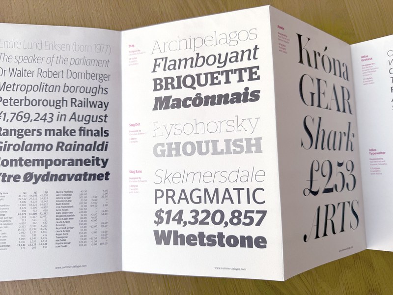
I didn’t know it then but I found something else through that experience that changed my life forever: The goodie bag had a specimen from Commercial Type featuring the newly released Marian and Stag families. It was my first time seeing a typeface specimen and I sort of came to terms with the fact that someone actually designs these things. Of course, I’d done the basic foundational typography classes but I’d never fully encountered Type Design as a discipline. And it wasn’t just any typeface, it was fucking MARIAN! It was stunning and perplexing—the ligatures, the swashes, and all as thin as hair. But the typeface that really blew a bulb in my head was Stag: There was a showing of both the Sans and Slab versions (again, my first time encountering a superfamily concept) and I distinctly remember noticing that Christian had retained the terminal slab on the a in the sans. That sort of realigned my brain a little bit, the subtle way of creating a relationship between two styles: It was suddenly like ooooohhhhhhh I get it! It seems miniscule now but you can’t choose what influences you 🙂
When we got back to school I did a deep dive on Commercial Type—its typefaces, designers, and partners. When I found out that Paul had worked with Peter Saville, that was it for me (music was my gateway drug to design). I loved (and still love) Christian’s personal Schwartzco site—It was so well written, with such personal writing about the process behind each typeface. He generously shared his sources, ideas, and inspirations, which then led to a lot more googling and rabbit holes. I still recommend the site to everyone.
I think I can trace whatever knowledge and passion I have for typography to picking up that specimen that day. So yes, fifteen years later, being in a Commercial Type specimen myself is a wonderful feeling.
Have any other specimens influenced you? Do you have quite a collection?
Many! I don’t have all that much (nothing compared to Commercial Type or the legendary collection of Tobias Frere-Jones), but most of my collection is from my time in Baltimore during my MFA at MICA or brief travels in Europe. Tal Leming (to whom I owe my career) introduced me to Oak Knoll Books and I spent most of my teaching-assistant stipend there. I’ve got some really great ones I found in bargain bins and thrift stores, including specimens by William Addison Dwiggins (I’ve always loved how the covers of his specimens were adorned with lettering and not the typeface itself); an old one from Enschedé showcasing their entire history (gorgeous, sparkling Rosart and Fleischmann faces); a few from ATF and Linotype; and one fantastic one from Fonderie Olive. All of these have greatly influenced me. I’ve been very lucky also to be given specimens from many current foundries and designers: I love the carefully considered type specimens of Typotheque (I later got to design one for them), Typonine, Bold Monday, and Production Type.
Tal told me once that if I emailed Enschedé they’d mail me some specimens, so I did and I received a very beautiful package that felt more like mail art than specimens: It was an envelope with postcards, specimens, and, most interestingly, pages torn out of books and newspapers that use their fonts. That was SO COOL! How better to sell a font than to show you how it looks printed in 8pt on bible paper? I’ve still kept the envelope as it contains the most beautiful handwriting I’ve ever encountered: that of Peter Matthias Noordzij (he writes oldstyle numerals and small caps for emphasis).
Another set of specimens I’ve loved are the collection from Storm Type. I’ve always been a huge fan of František Štorm’s eclectic and distinctly Eastern European style. His specimens are just as eclectic. Finally, a specimen I absolutely love: an early one from Klim. It’s a small black book with a horizontal layout, a single big word per page—it feels like a flip-book. I love that it mirrored his website of the time (another huge influence). It helped me understand how there’s a larger graphic language and philosophy that lends itself as easily to print as it does to the web. Specimens have often taught me more about graphic design and typesetting than type design itself.
But wait, there’s more! Read the full interview.
If you’re in New York, you can see work by November, along with work by our frequent collaborator Wael Morcos, in the exhibition “Reverberations: Lineages in Design History” at the Ford Foundation through May 3.
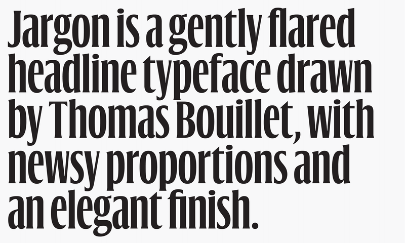
Jargon, Thomas Bouillet’s sharp, flared headline face in six weights, grew out of a single bold condensed style of Tandem, his 2020 degree project at Type]Media in The Hague. The upright styles betray the influence of Dutch newspaper types; the italic borrows from Roger Excoffon and François Ganeau’s chic sloped romans for Vendôme. Jargon’s honed terminals and steep, stadium-step x-height recommend it for posters, book and magazine covers, and headlines on the web.
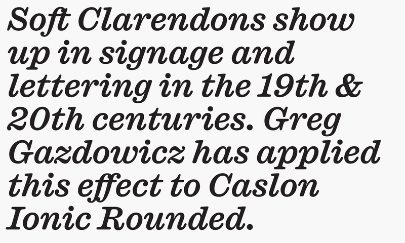
In the real world, type frays. It shows the effects of time and mechanical mishaps and weather. Greg Gazdowicz has spent the past few years exploring various aspects of softness in type: in contrast, with Terza; as an artifact of production processes, with Focal; and now as a transformative agent when applied to a historical genre—the Ionic—known for its crispness and solidity. This warm, charming remix tempers Caslon Ionic’s serifs, corners, and terminals. It also borrows some moves from the lettering on London’s historic public houses—favorite haunts of Commercial Type partner Paul Barnes—and from Caslon’s bizarre, flared Atlas, released in 1888.
Led by Dino Sanchez, the Commercial Type Design Studio first launched in 2019 as a sibling of Commercial Type, then quietly relaunched within the foundry in 2022. Opening a design studio within Commercial Type made sense to us because we view type as the foundation of visual design. Our firm grounding in type makes us uniquely poised to understand how brands can use words to engage productively with the visual elements—images, colors, patterns—that support them. Creative Boom has a write-up.
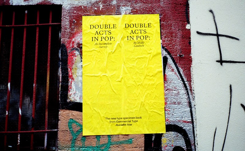
You may or may not know that we made a book. We’ve been talking about it a lot because we think it’s an instructive and delightful way to interact with type, and we had fun making it. Author Molly Lambert, who wrote the very wild text, gave a live reading of it in Hollywood, and we had a release party—a dance party (no one danced, but still)—in a bar on Chrystie Street. We made posters and stuck them up in New York and LA. If you don’t have a copy of Double Acts yet, get it! There’s also a special “bonus track” edition that includes a new booklet documenting some of the more out-there ways we’ve promoted our typefaces over the years.
 |
 |
 |