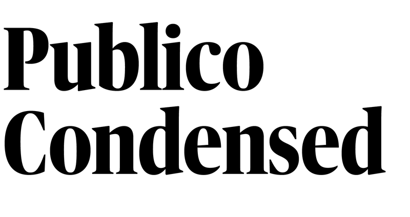
Publico Headline has been expanded with a Condensed width, drawn by talented Estonian type designer Andree Paat. Publico Banner now appears in two additional widths, Condensed and X Condensed, both drawn by Thomas Bouillet.
Publico Headline has been expanded with a Condensed width, drawn by talented Estonian type designer Andree Paat. Publico Banner now appears in two additional widths, Condensed and X Condensed, both drawn by Thomas Bouillet.
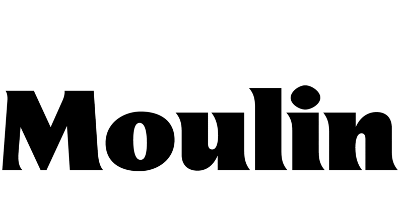
Sandrine Nugue’s asymmetrically flared Moulin now features two lighter and four heavier weights, for a full range of seven. Moulin’s proportions are influenced by classical lettering, and the shapes nod to Adrian Frutiger’s underappreciated Icône.
Publico Headline has been expanded with a Condensed width, drawn by talented Estonian type designer Andree Paat. Publico Banner now appears in two additional widths, Condensed and X Condensed, both drawn by Thomas Bouillet.
Publico Headline has been expanded with a Condensed width, drawn by talented Estonian type designer Andree Paat. Publico Banner now appears in two additional widths, Condensed and X Condensed, both drawn by Thomas Bouillet.
Sandrine Nugue’s asymmetrically flared Moulin now features two lighter and four heavier weights, for a full range of seven. Moulin’s proportions are influenced by classical lettering, and the shapes nod to Adrian Frutiger’s underappreciated Icône.

Work on Ergon, a display family in six weights by Hrvoje Živčić, started in 2017 as part of a design pitch for branding a region of Croatia. Stylistically, it is a combination of influences: stone chiseled letterforms local to the region, digitally rendered with sharp detailing for bold and sculptural graphic forms.
Publico Headline has been expanded with a Condensed width, drawn by talented Estonian type designer Andree Paat. Publico Banner now appears in two additional widths, Condensed and X Condensed, both drawn by Thomas Bouillet.
Publico Headline has been expanded with a Condensed width, drawn by talented Estonian type designer Andree Paat. Publico Banner now appears in two additional widths, Condensed and X Condensed, both drawn by Thomas Bouillet.
Sandrine Nugue’s asymmetrically flared Moulin now features two lighter and four heavier weights, for a full range of seven. Moulin’s proportions are influenced by classical lettering, and the shapes nod to Adrian Frutiger’s underappreciated Icône.
Publico Headline has been expanded with a Condensed width, drawn by talented Estonian type designer Andree Paat. Publico Banner now appears in two additional widths, Condensed and X Condensed, both drawn by Thomas Bouillet.
Publico Headline has been expanded with a Condensed width, drawn by talented Estonian type designer Andree Paat. Publico Banner now appears in two additional widths, Condensed and X Condensed, both drawn by Thomas Bouillet.
Sandrine Nugue’s asymmetrically flared Moulin now features two lighter and four heavier weights, for a full range of seven. Moulin’s proportions are influenced by classical lettering, and the shapes nod to Adrian Frutiger’s underappreciated Icône.
Work on Ergon, a display family in six weights by Hrvoje Živčić, started in 2017 as part of a design pitch for branding a region of Croatia. Stylistically, it is a combination of influences: stone chiseled letterforms local to the region, digitally rendered with sharp detailing for bold and sculptural graphic forms.
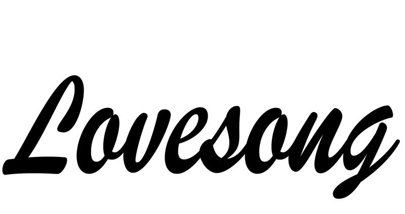
Miguel Reyes has drawn a tribute to Brush Script, called Lovesong. This standalone style started out as a custom project, but was cancelled amid a corporate reshuffle. Miguel later finished a version for Richard Turley’s guest editorship of Its Nice That in August.
Publico Headline has been expanded with a Condensed width, drawn by talented Estonian type designer Andree Paat. Publico Banner now appears in two additional widths, Condensed and X Condensed, both drawn by Thomas Bouillet.
Publico Headline has been expanded with a Condensed width, drawn by talented Estonian type designer Andree Paat. Publico Banner now appears in two additional widths, Condensed and X Condensed, both drawn by Thomas Bouillet.
Sandrine Nugue’s asymmetrically flared Moulin now features two lighter and four heavier weights, for a full range of seven. Moulin’s proportions are influenced by classical lettering, and the shapes nod to Adrian Frutiger’s underappreciated Icône.
Publico Headline has been expanded with a Condensed width, drawn by talented Estonian type designer Andree Paat. Publico Banner now appears in two additional widths, Condensed and X Condensed, both drawn by Thomas Bouillet.
Publico Headline has been expanded with a Condensed width, drawn by talented Estonian type designer Andree Paat. Publico Banner now appears in two additional widths, Condensed and X Condensed, both drawn by Thomas Bouillet.
Sandrine Nugue’s asymmetrically flared Moulin now features two lighter and four heavier weights, for a full range of seven. Moulin’s proportions are influenced by classical lettering, and the shapes nod to Adrian Frutiger’s underappreciated Icône.
Work on Ergon, a display family in six weights by Hrvoje Živčić, started in 2017 as part of a design pitch for branding a region of Croatia. Stylistically, it is a combination of influences: stone chiseled letterforms local to the region, digitally rendered with sharp detailing for bold and sculptural graphic forms.
Publico Headline has been expanded with a Condensed width, drawn by talented Estonian type designer Andree Paat. Publico Banner now appears in two additional widths, Condensed and X Condensed, both drawn by Thomas Bouillet.
Publico Headline has been expanded with a Condensed width, drawn by talented Estonian type designer Andree Paat. Publico Banner now appears in two additional widths, Condensed and X Condensed, both drawn by Thomas Bouillet.
Sandrine Nugue’s asymmetrically flared Moulin now features two lighter and four heavier weights, for a full range of seven. Moulin’s proportions are influenced by classical lettering, and the shapes nod to Adrian Frutiger’s underappreciated Icône.
Publico Headline has been expanded with a Condensed width, drawn by talented Estonian type designer Andree Paat. Publico Banner now appears in two additional widths, Condensed and X Condensed, both drawn by Thomas Bouillet.
Publico Headline has been expanded with a Condensed width, drawn by talented Estonian type designer Andree Paat. Publico Banner now appears in two additional widths, Condensed and X Condensed, both drawn by Thomas Bouillet.
Sandrine Nugue’s asymmetrically flared Moulin now features two lighter and four heavier weights, for a full range of seven. Moulin’s proportions are influenced by classical lettering, and the shapes nod to Adrian Frutiger’s underappreciated Icône.
Work on Ergon, a display family in six weights by Hrvoje Živčić, started in 2017 as part of a design pitch for branding a region of Croatia. Stylistically, it is a combination of influences: stone chiseled letterforms local to the region, digitally rendered with sharp detailing for bold and sculptural graphic forms.
Miguel Reyes has drawn a tribute to Brush Script, called Lovesong. This standalone style started out as a custom project, but was cancelled amid a corporate reshuffle. Miguel later finished a version for Richard Turley’s guest editorship of Its Nice That in August.
 |
 |
 |