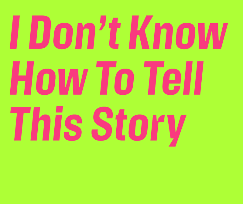
Action Text, another recent release, represents Erik van Blokland’s meditations on what constitutes a performant sans serif for interfaces, thereby fostering a positive onscreen reading experience. Its adventurous, sculptural letterforms derive directly from function: any details that couldn’t be stripped away have been simplified and exaggerated. Action Text comes in a variable version with weight and grade axes, as well as a “flat” version in four emphatically distinct weights accompanied by matching italics, with a “Bright” and “Dark” grade for each weight.
Action Text, another recent release, represents Erik van Blokland’s meditations on what constitutes a performant sans serif for interfaces, thereby fostering a positive onscreen reading experience. Its adventurous, sculptural letterforms derive directly from function: any details that couldn’t be stripped away have been simplified and exaggerated. Action Text comes in a variable version with weight and grade axes, as well as a “flat” version in four emphatically distinct weights accompanied by matching italics, with a “Bright” and “Dark” grade for each weight.
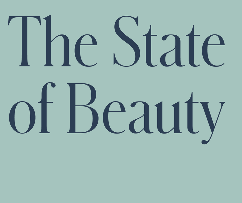
Before Review and its serif companion Feature defined the look of T, Schnyder served for several years as its primary display face. Occupying a gray zone between type and pointed-pen lettering, Schnyder features the high contrast typical of typefaces associated with high fashion, but is intercut with idiosyncratic, organic details. It comes in four widths, from X Condensed to Wide; unusually, the stem thicknesses are identical across all widths, which allows the various widths to be mixed and matched, even within the same word.
Action Text, another recent release, represents Erik van Blokland’s meditations on what constitutes a performant sans serif for interfaces, thereby fostering a positive onscreen reading experience. Its adventurous, sculptural letterforms derive directly from function: any details that couldn’t be stripped away have been simplified and exaggerated. Action Text comes in a variable version with weight and grade axes, as well as a “flat” version in four emphatically distinct weights accompanied by matching italics, with a “Bright” and “Dark” grade for each weight.
Action Text, another recent release, represents Erik van Blokland’s meditations on what constitutes a performant sans serif for interfaces, thereby fostering a positive onscreen reading experience. Its adventurous, sculptural letterforms derive directly from function: any details that couldn’t be stripped away have been simplified and exaggerated. Action Text comes in a variable version with weight and grade axes, as well as a “flat” version in four emphatically distinct weights accompanied by matching italics, with a “Bright” and “Dark” grade for each weight.
Before Review and its serif companion Feature defined the look of T, Schnyder served for several years as its primary display face. Occupying a gray zone between type and pointed-pen lettering, Schnyder features the high contrast typical of typefaces associated with high fashion, but is intercut with idiosyncratic, organic details. It comes in four widths, from X Condensed to Wide; unusually, the stem thicknesses are identical across all widths, which allows the various widths to be mixed and matched, even within the same word.
 |
 |
 |